Tuesday, 27 February 2018

How to Bake Engagement Into Video Content

Would you like to create video content that is more engaging and draws in and retains more viewers while also attracting more shares, likes, comments, and other reactions? If you do then you should know that engagement needs to be ‘baked into’ video content, and that starts from the time you sit down and begin to plan it.

To be more specific if you want to bake engagement into your video content, there are a few areas you need to look into carefully:

Give your audience something they want

The best way to engage your audience is to give them what they want – whether it is a solution to a problem, some helpful advice, or information about a certain topic. Make no mistake it can be tricky finding out what your audience wants, and you’ll have to carry out research to find out more.

Try to provoke emotions

As you may have noticed people tend to watch videos that trigger an emotional response, whether it is joy, shock, inspiration, or even sadness. The more intensely you’re able to provoke an emotion, the more engaging your video will be.

In some cases the topic and script need to be designed to trigger emotional responses. On the other hand in other types of videos that are personality driven it is up to the personality to allow their emotions to be reflected in the video.

Watch the duration

To put it simply: The longer a video goes on for, the more viewers it will lose, and the less engaging it will be. Because of that you should watch the duration of your video, and as a rule should keep it as short as possible.

Although there are lots of recommended durations for engaging videos, the fact of the matter is that nothing is set in stone. In some cases short videos that are between 15 to 60 seconds are best for social media, but in others longer videos may work too. At the end of the day it will take some trial and error to find out what the ideal duration is for your audience.

Use subtitles and captions

Over the last few years the number of viewers watching videos without audio has increased sharply. If you want to engage these viewers you’ll need to ensure your message can be delivered effectively even without audio – and the easiest way to accomplish that is with subtitles and captions.

Always show as opposed to telling

As you probably know videos are known for being engaging, and the reason for that is because they are a unique type of visual content. It is important that you leverage that fact, and always ‘show’ the points and message that you’re putting across rather than just ‘telling’ your viewers about it.

In some cases it is easy to ‘show’ actions being performed, a particular part of a product that you’re talking about, or a graph that displays certain data. However in others it may be more difficult to visually represent the information, and you will have to be creative.

Get straight to the point

If you want to retain more viewers, your video should get straight to the point so that it is able to interest viewers within the first few seconds. Try to use the introduction of your video to tease the content, and explain how it will benefit viewers.

Generally viewers will decide whether to keep watching within the first 10 seconds of a video – so you don’t have long to give them a good reason.

As you can see the idea that videos need to be expensive productions in order to be engaging really doesn’t hold much weight. In fact you can create extremely engaging videos using just a smartphone, digital camera, or any form of video capture on Mac or PC.

By focusing on the areas listed above and ‘baking’ engagement into your videos, you’ll find that they are likely to outperform videos that may be more expensive or have higher production value. Just remember to keep experimenting, and always pay attention to what your audience wants – and you should be able to increase engagement levels further as time goes by.

The post How to Bake Engagement Into Video Content appeared first on SpyreStudios.


from SpyreStudios http://spyrestudios.com/bake-engagement-video-content/

Monday, 26 February 2018

The Powerful JavaScript Debugger You Never Knew You Had

When you were first starting to write JavaScript, you learned about console.log. You learned about outputting messages to the console and using it to troubleshoot your JavaScript. And unless you’re a fairly serious JavaScript developer, you might not have bothered with much more. When JavaScript apps don’t work correctly, developers are often quick to start peppering their code with console.log statements, echoing the values of expressions to the console to try and traceback an error. It’s hardly efficient, but for a simple program, it works. It probably won’t surprise you to learn that there is a better way to troubleshoot your JavaScript. Better still, there’s an awesome JavaScript debugger buried right inside your browser. You can use Firefox Quantum’s recently-revamped built-in JavaScript debugger or Google Chrome’s Sources tool to track and analyze your code and say goodbye to console.log for good.

In this post, we will be focusing on Firefox, but you can also find the same essential tools inside of Google Chrome’s DevTools. The overall layout off the debuggers is basically the same as well.

Getting Started with the JavaScript Debugger

To use the Firefox debugger, you’ll need to install Firefox. You can use the Developer Edition or the stable version, provided you have the newest version (codenamed Quantum). The Developer edition is sort of a half-way in-between Firefox Beta version, with some beta features geared specifically towards devs and a few UI tweaks. As far as we can tell, however, Firefox’s standard release channel contains all the same developer tools as Firefox Developer Edition.

We’ll be doing our debugging on a training site offered by Mozilla. Navigate to the site.

Open the Debugger by pressing Option + Command + S on a Mac or Control + Shift + S on a PC. This will slide up a pane from the bottom of Firefox’s primary window. If you’ve ever used Inspect Element before, this will be fairly familiar.

If you primarily use Chrome, you can also follow along in Chrome’s JavaScript debugger. It’s essentially the same, but it does have some cosmetic differences. Press Option + Command + I or Control + Shift + I to launch the Console in DevTools, then click on the “Sources” tab.

Once we have correct panel open in Firefox, we’ll want to click on the correct source. Navigate through the tree on the right until you’ve reached the JavaScript file you want to inspect. For your own projects, you’ll know what you’re looking at. For this project,

Using the JavaScript Debugger

If you’re not familiar with the idea behind using a debugger, you’re basically going through your code slowly and carefully inspecting the values of given expressions. This works the same whether it’s a C debugger or a JavaScript debugger.

Setting Breakpoints

In order to step through your code effectively, you need to set breakpoints. Breakpoints tell the debugger where to pause executing code for a moment, giving you the chance to inspect values.

Click on a line value to set a breakpoint. Here, we’ll set a breakpoint at line 13 by clicking on its line number.

add breakpoint
Image Source: Mozilla

Once we’ve set our desired breakpoints, try adding an item to our to do list.

javascript debugger firefox

The code will “break” at that point, pausing its execution until we manually continue through the stack. This let’s us take our time inspecting values.

Inspecting Values

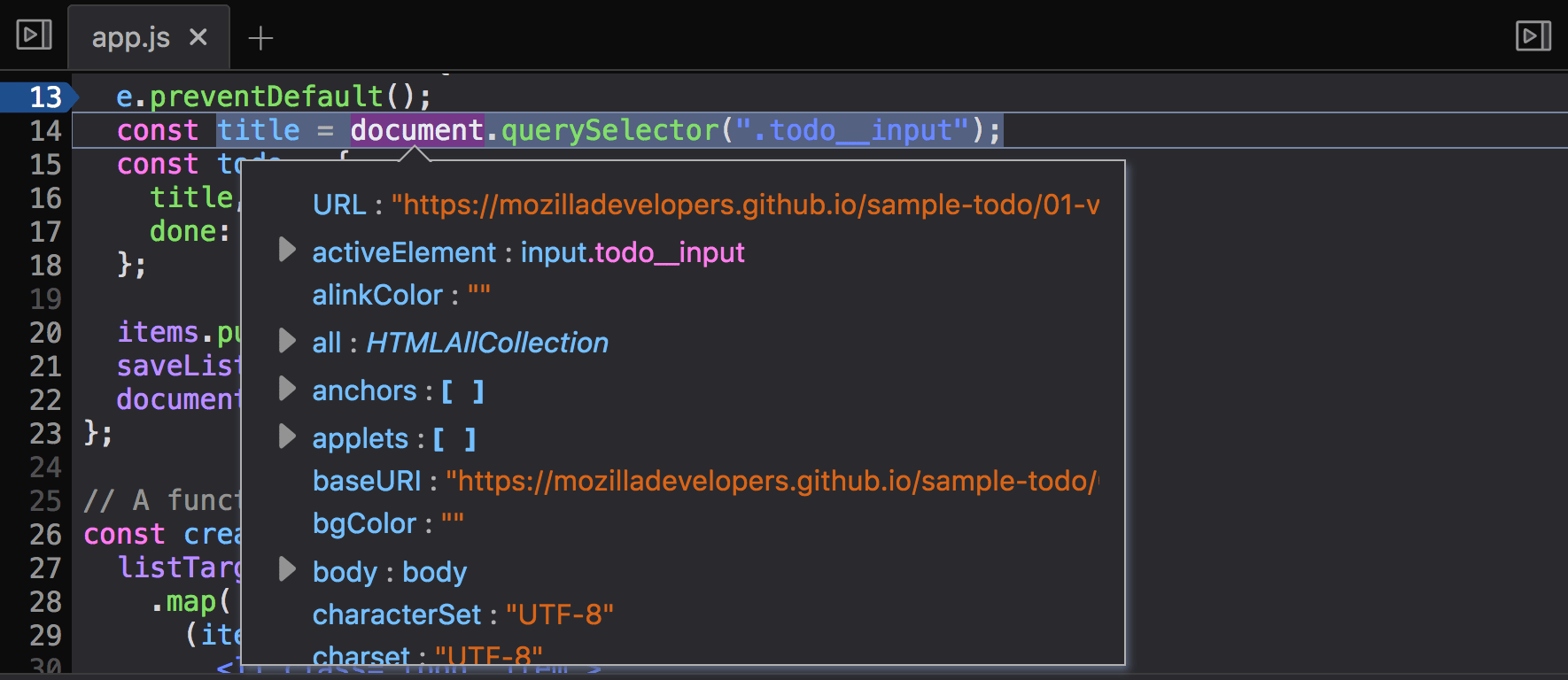
To inspect the value of a given expressing in our JavaScript, we can hover over the value to see all it’s parameters. This value will be updated as we progress through our code.

hover
Image Source: Mozilla

You can also see what’s going on in the Scopes pane on the right. The top Block shows the variable assignments current in scope for the current line.

Stepping through Code

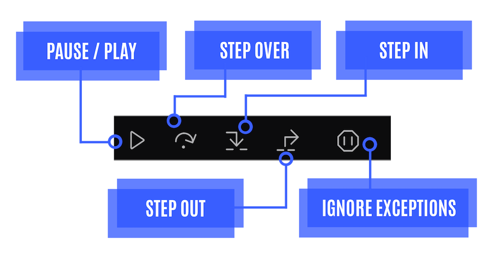
Once we’ve set some breakpoints, we’ll want to control how we move through our code. This is called “stepping” through the code, and we can do it in various ways. There’s a few tools that will help us do that. These tools are available at the top of the right-side pane.

We can take a closer look at what they do.

overview
Image Source: Mozilla

All of these tools run code one line at a time, but they behave different when they encounter functions.

Step Over: “step across” the current line. This will run the next line, executing any functions you encounter. This can automatically skip over many lines of code executing called functions.

Step In: run the code one line at a time, but navigate “inside” of any function you encounter. This allows you to quickly navigate to the contents of called functions for troubleshooting.

Step Out: exit a function that you entered with “Step In” and return to the main body of code.

Learning More

The JavaScript debugger is capable of more than the functions we’ve discussed here. You can learn more at Mozilla’s Debugger PlayGround, or dig in to their debugger documentation.

You might also be interested in the following posts:

How to Build a Firefox Extension

Best JavaScript Libraries for Building Web Interfaces

Learn Web Development With These Web Developer Courses

The post The Powerful JavaScript Debugger You Never Knew You Had appeared first on SpyreStudios.


from SpyreStudios http://spyrestudios.com/powerful-javascript-debugger-never-knew/

Friday, 23 February 2018

From Hobby to Career: Interview with Designer Michael Moodie #1 DOTW

Designer of the week

Editor’s notes:
This first interview marks the beginning of a new series of interviews on WDL. We want to keep you, our audience, as engaged as possible with the news in the web design field but also give back by featuring our favorite designers in a weekly article.

We’ll feature a new designer every week (hence the name; Designer Of The Week or DOTW) and we want to give you the possiblity to be featured as well. If you think you have something to say to our audience, drop me an email and we can chat some more (andrei.tiburca@gmail.com)

Enjoy.

Interview with Michael Moodie

Michael Moodie is a Canadian designer living in Seattle. His passion for design and lettering has its roots back in the early years of childhood when Michael was writing graffiti and skateboarding. I first encountered him on Instagram where his painstaking work has a consistent fan base. The designer and lettering artist spent the last 7 years working in-house at creative agencies, startups and now at Amazon Video. On his blog, Michael welcomes his visitors with the unconventional “Don’t steal my work, Thanks” and justly he does.

Hereinafter, we invite you to get to know the talented artist and his beautiful work better. Also, do not hesitate to follow Michael on Instagram, Dribble, Behance, and LinkedIn.

Michael, where does your inspiration come from? 

I gather a lot of inspiration from what my friends are getting up to and how they are making an impact, also from places I visit and how graphic design influences their culture. When I’m not designing I enjoy mixing drinks, creeping around gallery spaces looking for inspiration and spending time with my good mates.

How would you describe the world of graphic design in your country?

With the emerging industry of User Experience design, Graphic Design has changed to be more of a data-driven process opposed to a subject matter experts (the designers) opinion. Through my experience, Data informed graphic design has given designers the opportunity to take their craft to the next level and lead projects from the customer back to the experience. We are starting to see design led fortune 100 companies to perform at 200%+, and more ownership given to design teams and individual creatives.

What is your favorite piece of work and why?

I change my favorite piece of work every day, I create a lot of my work to be sarcastic and relatable. I generally create all the work I love by hand using pencil, ink, and paper.

What do you think are the most important 3 skills for a designer?

Critical thinking, Humility, and a genuine love for the craft.

How do you stay updated with what is new in the design world?

Design conferences, meetups, online classes such as Skillshare, Reddit/medium, friends.

Have you worked with any major brands?

I have worked with brands such as Warner Brothers, Starbucks, Mattel, McDonald’s, Microsoft, etc. My experience working with large corporations is that the design process is very slow paced with many revisions and restrictions. For me, it is most important to spend most of my time in the planning phases to get a strong understanding from all stakeholders on the artifact we are delivering or collaborating on. In my experience, these brands aren’t big on “surprises”. Document your process and bring your client along for the journey.

Who are your favorite 3 designers?

I couldn’t chop my favorite down to 3, I have many inspirations across many mediums.

What is something new that you have learned as a designer in your past experience (jobs & internships)?

I’ve learned that not everything needs to be perfect, there is a very human element to imperfections and errors that should not be fixed.

What kind of people do you love to work with? 

I love to work with big idea thinkers, a visionary per say. A person who sees things that I don’t and understands the lifecycle of the design work we are doing. I love to work with people with purpose, who leave their own flavor on the work.

How do you handle stress and pressure?

I work my best under stress and pressure. I start to feel very competitive with myself and push harder to excel.

Michael, thank you for being so receptive and kind to have answered our questions. 

Thanks so much for the opportunity!

Below, we have cataloged some of Michael’s images that highlight the best his versatile, innovative, and done with great care and thoroughness work.


Read More at From Hobby to Career: Interview with Designer Michael Moodie #1 DOTW


from Web Design Ledger https://webdesignledger.com/designer-of-the-week-michael-moodie/

Tuesday, 20 February 2018

6 Streetwear Brands on Fire with Millennials

Some fashion brands are better than others. That’s just a fact. And while you might be obsessed with Nike and Under Armour, does that mean they’re the best brands out there? No, it certainly doesn’t. And to be honest, those brands are trash compared to other street style companies that have been around a lot longer and made an actual influence on society. I’m not trying to piss anyone off, but here are the TRUE best streetwear brands in the game right now:


Supreme:

Supreme is by far one of the best streetwear brands out there. This skateboarding shop turned clothing brand, created by James Jebbia, started off as a small company in downtown Manhattan and quickly became a designers dreams. Thanks to collaborations with top luxury/streetwear brands like Louis Vuitton, Nike, and Kermit the Frog, Supreme is the brand people want to be wearing. Even celebrities like; Cara Delevingne and DJ Khaled have been pictured wearing this. Consumers don’t seem to have a problem dropping thousands of dollars if that means they get to rock a Supreme Louis Vuitton Bag (which sells for no less than $4,000, btw) and post a picture of it on Instagram.

The Louis Vuitton x Supreme-$7000-$14500


Supreme Box Logo Hoodie in Heather Grey: $800-$1450


Read More at 6 Streetwear Brands on Fire with Millennials


from Web Design Ledger https://webdesignledger.com/6-streetwear-brands-fire-millennials/

Monday, 19 February 2018

Vandelay Special – Ultimate Design Bundle

Vandelay Special – Ultimate Design Bundle

For many, working as a freelance designer means freedom. As a freelancer, you get to choose where and when you work. It also means, unlike many corporate jobs where they pay you a salary and effectively have you on the clock 24/7, you’re paid what you’re worth. What you put in is what you get […]

The post Vandelay Special – Ultimate Design Bundle appeared first on Vandelay Design.


from Vandelay Design http://www.vandelaydesign.com/vandelay-special-ultimate-design-bundle/

Modern Handwritten Fonts for Fresh Design Trends

Handwritten fonts are on-trend for 2018, to the point where their use has become somewhat overwhelming. We’re smack in the middle of a aesthetic age focused on simplification: the removal of skeuomorphs, the simple use of color and direct expressions of design ideas. Handwritten fonts might seem to contradict that notion, but in fact support it with a feeling of personal and authentic expression that appeals to the individuality and personality of consumers. This focus on direct, personal communication is the overall design trend of our modern corporate age, and these fonts support it. They speak best for small businesses with handmade (or seemingly handmade) products, or for larger brands focused on individual expression.

Pacifico

handwritten fonts pacifico

Novito Nova

modern handwritten fonts novita nova

Bestters Supply

modern handwritten fontsBrayden Family

modern handwritten fonts brayden familyUchiyama

modern handwritten fonts uchiyama

This hand-drawn headlining font draws inspiration from mid-20th century matchbook covers. It includes a number of variations, which will automatically shuffle to provide the most natural look (provided your typesetting application understands OpenType variations).

Ether Cute Poison

modern handwritten font ether cute poisonPorter

modern handwritten fonts porter

Hipsta Script

handwritten font hipsta

Vantom! Script

handwritten font vantom

BiteChalk

handwritten font bite chalk

This handwritten font is great for chalk menu boards of similar designs. It includes a normal weight, along with bold, italic and slim faces, along with a few extra vectors thrown in.

Rallifornia Brush

handwritten fonts rallifornia

This bold, aggressive font counters the traditional stereotypes of romantic script fonts, with a marker-style stroke design and hasty feel.

Crushine

handwritten fonts

Crushine is a handwritten font based on a casually written brush style. It has a less regular baseline and a slightly rushed edge, but it’s not as adventurous as some of the other options out there.

The Painter

handwritten font the painter

Rising Star

handwritten font rising star

Rising star is a handwritten font style monoline font capturing the nostalgic feeling of a lake-side summer camp.

Mystique

handwritten font mystique

October Storm

handwritten fonts october storm

This thick set watercolor-style handwritten font supports a bold headline and human-scale brand.

Lady Rose

Flirty Feminine Font


As a more traditional script font, this handwritten font communicates old-fashioned ideas of love, femininity and romance.

Endless Script

Emellie Script

handwritten font emellie

BigMom

This fun duo of display fonts includes a script and sans face, which you can pair for a variety of attention-getting uses.

Matta

handwritten font matta

Snowdrop

handwritten font snowdrop

Snowdrop is one of the very trendy handwritten fonts that seem to completely ignore the baseline. The letters connect to one another, but seem to have absolutely no shared baseline.

Heartbeat

Amsterdam

handwritten font amsterdam

Georgia Script

handwritten fonts georgia script

Heritage


handwritten fonts heritage

Another font duo, Heritage comes with Voster, a stylistically similar handwritten font that can be used either alongside Heritage or separately.

Catalina Avalon

handwritten fonts catalina avalon

Catalina Avalon actually includes three handwritten fonts: a contrasting weight typeface, a script font, and a body font that could be used for paragraph text.

Authenia

handwritten fonts authenia

Moscato Script


handwritten fonts moscato script

Brixton Line

handwritten fonts brixton line

This simple and effective thinline handwritten font includes dozens of alternatives, with alternate handwritten glyphs for each letter.

You might also like the following collections:

33 Free Display Fonts for Attention-Getting Headlines

Bring Elegance To Your Designs With These Free Thin Fonts

29 Useful And Free Thin Fonts To Download

The post Modern Handwritten Fonts for Fresh Design Trends appeared first on SpyreStudios.


from SpyreStudios http://spyrestudios.com/modern-handwritten-fonts-fresh-design-trends/