Wednesday, 31 October 2018

Benefits of Using Kanban Tools in Project Management

Team members are the people who usually give their insight when there is a discussion about identifying the opportunities to improve the business. But in the majority of the situations they will be busy, and it does not seem right to pull them from their work and get their input. So, if the same team starts brainstorming about the improvements then who can do the actual job which must go on.

This is where the situation where many teams find it very difficult to come out of. We can also understand that they are too busy to think and make some improvements. So, they do not spend time on improvements which can actually bring them some free time, but they do not come out of their busyness. This is the reason; it becomes difficult to break the cycle of inefficiency.

This is where the Kanban comes into the picture. This can be a starting point which helps to overcome the challenge of handling too much work and not having time to think about opportunities. Kanban comes with certain systematic approach which helps in identifying the opportunities.

One must understand that Kanban is a practice. This is the reason it becomes easy to leverage its principles in daily work rather stopping it and turn towards new initiatives for improvements. A team which starts practicing the Kanban will succeed in identifying the opportunities through implementing and inventing their own unique solutions through proven methods.

Roots of Kanban

what is kanban
Kanban ordering system also is known as Kanban was actually originated in Lean manufacturing. Later it grew quickly and got popularity since this technique was embraced by knowledge workers mainly to reach increasing demands of their customers and to reduce the costs.

Today one can find thousands of companies using Kanban which include all types of industry. Kanban can lead to continuous improvement.

Software Development and Kanban

Since there is an affiliation between Kanban and Agile development it has become a very popular tool when it comes to software development. One must understand that Kanban is different from Waterfall approach, Extreme Programming, or Scrum which are project management methodologies. Kanban do not make use of time boxed iterations where as these methodologies do.

When using Kanban, if the expectations are not met them the team has many other opportunities through which it can make corrections during the iteration. Kanban is a method which is based on iterative work. This is nothing but the work done in smaller segments.

Hence there will be reduction in amount of re- work to be done if there is any change which occurs suddenly. This is the reason customers get chance to give their honest feedback and can also request for changes during the iteration along with keeping the budget in check and preserving the timelines.

Kanban System

Kanban system can be understood as a work scheduling system. This can maximize the productivity of a particular team through minimizing the idle time. Idle time is common in any process, procedure, or even in the workflow. This can be traced back to some opportunities in the process.

Maximize resource and time using Kanban

When there is a Kanban tool it can help teams to understand how the time is spent. Majority of the Kanban tools available online can help in providing tracking as well as productivity data which leads to the easy identification of problem areas. Once the team understands the problem area, they can easily develop solutions.

Kanban benefits

kanban features in management
When it comes to managing work there are many advantages of using a Kanban system. Some of them are:

  • Increase the ability of the team member to focus on the task
  • Enhanced efficiency
  • Increased productivity
  • Reduction in time wasting and wasted work
  • Complete focus on delivery with continuity
  • Flexibility

The first thing one must understand is Kanban is very flexible. Here there will not be any phase durations which are prescribed. When it comes to priorities, they are reassessed continuously and this is based most recent information. Continuous delivery is the one more advantage of using Kanban.

There will be the continuous delivery of the project in small portions to the customer. There will be multiple opportunities for the team to synchronize the future iterations using updates requirements of the business. This is the reason Kanban makes the teams deliver want exactly the customer is expecting.

It is possible to maximum value through Kanban to the customer since it comes with continuous improvements and iterative cycles. But in case of time boxed approaches, one must wait until the end of the project for feedback from customers. Later the changes can be done. This is the reason they end up in higher project costs.

After very long waiting may be for months to deliver a project or to give a prototype customer may find something and feel the product is lacking some important feature. This leads to the entire team going backwards to find that mistake. Later they must undo the work which is done in weeks. So, in this situation a developer may get frustrated easily. Meantime customer feels bitter after taste and ends up paying more for the project.

But Kanban revolves around efficiency and productivity. Along with this, there will be a reduction in waste when Kanban is followed. The waste reduction is taken care in all its forms like defects, unnecessary motion, over-production, over processing as well as waiting.

When it comes to software development, wastage is nothing but

  • Work which is done incorrectly
  • Work which is done but not necessary
  • Time which is spent on doing wrong or unnecessary work rather spending it on valued work

When there is a method to eliminate the waste from a workflow, project or from a process there will be high productivity. This also leads to the increased focus of the people towards work that really matters.

Read also: more in-depth knowledge about kanban system

“This is the reason efficiency improves since people learn to manage their time or they start completing their work.”

Along with re prioritizing the work as per need there will be proper communication on task board in Kanban system which allows clarity. So, there will not be any question on what the next task one must do since it will be very clear. A team member will keep pulling the next Kanban card from the top in the queue. So, there will not be any waste of time to find the next task.

The post Benefits of Using Kanban Tools in Project Management appeared first on SpyreStudios.


from SpyreStudios https://spyrestudios.com/benefits-of-using-kanban-tools/

This Is How You Design a Brochure in 2018

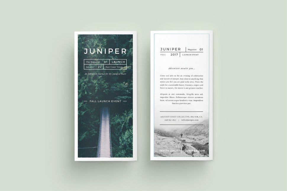
brochure design

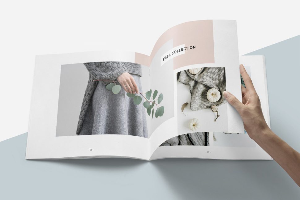
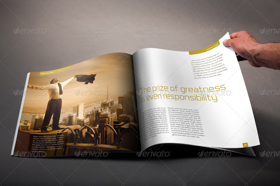
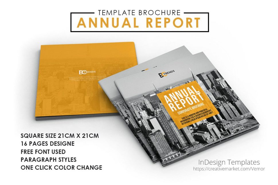
The feature of keeping information up-to-date over a longer period of time makes brochures an important and useful tool in marketing campaigns. There are plenty of websites that provide you with brochure templates. We’ll mention some in this blog post. But at times, you might feel like designing one from scratch. For this very reason, we provided you with some simple brochure design guidelines. 


We all know that brochures tell only one story at a time. This is the rule. In a brochure, you only focus on one thing, a single subject. Therefore, the information contained in a brochure is unitary, circumscribed to a particular theme. The design of the brochure, the presentation of the theme, the quality of the information, and the expectations of the target audience are directly responsible for the success or failure of a brochure-based advertising program. Once we understand the importance of a good brochure design, we can actually take the first steps into designing one.

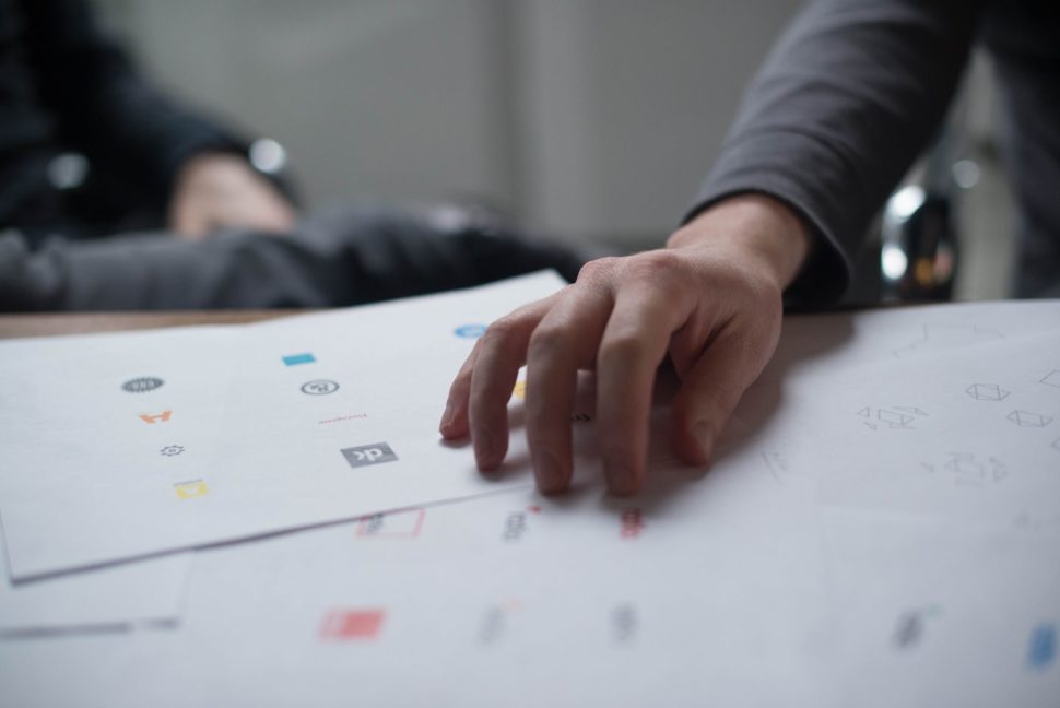
brochure design

Know your audience

Whether you design a brochure for yourself or for a client, you need to make sure that you know as much about your target audience as possible. Usually, this is the less visible or cared for aspect of a booklet: the audience to which it is addressed. An in-depth study of your audience increases the effectiveness of the message promoted through brochures. You need to take into account the age, the ethnicity, demographics, and the gender of your audience. Once you have figured all that out, you can effectively take the first steps into the physical design of the brochure.

Distribute the information correctly

Brochures limit us regarding the amount of content they can display. Advertising brochures should be based on a layout that draws the attention in a convenient way. You can do this by separating the text blocks through descriptive headlines. But in order to avoid any misunderstandings with your client, make sure you talk to him/her before you decided how much space is necessary for the content, and how much for the images. You don’t want whoever is reading the brochure to be overloaded with information in the first couple of sentences. Distribute all the information equally so the viewer stays interested.

brochure design

Make them attractive, use colors

An advertising brochure has to go beyond its black-and-white version, which is typical of textbooks, small-scale cards, etc.. A reaction is guaranteed on those reading the booklet if you use colors, chosen in such a way that they resonate with the theme. Use polychromy for a bigger psychological impact. Beyond the point, colors make anything look better. We are a designer, after all, so use your imagination. 

brochure design

Images speak louder than text

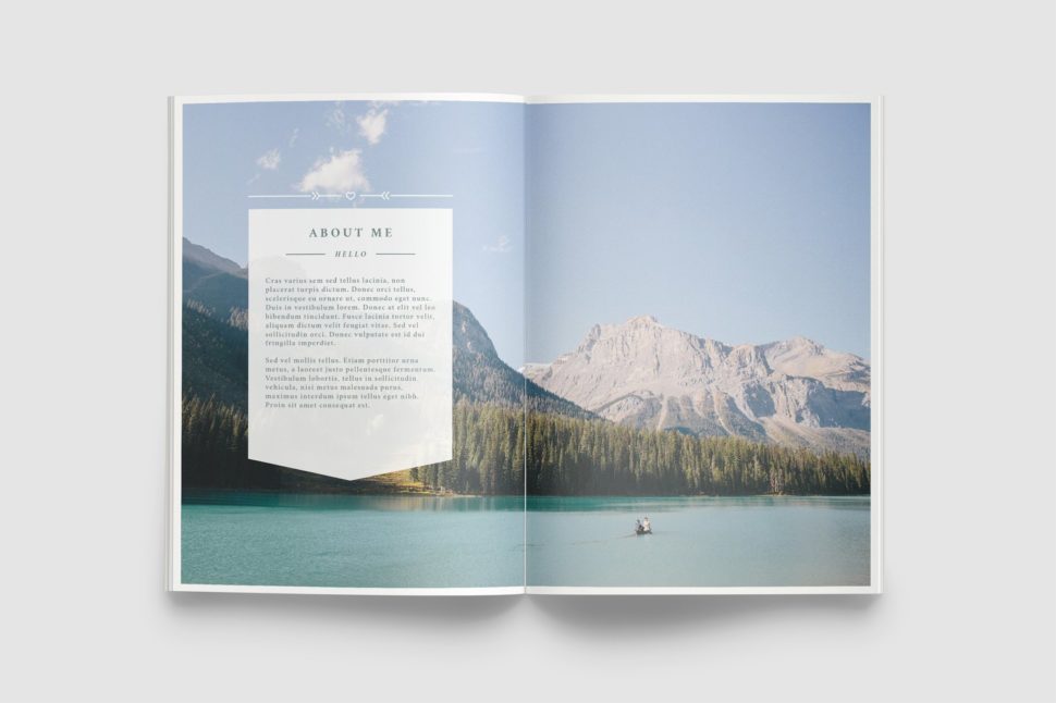
Images draw attention involuntarily and are infinitely easier than any text. The use of thematic and aesthetic images is necessary to capture the interest of the reader. Incorporate large images that fill the page tastefully in the brochure layout. Get your hands on any corporate brochure and you will see that the photos seem to go beyond the edges of the pages. Adding images gives more depth to the content on the page. It takes the reader beyond the letters laid out in front of them and gives them a different form of visual stimulation.

brochure design

Get your content right

The content, the information in the brochure must be legible, clear and grammatically correct. The easiest way of doing that is by keeping it simple. You don’t need heavy words, nor neverending sentences. Also, use only one font. Since you’re only using one font, try alternating the sizes according to the importance of the text. Give your viewers something new to read, without overcomplicating things.

Keep in mind that size matters

If you have a large budget, then go for a larger brochure size. Keep in mind, however, you want to keep things aesthetically pleasing, so don’t go too crazy with the size. A larger format allows a better use of the white space. Use white space with the intention of guiding the page from one block of information to another. White space balances the active areas in the brochure design with visual rest areas. The customer’s attention is a rare and valuable resource, so manage it with great design and a comfortable layout.

brochure design

Ease your work

As mentioned at the beginning, there are websites that provide designers with quick downloads for brochure templates. As genuine as a custom brochure can be, we also understand that time is a valuable resource. If you ever find yourself in a pinch and need a quick brochure template, here are a few places you can find them:

https://graphicriver.net/item/a5-brochure-creative/7960373

https://creativemarket.com/studiosumac/2819638-Magnolia-Lookbook-Template

https://creativemarket.com/Forty6and2/622623-WANDERERS-Photography-Brochure

https://graphicriver.net/item/brand-manual/14370396

https://graphicriver.net/item/a5-trend-brochure/310012


Conclusion

Whether you are a beginner designer or an experienced one, we hope that you found these tips helpful. Here is a short summary of them that you can print out and always take into account when designing a brochure:

  • learn who all you can about your audience;
  • let your pages breath, don’t overload them with content;
  • use colors;
  • add relevant images that speak the same message as your text;
  • make sure your text is correct in every aspect;
  • find the right size for your brochure;
  • ease your work by using already created brochure templates;
  • have fun!

If you liked our blog post, please share it with your friends so they can benefit from these amazing tips. We would also love to know what are your favorite techniques when creating a brochure. Share your tips with us in the comment section below.

Read More at This Is How You Design a Brochure in 2018


from Web Design Ledger https://webdesignledger.com/this-is-how-you-design-a-brochure-in-2018/

Tuesday, 30 October 2018

Top 12 YouTube Channels To Learn About WordPress

YouTube Logo

You can learn so much with online tutorials. The vast majority are totally free and they cover topics ranging from WordPress to backend coding and even custom webapp development. We’ve written about WP theming tutorials which are great for studying the WP ecosystem. But did you know there’s a whole bunch of channels all focused […]

The post Top 12 YouTube Channels To Learn About WordPress appeared first on Vandelay Design.


from Vandelay Design https://www.vandelaydesign.com/best-wp-youtube-channels/

Sunday, 28 October 2018

50+ Sets of Free Social Media Icons

50+ Sets of Free Social Media Icons

Designers love free icon sets. Having quality icons can help to make a site's design look complete, and can also help with the usability of the site. Social media icons are some of the most commonly used icons, especially in blog design.

Fortunately, there are a number of free sets of quality social media icons. In this post we'll feature over 50 social media icon sets from various designers. Click on the links to be led to the source where the icons can be downloaded. As always when you are dealing with freebies, check the terms and conditions to be sure that you're using them in a way that is allowed by the designer...

The post 50+ Sets of Free Social Media Icons appeared first on Vandelay Design.


from Vandelay Design https://www.vandelaydesign.com/free-social-media-icons/

Saturday, 27 October 2018

Tips to Choosing the Best Logo Font

logo font

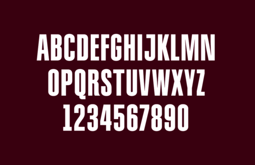
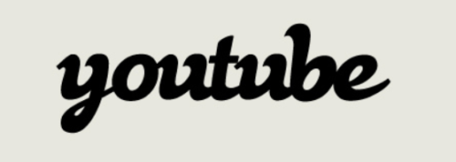
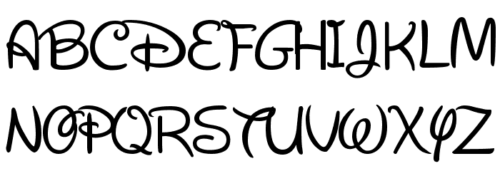
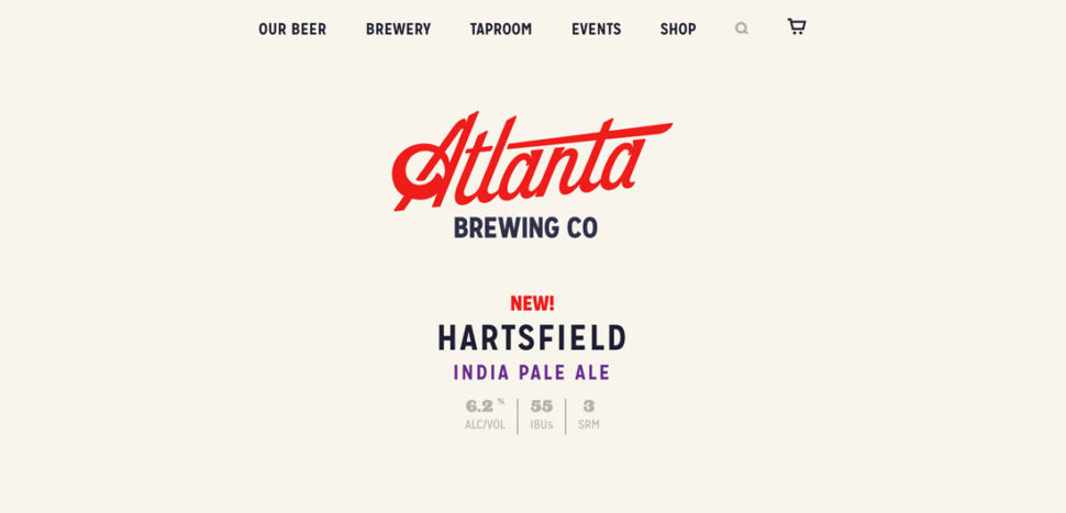
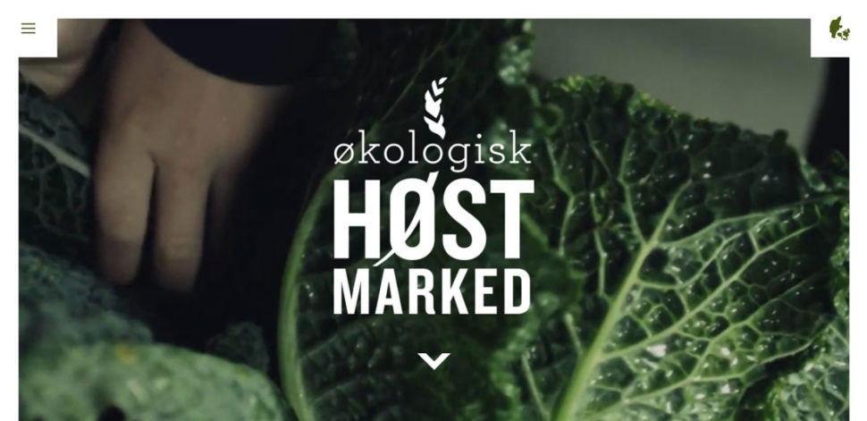
Choosing the best font for your logo is not a minor step in creating your brand’s identity. In fact, when your business receives some recognition, simply seeing the font you chose but in another context, will make people think of your brand instantly. That’s how valuable fonts are. When you choose the best logo font for your company, you have to put a lot of thought into it. It’s not a difficult process, but it’s certainly a crucial one. Today, we are here to give you some comprehensive tips and examples on how to choose the best logo font. 


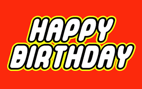
Let’s start with a little exercise of imagination. The images below depict some fonts of the most renowned brands out there. Your job is to try to guess to which brand does each font belong. Here we go:

logo font  logo font

logo fontlogo font logo font


In order of appearance: Coca-Cola, Lego, Hershey’s, Vimeo, and Disney. I’m sure you were all able to solve the mystery, as there is no mystery at all. The fonts have been chosen correctly, which ensured the companies with easy recognition. This is what you need for your business, as well. Let’s go over some tips that will stick to your clients’ minds and will make them come for more.

1. Find a font that best describes your brand’s personality

The playful Disney font would look rather silly if Mercedes-Benz decided to use it for their logo, but it fits Disney’s personality so well! And that’s all due to the font’s swirls and swashes. Before you go into the particularities of a font, start first by choosing one of these general categories:

  • Serif: for a classy and traditional look
  • Sans serif: for a modern, and simple touch
  • Script: for a feminine and elaborate look
  • Novelty: for a funky and unique look

logo font

2. Never go for trendy fonts

When you choose a font, it’s like choosing a coat for your brand that needs to stay on forever. And as we all know, fashion always changes. What might look cool and trendy today, will look outdated tomorrow, or the day after tomorrow. We know, trendy is very tempting, but as we mentioned earlier, when you pick your coat you need to put a lot of thought into it. We would suggest that you go for an older font that features some of the particularities of the trendy font you like.

logo font

3. Look into a custom design

If you feel like any of the already existing fonts don’t describe your brand, custom designing it might be the solution. Not only can you have the perfect font for your brand, but you won’t have to worry about sharing the same typeface with any other brands. There are ups and, unfortunately, downs to this option. On one hand, you can get creative and design the font of your dreams, on the other hand, it can be more expensive than picking a font that has already been created. But if you have the financial resources to go for a custom design, this will probably be your best option, if not, go with plan B.

logo font

4. Plan B

We get it, commissioning a custom typeface may not be in your budget, especially if you’re just starting out. If that’s the case, then you should put all your effort into finding a new font that is still unique. Websites such as Creative Market and MyFonts are great outlets for shopping for fonts. Taking this route has its advantages, though. When you purchase a font from websites like the ones mentioned, the original creator will typically allow you to add a few custom touches. It’s nothing major, but it could be a tweak like bolder letters or maybe an additional character or two.

logo font

5. Keep your brand’s growth in mind

One of the biggest mistakes you can make when choosing your logo font is limiting yourself. What do I mean by that? Change is inevitable, especially if you are a growing business. Your logo should be unique, but flexible. You never know when color schemes need to be changed, or even the brand itself. You should look for a font that looks good in multiple colors and different sizes.

logo font

6. Keep it simple and personal

As important as it is to have a unique look, you also do not want to go over the top with it. What you want instead is to make it easy to read and understand. If your audience cannot easily identify your name, then they can’t establish an emotional connection. Some of the mistakes people do are: choosing a messy handwriting typeface, a super elaborate cursive, tight lettering, harsh and thick strokes, and the worst, mixed lettering (using random typefaces). The key to an amazing logo font is to make it look effortless.

logo font

7. Don’t overuse your logo font

Have you heard a song over and over again, even unwillingly, until you got sick of it? In the same way, you can overuse the typeface of your logo. You want the experience people get when they view your logo to be unique to the logo. Make sure you choose a different font for headlines and body texts in order to keep the importance of your logo fresh. You need your logo to stand out, so don’t blend it in with other parts of your branding.

logo font

Conclusion

Keep your logo font simple. Make it personal. Take time to find the perfect logo font, don’t make an impulse decision. Here’s an extra tip: whatever you do, be the best at it. Quality always surpasses quantity.

Read More at Tips to Choosing the Best Logo Font


from Web Design Ledger https://webdesignledger.com/tips-choosing-best-logo-font/

Thursday, 25 October 2018

Draw with CSS: Using CSS To Draw Elements

With clever use of CSS properties, it is in fact possible to draw very complex shapes. All the shapes below were drawn with CSS alone. It might be that CSS isn’t the best way to render shapes in the browser window, but it’s very fast and included for “free” on all modern browsers. Learn how to draw with CSS below.

Draw with CSS: Border-Radius

Setting the border-radius of an object can round off the corners. When used with more dramatic values, it can draw circular and elliptical shapes.

Circle

If we want to start a simple circle, we could use something like the following:

draw with CSS circle shape

#circle {
  background: lightskyblue;
  width: 100px;
  height: 100px;
  border-radius: 100%
}

Ellipse/Oval

We can use the same properties to draw a simple ellipse.

draw with CSS ellipse shape

#ellipse {
  background: lightskyblue;
  width: 150px;
  height: 100px;
  border-radius: 100%
}

Because the height and width of the object are different, the circle is slightly cockeyed. This produces an ellipse, which is really nothing more than a drunk circle, if you think about it.

Cylinder

Using this principle, we can fake a cylinder too:

draw with CSS cylinder shape

#cylinder {
  background: lightskyblue;
  width: 150px;
  height: 100px;
  border-radius: 100% / 30%;
}
#cylinder:after {
  content:"";
  position: absolute;
  background: grey;
  border: 0 solid transparent;
  border-radius: 100%;
  z-index: 500;
  width: 150px;
  height: 40px;
  top:  6px;
}

And if we add in another pseudo-element, we can give our cylinder a little shine:

draw with CSS shiny cylinder shape

#cylinder:after {
  content:"";
  width: 150px;
  height: 100px;
  border: 0 solid transparent;
  background-image: linear-gradient(to right, rgba(255,255,255,0) 0%, rgba(255,255,255,0.36) 50%, rgba(255,255,255,0) 100%);
  position: absolute;
  top: 10px;
  left: 20px;
  z-index: 400;
}

Visit the Codepen with this shape.

The linear gradient sits on top of the blue but below the grey. It’s also barely opaque, so it only creates a minor effect. This creates the illusion of depth, making our two-dimensional cylinder appear slightly more three-dimensional.

Uneven Border Radius and Slash Notation

This cylinder in both its forms relies on an important property: uneven border-radius and slash notation. If we set two values with a slash, like 100% / 50%, those values individually sets the horizontal border radius separately from the vertical border radius, and in that order. This creates unequal or uneven border curves. You can learn more about uneven border-radius syntax from MDN.

Here’s an example:

body {
  font: 24px Helvetica, sans-serif;
  color: #fcfcfc;
  text-shadow: 1px 1px 0px #000;
}
.shape {
  height: 200px;
  width: 200px;
  background: lightskyblue;
  border: 10px solid green;
  margin: 10px;
  display: block;
  float: left;
}
#even {
  border-radius: 10%;
}
#uneven {
  border-radius: 10% / 20%;
}
#more-uneven {
  border-top-left-radius: 60px 100%; /* no slash on individual radius properties, mix-and-match with pixel and percent measures */
  border-top-right-radius: 10% 40%; /* border will sometimes reflow to fit curve*/
  border-bottom-left-radius: 300px 100px; /* radius measurements larger than the shape itself can be declared */
  border-bottom-right-radius: 10%; /* you can mix and match with regular radius statements */
}
#center {
  width: 80px;
  margin-left: auto;
  margin-right: auto;
  position: relative;
  top: 50%;
  transform: translateY(-50%);
}

View the Codepen for these shapes here.

For a deep explanation of how border-radius works in a variety of cases, check out Lea Verou’s incredibly deep talk, “The Humble Border-Radius.”

Drawing With Border Widths

Non-curved shapes can be created with careful manipulation of borders. Most of these examples with use an object with 0 height and 0 width, so we’re really drawing with just the borders here.

#shape {
  width: 0; 
  height: 0; 
  border-left: 50px solid transparent;
  border-right: 50px solid transparent; 
  border-bottom: 100px solid lightskyblue;
}

The CSS above will draw and equilateral triangle in light sky blue, my personal favorite of the named CSS colors. It works because of the way borders are divided.

If we were instead to draw a shape like the following, we’d see a more intelligible shape:

#triangle {
  background: black;
  width: 40px; 
  height: 40px; 
  border-top: 50px solid green;
  border-left: 50px solid red;
  border-right: 50px solid yellow; 
  border-bottom: 50px solid lightskyblue;
}

See how the differently colored borders are separated from one another at 45-degree angles? That’s what allows us to create a triangle. We are taking advantage of the spec to draw.

By manipulating which borders are which, we can change the direction of the triangle.

#right-triangle {
  width:0;
  height:0;
  border-left:100px solid transparent;
  border-bottom: 100px solid lightskyblue;
}

We can draw a massive variety of shapes using this trick, including some really complex ones. Take this five-pointed star by Kit MacAllister and found on CSS Tricks.

#star-five {
     margin: 50px 0;
     position: relative;
     display: block;
     color: red;
     width: 0px;
     height: 0px;
     border-right: 100px solid transparent;
     border-bottom: 70px solid lightskyblue;
     border-left: 100px solid transparent;
     transform: rotate(35deg);
 }
 
 #star-five:before {
     border-bottom: 80px solid lightskyblue;
     border-left: 30px solid transparent;
     border-right: 30px solid transparent;
     position: absolute;
     height: 0;
     width: 0;
     top: -45px;
     left: -65px;
     display: block;
     content: '';
     transform: rotate(-35deg);
 }
 
 #star-five:after {
     position: absolute;
     display: block;
     color: red;
     top: 3px;
     left: -105px;
     width: 0px;
     height: 0px;
     border-right: 100px solid transparent;
     border-bottom: 70px solid lightskyblue;
     border-left: 100px solid transparent;
     transform: rotate(-70deg);
     content: '';
 }

Visit the Codepen with this shape.

The big trick with this shape (or combination of shapes) is the use of the transform: rotate property. This works like it sounds, and spins the element around its central point. Positive degree values rotate the shape clockwise. Negative degree values rotate the shape counter-clockwise.

In shapes with zero height and width, the object is rotated about the point that would be the center of the shape if it had dimensions. This means that, with uneven border values, rotations may appear to happen about a position slightly outside the element, which is normal but confusing until you see it.

Conclusion:

Drawing with CSS is an under-utilized use of style sheets. Developers tend to reach immediately for images, SVGs, or even JavaScript. But there’s no reason to bring more than is necessary into your code. Sure, drawing a five-pointed star with CSS isn’t exactly easy or maybe even sensible. But for basic buttons, you can style shapes far more dramatically than you might realize. Try it out on your next project and see what you think.

You might also like the following posts:

Adding Vectors and SVG Images into Website Layouts

What is Z-Index and How Does It Work?

Using CSS Pseudo-elements and Pseudo-classes like ::before and ::after

The post Draw with CSS: Using CSS To Draw Elements appeared first on SpyreStudios.


from SpyreStudios https://spyrestudios.com/draw-with-css-using-css-to-draw-elements/