Monday, 4 September 2017

25 Animated Logos For Your Inspiration

As I wrote in 9 Logo Design Trends To Keep An Eye On In 2017, the animated logos are one of the hottest trends this year. I promised then to come back with more details related to this, and now it’s the time. Not just because they’re cool, but also because I consider the animated logos are one of the marketing and design trends that you should actually consider.

Animated logos are no longer reserved just for the end frames of videos, presentations, banner ads, and archaic flash animations. In fact, even if they have been around for 25 years, the tendency of using them has become stronger since 2015 and in 2017 it’s one of the most popular trends in graphic design.

Why? There could be many reasons, but the most important are:

  • an animated logo is a tremendous visual focal point for any website that will elevate your brand – check the Fubiz website, for example

  • it crafts a focused brand story
  • it’s extremely memorable.

So, why are they such a big deal now? Well…. As SVG and CSS have reached their maturity lately in terms of animation, more and more developers and designers tend to replace the static logos with the animated ones.

There are many reasons for which you could consider moving your company’s brand from static to animated, but the simplest and the most effective are:

  • Animated logos retain viewer’s attention

As people are consuming more and more online content, their tendency for going forward to instant gratification is becoming a habit. Therefore, getting and holding the attention of the target audience seems to be a real struggle for companies and other different organizations. Using an animated logo helps you to enhance your brand presentation and grab the user attention from the first moment.

  • Animated logos increase brand awareness

Regardless of your company’s products or services, or the size of your business, increasing the brand awareness should be an important part of your marketing and communication strategy. Investing in an animated logo will help you accomplish this goal. It is much more memorable and recognizable to customers and prospects than a static one and can often stick in their mind if not immediately, then very quickly.

  • Animated logos make a better storytelling

Business storytelling is not about producing an animated fiction movie about your products, services or company. The main idea is to connect with your target audience by telling your brand’s story. An animated logo will always contribute to your brand’s overall narrative, becoming at the same time a fluid part of the storytelling process. So, get on board, develop your brand and create a real emotional connection with your customers and prospects.

  • Animated logos help to improve your website SEO

As web pages featuring videos (or any kind of motion graphic) are more likely to attract viewers’ attention like the static ones, animated logos also help to improve your site’s SEO via shares, backlinking or image tagging. Google loves dynamic content living on websites, so you should consider different ways to create and publish animated content that connects to your consumers.

  • Mobile use

Lately, mobile has surpassed the desktop in terms of the primary way to access the internet. However, due to the so much smaller display sizes of the mobile devices, it’s much more efficient to implement catchy animation rather than use just plain text or images to get your audience’s attention.

That said, let’s see how animated logos are used in the real world. In this article, I featured 25 examples of animated logos that I hope to inspire you to take the next step and improve your brand awareness:

Terri Timely

On the other hand, Terri Timely uses animated rotation to add character and personality to its logo design. All the clock elements spin in a silly and rapid manner, turning a quite modest logo into something fun and playful.

Concreate Studio

Concreate Studio approaches the situation in a different and more creative way, employing the animated logo as an internal document for showing their clients why they choose that design. Seeing how the elements of the design fit together, the client can build his brand around the logo.

500px

Designed by William Kesling, this clean, simple and articulate logotype clearly communicates the 500px name. The mark is bold, demonstrative and playful, with a pattern that evokes a fingerprint and an animation that echoes the turn of a camera lens.

OpenView

In their logo for OpenView, Pentagram did a great job by using a revealing technique to show the concept of “opening”. The logo begins with the “O” and “V” characters, then spread them apart, unveiling the full logo name. By using this technique, the logo runs smoothly between its full form and its shorthand version.

David Rowland

The concept behind this logo speaks about photography and about the ability to manipulate subjects with light. The logo begins with “D” character from the beginning and the end of the design, portraying the short version of the logo in negative space. They spread them apart revealing the full brand name, while the logo animates bringing even further attention to the negative space used here.


Delfina Foundation

The non-profit artists’ residence Delfina Foundation tells its story using a modern and bold monogram. The logo reduces to an underline, then to nothing, and finally completes its cycle by revealing the “D” and “F” again. This straight-forward functionality conveys the idea that Delfina Foundation brings functionality to artists.


Tangles

Hand-drawn logos have been around forever. But using animation, Henrique Barone brings Tangles logo to another level.  The animation used to visually articulate the process of “drawing” the logo is on the same line with the overall design of their website, helping the brand storytelling.


Feral Sphere

By approaching the animation as a method for iteration, Mind Design brings the Feral Sphere logo to a different level. Each frame of the animation portrays a new version of an organic, living logo, helping the company to convey the message of sustainable commitment to the audience.


Ideo Architekci

The idea behind Ideo Architekci’s logo is “maximum of flexibility”. It becomes a living form and fills out the space adjusting its size both vertically and horizontally. It’s a great solution, especially given that architecture often works with similar grid systems and floor plans.


Eat

By using expansion for Eat logo, Fable shows how it can fit any size. As the typographic characters literally eat, it is getting bigger and bigger with every “bite”. The transition from Light to Regular, to Semibold, to Bold, and finally to Black font encapsulates the process of gaining weight.


Simon Pengelly

The logo for furniture designer Simon Pengelly expands by adding lines of different sizes to represent the layering of plywood. Not only this does speak to the material in his products, but it also helps the logo fit into different spaces for the company’s branding.


Modhouse

Modhouse, a sustainable modular home company, represents their product with simplicity and clarity. Each design component is elemental in the construction of their brand identity.  Using a playful Tetris like sensibility, their animated logo offers a creative system, open to various iterations and dynamism.


Brikk

The designer Gun Karlsson uses animation to change the word “Brikk” into a neon glowing brick. The combination of those elements that represent the same business adds a visual impact to the brand.


Bang
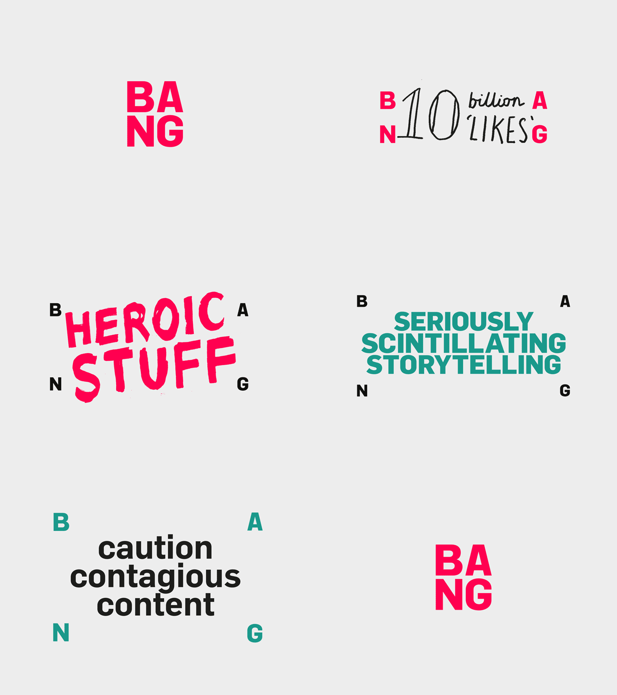
The Bang’s identity conveys energy and vitality. It is flexible, bold and optimistic and the animated logo is the visual demonstration of the explosive potential and the impact they have on their clients’ businesses.


Sello

By using interchanging animation, Sello replaces the letter “o” from their name with a set of circular objects that people sell on the platform. It’s another way of conveying the brand identity to the audience.


Historiska

By using animation, the serif font form Historika’s logo can be replaced with historical artifacts, offering the museum the opportunity to be playful in its visual expressions and displays the museum’s breadth of exhibitions.


Creagent

Creagent is a small Nordic design broker that connects business needs and design talent. Bond designed Creagent’s identity around a set of pictographs and slogans that communicate the value of design while the animated logo conveys their message.


Riksteatret

The logo for Rikstreatret, a touring theater company, features a black border or “stage” that stretches and warps. In this way, they express the idea of performing in many different spaces of different shapes and proportions.


Lighthouse no.6

The designer Brien Hopkins gives the shining beam of a lighthouse by allowing it to flash across the logo from left to right and to complete the number “6” with its creation of negative space.


Kevin Yang

Animating his own mark, Kevin Yang brings a narrative storytelling to his brand. The fingerprint adds the design a real personal touch.


Talawa

Talawa is an all black theater company that looked to address the lack of opportunities for minorities. Their animated logo captures the energy and rhythm of performance and also emphasizes the phonetics of the Patois name.


Squarespace 6

Created by Andrew Willis, this animated logo is simple and clean, in keeping with the Squarespace look and feel.


The University of the Arts Helsinki

The University of the Arts Helsinki animated logo looks like a bouncing building full of creative artists who are about to bust the walls down. Designed by Bond, the visual identity is centered around the simple and bold anchor symbol “X” that has plenty of meanings, just like art does.


Common Lot
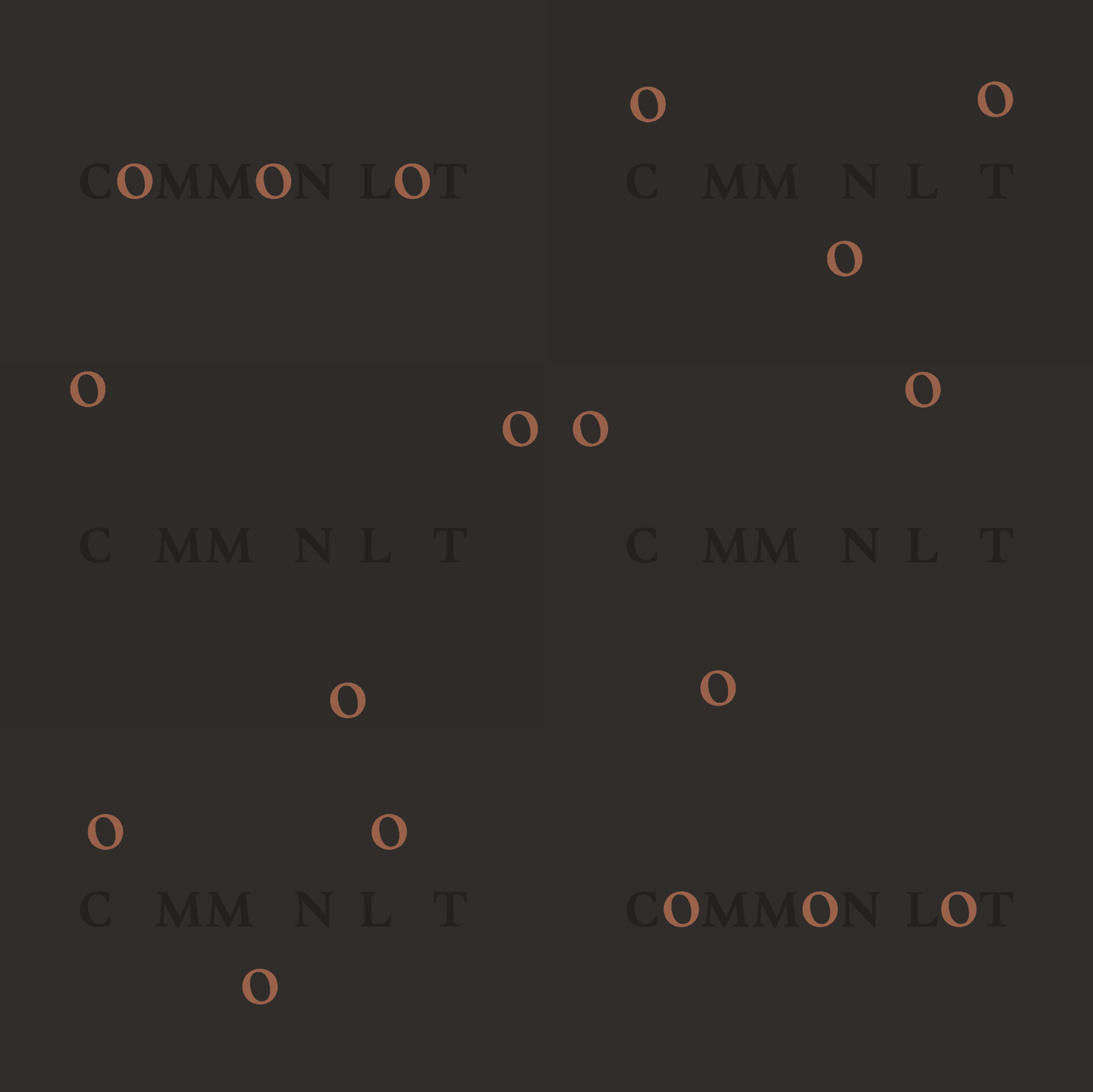
The restaurant Common Lot uses movement to give each “O” a life of its own. The restaurant’s identity is inspired by common wayward, grazing sheep and shared plates, while the moving “O”’s can be perceived as grazing animals or traveling people coming together at a dining table.


Lux Capital

For the investment company, Lux Capital one thing is clear: make money. The concept of the logo plays with the idea of addition, multiplication, and profit by rotating the letter “X”. Additionally, after the “X” rotates, the name Lux rises upwards and to the right, another nod to the idea of profit.

Read More at 25 Animated Logos For Your Inspiration


from Web Design Ledger https://webdesignledger.com/25-animated-logos-for-your-inspiration/

Friday, 1 September 2017

New Update! Responsive Slideshows, Compositions, and Forms – Adobe Muse CC

Muse For You - New Update - Responsive Compositions - Adobe Muse CC

Creating Responsive Compositions in Adobe Muse. No Coding Skills Required.

 Muse For You - Adobe Muse CC Adobe Muse CC Logo

Responsive slideshows, compositions, and forms are finally here! Adobe Muse 2017.1 was released on August 22, 2017 with more responsive widgets, stability and performance improvements, and productivity improvements. The release notes can be found here:

https://helpx.adobe.com/muse/release-note/adobe-muse-release-notes.html

If you are an avid Adobe Muse user you will know that these updates have been anticipated for quite some time. Since the release of breakpoints and fluid-width design we’ve all been waiting for these widgets to catch up with the new way of designing in Adobe Muse. Prior to this release slideshows, compositions, and forms were not able to respond to the browser width.

I created the video tutorial above to showcase the new updates and to show the power of responsive compositions within Adobe Muse.

Here is a preview of the website: http://bit.ly/2w5Ihgj

The assets to re-build this website can be found at the following link: http://bit.ly/2xumluL

Muse For You - New Update - Responsive Compositions - Adobe Muse CC

To create a responsive composition in Adobe Muse:

  1. Go to Object > Insert Widget > Composition > Blank
  2. Add triggers and targets by click on the ‘+’ symbol around the triggers. To have all the triggers and targets have the same styling initially, delete all triggers besides one, then style the first trigger and target. Now when you add a new trigger and target they will have the same styling as the first.
  3. Style and add content to the triggers of the composition.
  4. Style and add content to the targets of the composition.
  5. To have the composition be responsive set the composition to ‘Responsive Width’ by going to the ‘Resize’ option in the upper toolbar and selecting ‘Responsive Width.’
  6. Done!

Muse For You - New Update - Responsive Compositions - Adobe Muse CC

Muse For You - New Update - Responsive Compositions - Adobe Muse CC

Muse For You - New Update - Responsive Compositions - Adobe Muse CC


For more video tutorials and widgets for Adobe Muse visit http://museforyoushop.com.

Happy Musing!

Read More at New Update! Responsive Slideshows, Compositions, and Forms – Adobe Muse CC


from Web Design Ledger https://webdesignledger.com/new-update-responsive-slideshows-compositions-and-forms-adobe-muse-cc/

My Journey Of Learning Programming Through Flatiron School #38

flatiron school

My name is Mason Ellwood, and I’m currently working on Flatiron School’s Online Full Stack Web Development Program. Each week, I’ll be writing about my experience, what I’m learning, and tips on learning to code.

This section that I am currently working through is all about how the internet works. The internet is kinda weird. Or at least is in my opinion. It is this vast multi tool that we use every day and most of the time and most of us, at least at a rudimentary level very vaguely know how it works. Throughout these past post we I have been working through ruby and how to built usable tools with it to accomplish a task, but up until this point all locally. But how does all that work in unison with the “internet”?

This is where servers and databases come in. In basic terms, a database is where all your data is stored and a server is used as a method to serve that data in a displayable form.

“In a technical sense, a server is an instance of a computer program that accepts and responds to requests made by another program, known as a client. Less formally, any device that runs server software could be considered a server as well. Servers are used to manage network resources.”

https://www.computerhope.com/jargon/s/server.htm

A database is a collection of information that is organized so that it can be easily accessed, managed and updated.

http://searchsqlserver.techtarget.com/definition/database


Linking these two powerful tools together, you then are one step closer to completing projects at an industry standard level.

Before diving deeper into this and how that is set up, what the heck is the internet. The internet is basically a conversation between two different things a client which is widely known as a browser and a server or the code running the web site you are trying to load. By typing a URL into a browser you as the client are asking the browser to give you something, a web page. The server then accepts the request as a URL and sends a response or the relevant content that you are looking for. In this leading lessons we will be working with Ruby, and primarily Rack to build out this server. This is the fundamentals of how the web works.

The server and the client are able to speak together with a tool that has been widely adopted using HTTP or Hypertext Transfer Protocol. Your server will be the recipient of the request trailing your HTTP. Think about the request in the diagram below.

The HTTP request is sent to the server, and in return, an HTTP Response is sent back with your relevant content.

When you make requests using the HTTP call the trailing information is known as a URI or Uniform Resource Identifiers or URIs, this is basically the same thing as a URL which you have probably heard of before. These links are broken down into a few parts.

  • Http – the protocol
  • Youtube.com – the domain
  • /adelevevo – the resource

The protocol which is the way of sending your request. The domain name is a string of characters of the part we want to load. Appended with the specific recourse /adelevevo. Thinking about it in these terms simplifies how the internet makes those requests and retrieves specific data.

When building out your server you have to specify what you want the HTTP request to do. We do this with HTTP verbs, you will mainly use GET but there are many others to consider.

  • HEAD – Asks for a response like a GET but without the body
  • GET – Retrieves a representation of a resource
  • POST – Submits data to be processed in the body of the request
  • PUT – Uploads a representation of a resource in the body of the request
  • DELETE – Deletes a specific resource
  • TRACE – Echoes back the received request
  • OPTIONS – Returns the HTTP methods the server supports
  • CONNECT – Converts the request to a TCP/IP tunnel (generally for SSL)
  • PATCH – Apply a partial modification of a resource

In the next lesson, we will get into how to use these verbs and how RACK is used. But before I sign off, there are two different web apps we would like to consider; static and dynamic. A static web app is something that does now change. While a dynamic webapp is something that changes based on user input. But don’t worry too much about that right now. Through The Flatiron School, I will walk you through step by step on how to setup RUBY with RACK and to push you in the right direction to building out your own server.

Read More at My Journey Of Learning Programming Through Flatiron School #38


from Web Design Ledger https://webdesignledger.com/my-journey-of-learning-programming-through-flatiron-school-38/

A Little Help – Developing A Tutorial-Driven Website

It’s harder and harder to carve out a profitable niche among the millions of sites populating the web today, but one option that has stood the test of time is the tutorial website. Based on a constantly evolving knowledge base, innovative presentation styles, and overall profitability, tutorial websites may be the one website in which supply can’t keep up with demand, even as they continue to proliferate.

Of course, like any other profitable website, you need to find ways to help yours stand out from the pack in terms of visual appeal, content quality, and innovation. Whether you’re just starting up or you’re redesigning a tutorial website, these 3 strategies may help your site outperform the competition.

Choose A Niche – Or Don’t

One of the great things about developing a tutorial-driven website is that you have the option of focusing on a narrow range of topics or keeping things broad – and each approach has advantages and disadvantages.

Narrower topic choices are perfect for those who offer tutoring online. A popular work from home option, tutoring websites only need to feature information on the academic topics in question. That might include math, foreign languages, or the sciences. You might also remain within the world of academic tutoring by outsourcing course material production for topics beyond of your own area of expertise. Even within a fairly narrow niche, your options are extensive.

Websites that eschew the traditional notion of “niche” can develop tutorial content for any topic, ranging from software tips to home improvement. If you can provide the necessary insights in a digital format, then you can offer a tutorial.

Transform The Format

Niche may determine the breadth of your audience, but the format of your tutorials is the factor that really keeps people engaged. If you pick an approach to presentation that stands out from the bulk of tutorial videos online, you’ll have your market made.

One underutilized option for tutorial websites is remote control software. Remote control software could work for websites that offer one-on-one tutorial sessions, as it allows the person receiving the tutorial to learn a digital process or how to fix a variety of computer problems as though they were manipulating the screen themselves. The only difference is that the provider is running the show, explaining the procedure. A remote support software can even enable the tutor to download and export files onto the other system, if needed. Pair this with a screen recorder program and the user can watch their tutorial session over and over again until they master the task.

Screen recorder software is also ideal for mass produced tutorials, allowing site designers to record a process and post it as a tutorial video on the page. The recorder, lets you go in-depth, no matter what you’re demonstrating.

Stay Current

No matter what topics your tutorial site covers, the most important thing you can do if you want to build a popular, profitable page is to stay up-to-date, especially when it comes to digital trends. The best teachers know how to take screenshots on an Apple Watch and can tell you about the best web animation tools available online. They’re the designers who have access to new software on or before the launch date and are ready to show you how to use it. Timeliness is key.

Tutorial websites need to have a constant flow of new, innovative content, whether you’re producing it all yourself, outsourcing production, or offering one-on-one tutorials with content built for the session. Luckily, there’s always something new to learn – for you and for your audience.

The post A Little Help – Developing A Tutorial-Driven Website appeared first on SpyreStudios.


from SpyreStudios http://spyrestudios.com/little-help-developing-tutorial-driven-website/