Can you hear that? That’s the sweet sound of jingle bells followed by the explosion of fireworks. The combination of these two sounds can only mean one thing: 2019 is right around the corner. That might sound a little scary, but I can assure you that this article contains nothing but good vibes and happy thoughts.
As a designer, you’re probably pretty aware that you should be keeping up with trends, right? I certainly hope so. But, that doesn’t mean that you can’t put a little personal flare on those trends. For the purpose of this article, and because the title already says typography trends for 2019, we’re going to discuss… you guessed it: typography trends for 2019. This list is in no particular order. It will contain new trends and a few classics that you totally need to stick with. Fasten your seatbelts, explorers, we’re diving straight in.
Handwritten fonts
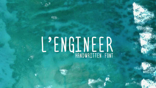
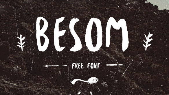
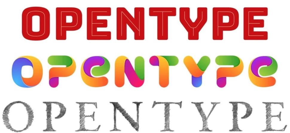
We’re going to start this list off with a style of font that will most likely be a trend for many years to come. Handwritten fonts are great because they allow you to put your own touch on your brand, and they bring with them a sense of detail that other fonts can’t. Granted, a handwritten font may not look so great on the side of a corporate office building, but they certainly are a great way to reach out to your audience on a more personal level.
Vintage fonts
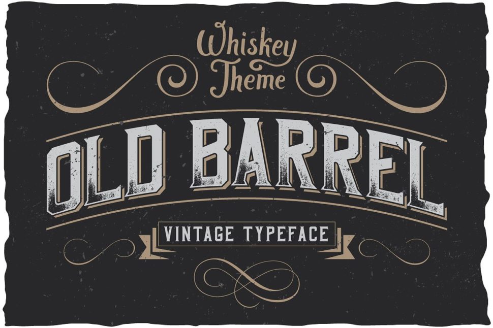
Vintage fonts are also a timeless classic that deserves a spot of any typography trends lists ever. The reason people are so drawn to vintage fonts is very similar to the reason they’re so drawn to handwritten fonts. The difference here is that the audience is most likely already familiar with the font, as it is vintage. Instead of making new connections using a handwritten touch, you renew old connections by going vintage.

Watercolor fonts
Watercolor fonts have risen in popularity almost side-by-side with handwritten fonts because they go so well together. Watercolors have recently existed mainly in the background of a few web pages. But now, people are starting to use them in the spotlight. Watercolor fonts are a great way to portray calm, cool, and collected vibes. They take away from the seriousness of business and add to the homely feel.
Serif fonts
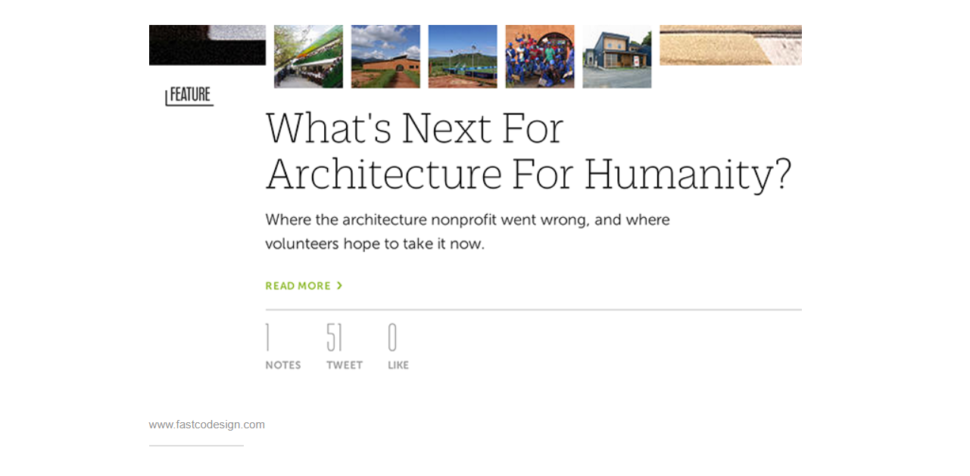
Serifs again are nothing new. In fact, they’re probably one of the oldest typography trends we can dig up. They are, however, a trend that’s making a comeback. Serifs can vary depending on how extra you want to be, but they’re another great way to put a little more flare on your work.
Big and small font types… together?
Yes, it’s true. A lot of people are instantly attracted to things that match or at least are the same size. The idea behind using both big and small fonts together isn’t exactly a new thing, but it has made great headway over the years. Because the letters in the font don’t match up, it can grab someone’s attention quicker than a buy-one-get-one sale at Old Navy. plus, it’s a creative way to put emphasis on a particular part of your brand or logo.
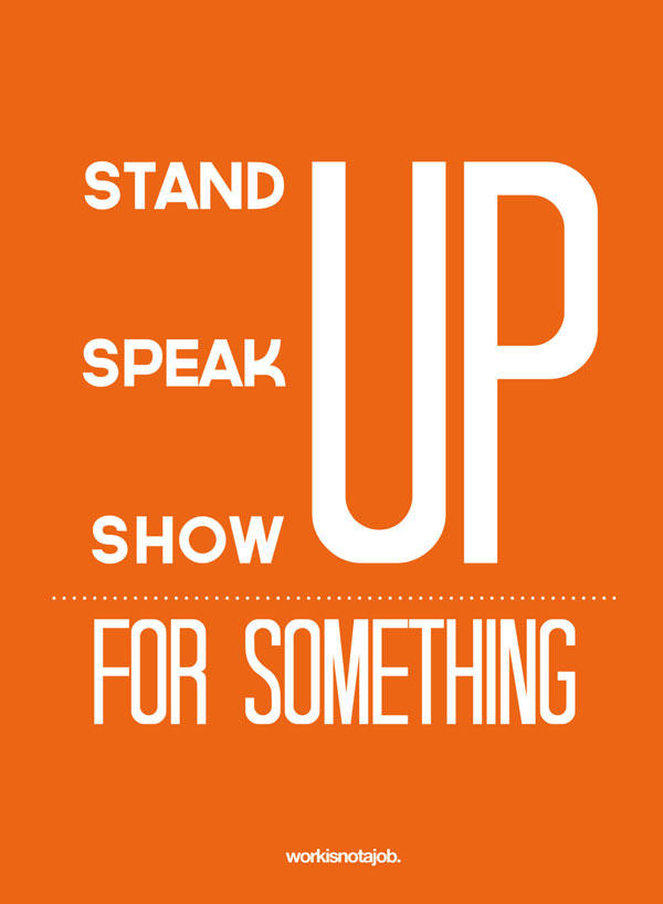
Variable fonts
In addition to the variation in size, the mix-match of different font types has become a design phenomenon. I mean, why stick to just one font if you’ve found a few that you like? If done correctly, you’ll be able to mix a number of different fonts together and create your own personal masterpiece. Just try not to be too overwhelming.
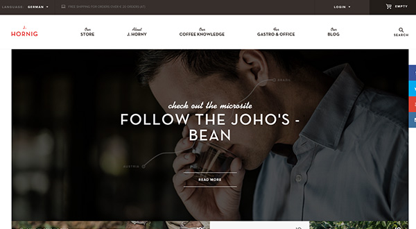
Color fonts
For too long black and white fonts have haunted our screens! Okay, maybe that’s a little dramatic, but sometimes we just need a little color. Color fonts have been popular on and off for forever, and they’re starting to make a massive comeback. Color fonts allow us to be that much more creative with our projects. They can say as little or as much as you want them to about the letters that they’re highlighting. They’re the perfect way to snag someone’s attention in a crowd full of black and white.
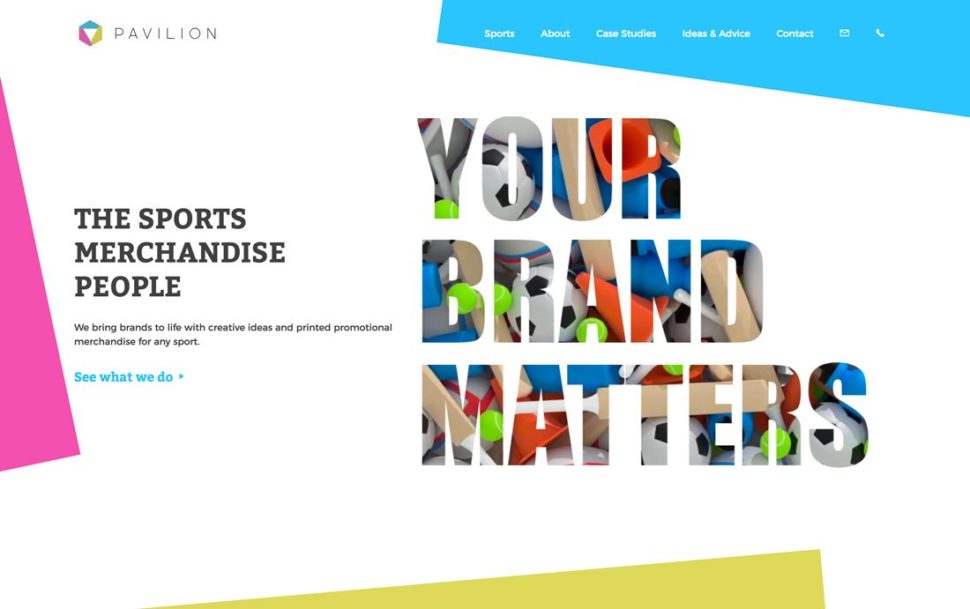
Cutouts and overlays
Everyone wants to add layers to their designs, and it’s for good reason. People don’t want to sit and stare at a flat-looking, boring, underwhelming webpage. They want to be wowed and wanting more. Cutouts and overlays are a great way to give that 3-dimensional effect without having to wear the glasses that hurt your eyes after 30 minutes. They give you yet another layer to be creative with, and thus attracting more attention.
Geometric fonts
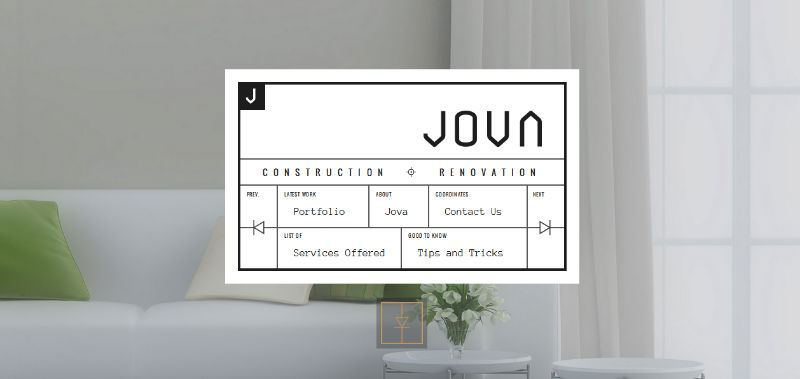
While handwritten fonts and different sized lettering are cool, perfectly straight lines and rounded corners will always be one of the typography trends, too. Don’t get me wrong, though, geometric fonts leave plenty of room to be creative. Geometric fonts have grown exponentially over the past year or two, and I don’t see them slowing down anytime soon.
Customize everything
If you have the extra cash to shell out, customizing your brand is a great way to set your own trends. I’m not talking about just logotypes here, I literally mean customize everything. What better way to give people a new experience than to create one custom for your brand? You’re a designer, challenge yourself!
Bring in the New Year right
Again, these typography trends aren’t in any particular order, but they are all super duper sweet. Trends are made every day. While some of us choose to follow those trends, others create their own path for us to follow in the future. The #1 rule of design is to be yourself and create your best work. Design something that you’re proud of, and show it off to the word.
Read More at 10 Typography Trends for 2019
from Web Design Ledger https://webdesignledger.com/10-typography-trends-2019/
No comments:
Post a Comment