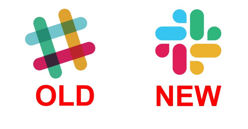
Is it just me or are there other people who taught for a second that they accidentally downloaded a new game on their phones? Slack decided to evolve, but is it really an evolution? Let’s find out.
Over the past few years, Slack has gone through a few, very minor logo changes. All of them, however, had their iconic hashtag icon as its centerpiece. As of January 16, 2019, slack has announced another logo change, but this one is a little more drastic.

Why did it change?
As I said earlier, the Slack logo was well known among the digital community. It was easily recognizable. Slack starts their announcement by stating that they loved the old logo, but explained that they’ve, “Decided to evolve.”
The reason behind the change seems quite sincere. In the announcement, they explained that the logo was just hard to get right. With the large variety of colors, the logo had to be placed carefully, as any color background except white would absorb some of the colors in the logo.
They went on to explain that they tried to develop many different varieties of their famous logo, but that meant that they had many different app logos, and that simply didn’t sit well. Each logo looked great by itself, but when compared to each other, they almost looked as if they each represented a different company.

The backlash
Since Slack has a very, and I mean very large user base, it makes sense that there would be a response from them, and well, it’s not great. The logo went from a colorful, perfectly designed masterpiece that made so much sense for the app, to a standard, run-of-the-mill logo that can easily get lost in a sea of apps.
The team at Pentagram that helped design it had this to say:
“After exploring a wide range of possibilities, the designers decided to retain the equity of the hashtag, or octothorpe, rebuilding it with two basic geometric shapes, a speech bubble and lozenge, that can be extracted and used as graphic elements.”
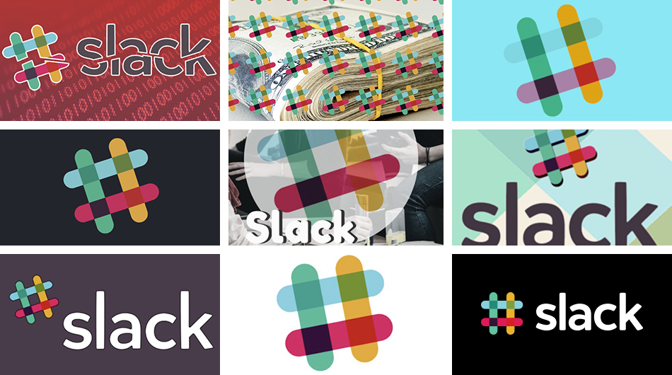
There was a lot of thought that went into this new logo. There are many elements that make sense. Even the speech bubbles were a clever idea. But the reality is, it’s nothing but a fancy Google logo, and they thought of it first, thus the criticism.
Quite many publications wrote about the new logo and, oh man, it’s bad. Here are some:
digg.com writes: “It’s… well, it’s not great! The jaunty angle is gone. The colors are still there, but suddenly it would be hard to pick out Slack in a sea of same-y startup logos.”
thenextweb.com says: “It went from a unique, quirky logo to something that looks like it belongs at your local pharmacy. Or maybe a Web 2.0 law firm or bank. Perhaps a summer arts program at the local middle school?”
Erin Scott Johnson went viral on Twitter with an eye-opening tweet: “The negative space in the new Slack logo makes it look like a whimsical swastika. Thank you for coming to my TED talk about how the internet has ruined my brain forever.”
And from there, the new Slack logo that was supposed to be a symbol of the tool’s evolution becomes a meme.
HisReptilianMajesty tweets: “#Slack has a new logo that I’m pretty sure is actually four ducks sewn together in an uroboros human/duck centipede. You add eyes and you can’t miss it.”

What do you think about the new logo? Let us know in the comment section below.
Read More at Slack Changes Their Logo and Designers Disapprove
from Web Design Ledger https://webdesignledger.com/slack-changes-their-logo-and-designers-disapprove/
No comments:
Post a Comment