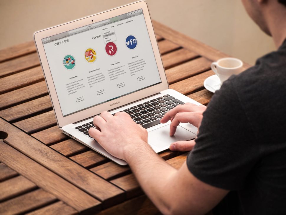
As a business, your website should be informative, and the key to a seamless user experience lies in the navigation. Any time a user visits a website, they want and expect all content to be clear and concise. Your navigation is the map—and therefore digital portal—between the visitor and what you have to offer.
According to Silverback Strategies, a DC web design agency, “A key step to staying ahead of competitors is ensuring that your company makes a great first impression, and your website is often the first encounter consumers have with your brand.” Unfortunately, not everyone puts the right amount of time and effort into crafting a navigation that works. With that in mind, these seven tips will help you create a better website navigation that users will appreciate and understand.

1) Plan Your Navigation Early
It’s not uncommon to be eager when creating a website and to simply start adding pages in your website host dashboard. However, this can easily lead to an ill-planned navigation menu, and you can do much better by prepping your pages ahead of time. When you prepare your
navigation menu ahead of time, this is called a “sitemap”—and just as it sounds, it’s a map of your website. There are several ways you can do this. Start off by drafting a map via pen and paper to help get your ideas out. Then, begin creating it in something as simple as a Google
Doc. Use an outline format to create your page setup. For example:
1. About
a. Our Team
b. Company Mission
c. Brand History
There are also dozens of sitemap creation tools to streamline the process for you. Keep in mind that early on, you want to focus on creating visual sitemaps, purely for planning purposes. Take a look at some visual sitemap creator tools here. And for some inspiration, check out these websites with great navigation.

2) Use Language People Can Understand
Your navigation uses language to communicate with visitors, and the language you use should be user-friendly. In fact, you might even consider getting creative with your copy, depending on your brand and the industry you’re in. Additionally, certain terms are more applicable across different industries than others.
For instance, if you were a professional scientific publication, it would be acceptable to use the word “Articles” to refer to your content, but if you were an e-commerce company, “Blog” would be the appropriate language to use. Similarly, as an e-commerce shop, you wouldn’t want to call your store “Marketplace” but would choose “Shop” instead.
3) Link Your Logo
Today, the majority of people expect certain experiences out of their website visits. And one of their expectations is that the logo always links back to the homepage. Typically, you will find the logo at the top left corner of the website. It’s not always bad to reinvent the wheel, but it’s important to understand that doing so can result in some confusion, and confusion can lose potential conversions. To ensure you’re creating the best experience for your users, you should A/B test your website to see which efforts are faring best with those visitors.

4) Implement a Responsive Navigation
Without a doubt, you need a responsive navigation. A responsive navigation allows any user to seamlessly view your content and design from any device, whether it’s desktop, phone, or tablet. Today, this is extremely important. There are many reasons for this. First and foremost, in 2015, Google announced that, for the first time, searches across mobile devices surpassed searches on desktop devices in at least 10 countries, including the United States. Another study revealed that between December 2013 and December 2015, tablet Internet consumption grew by 30%, while mobile smartphone consumption increased to 78%. If a user visits your website through their mobile device and has difficulty with your menu, they’ll simply move on to the next best thing.
5) Pay Attention to Your Footers
Your footer is the area where you put some of the items that are not so much fun—this includes your privacy policy and other legal terms. However, it’s an important area to pay attention to, as many people scroll directly to the footer to locate important information (or information they can’t find in the header navigation), such as where a business is located, how to find job opportunities, and where to get press and media information.
Many businesses, especially storefront companies, even put a visual map here to show visitors exactly where the business is located. And lastly, many businesses also include social media icons in the footer.
Read More at 5 Tips for Better Website Navigation
from Web Design Ledger https://webdesignledger.com/5-tips-for-better-website-navigation/
No comments:
Post a Comment