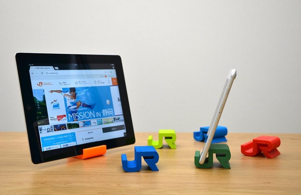
Taku Oomura is an award-winning Japanese Designer who came up with an innovative idea that made his name known worldwide. He started working on a project called “Trial and Error” a while back which received praise worldwide. Oomura took companies with popular logos and transformed them into useable everyday objects. How does he do it? Simply by designing them and printing them out on his 3D printer. Let’s see what he came up with.
While some believe that the Japanese Designer created too many object holding tools, others find them unique and useful. After all, these logos were not at all designed for what he recreated them to do. Many of the logos he used belong to Japanese brands that many of us have never heard before, but even so, we can appreciate the idea and enjoy the product, it is, indeed, useful. Today we are putting our judges masks on, and we will see which of these objects can really ease our life, and which ones are totally useless. Join us on this trip!
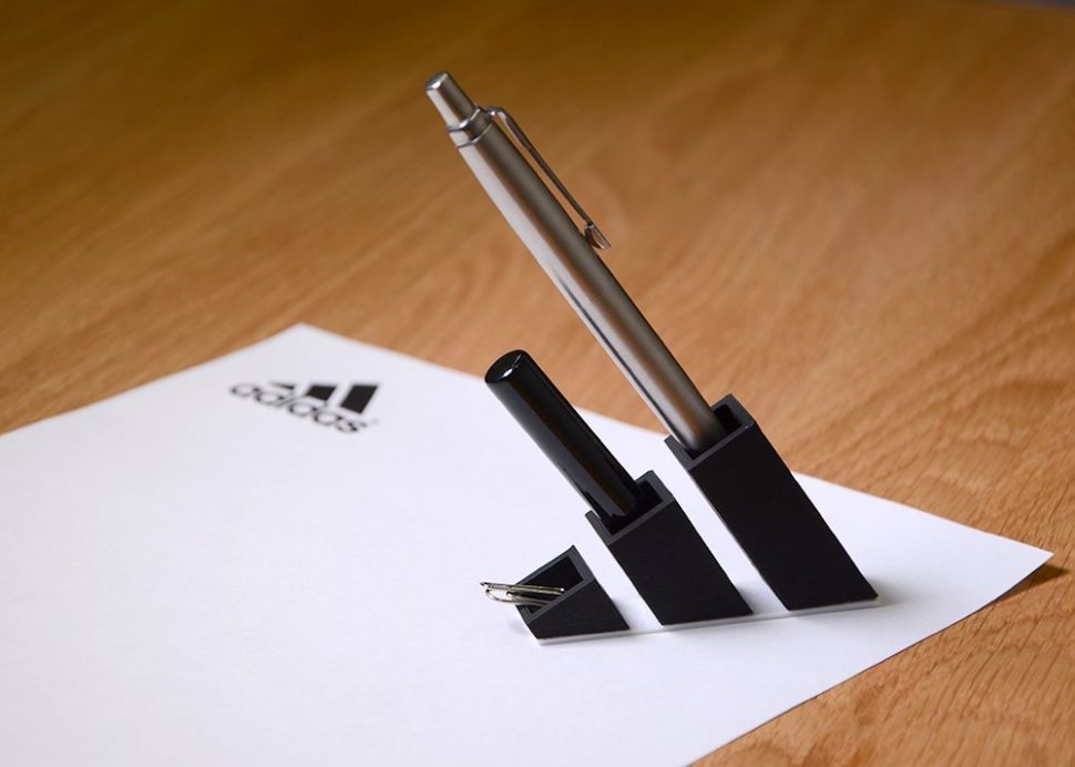
1. Adidas – pen holder
Although this particular design can only two pens, the individual bars that make up the logo are long enough to hold your pen perfectly in place. It’s quite a futuristic look and would look killer on an executive’s desk at Adidas Corporate office. Even if you’re just a relly big fan of the fan, this design would be easy to incorporate with many different styles at home.
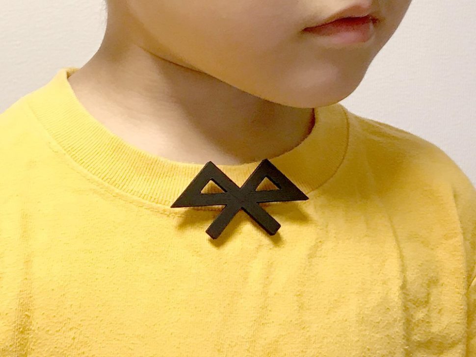
2. Bluetooth
Who would have thought that a simple rotation and the right placement would have turned the Bluetooth logo into a very unique bowtie? Apparently, Japanese designer Taku Oomura did.
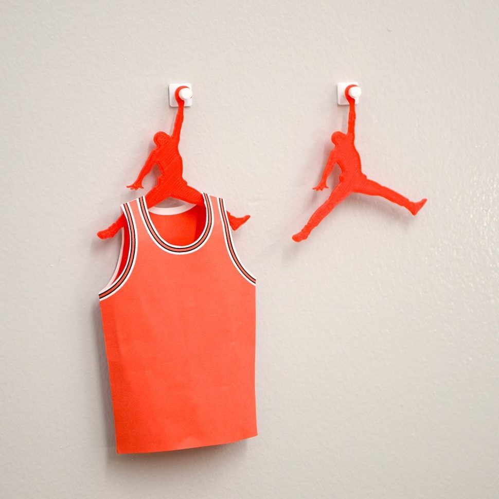
3. Jordan
Michael Jordan’s impressive mid-air pose makes for a great hanger. This would be the perfect gift for anyone who is a fan of basketball or the Jordan brand in general.
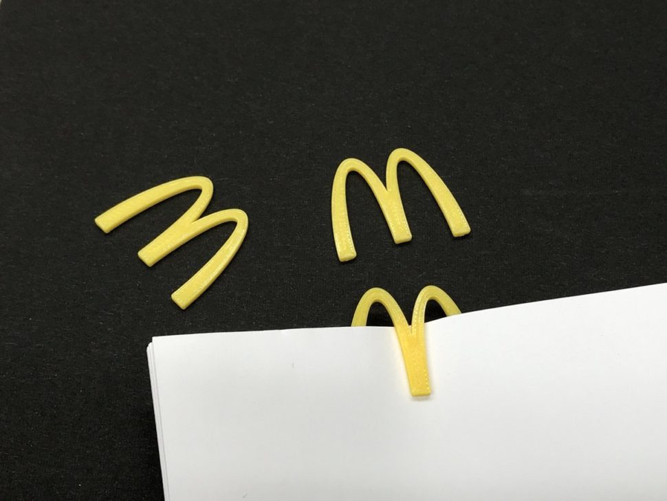
4. McDonald’s
Even though this has the potential of a creative design, I can’t imagine, unfortunately, that many people would actually buy, or even use a paper clip like this. No hate on McDonald’s, nor on the designer, but the McDonald’s brand doesn’t exactly scream paper clip. Nor does it look fashionable.
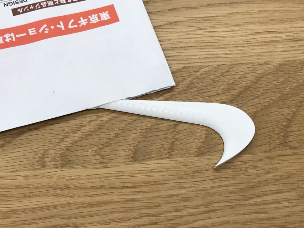
5. Nike
The swoosh from Nike makes for a very convenient way of opening envelopes. Because of its sharp and pointy ends, you can slice open any letter with ease.
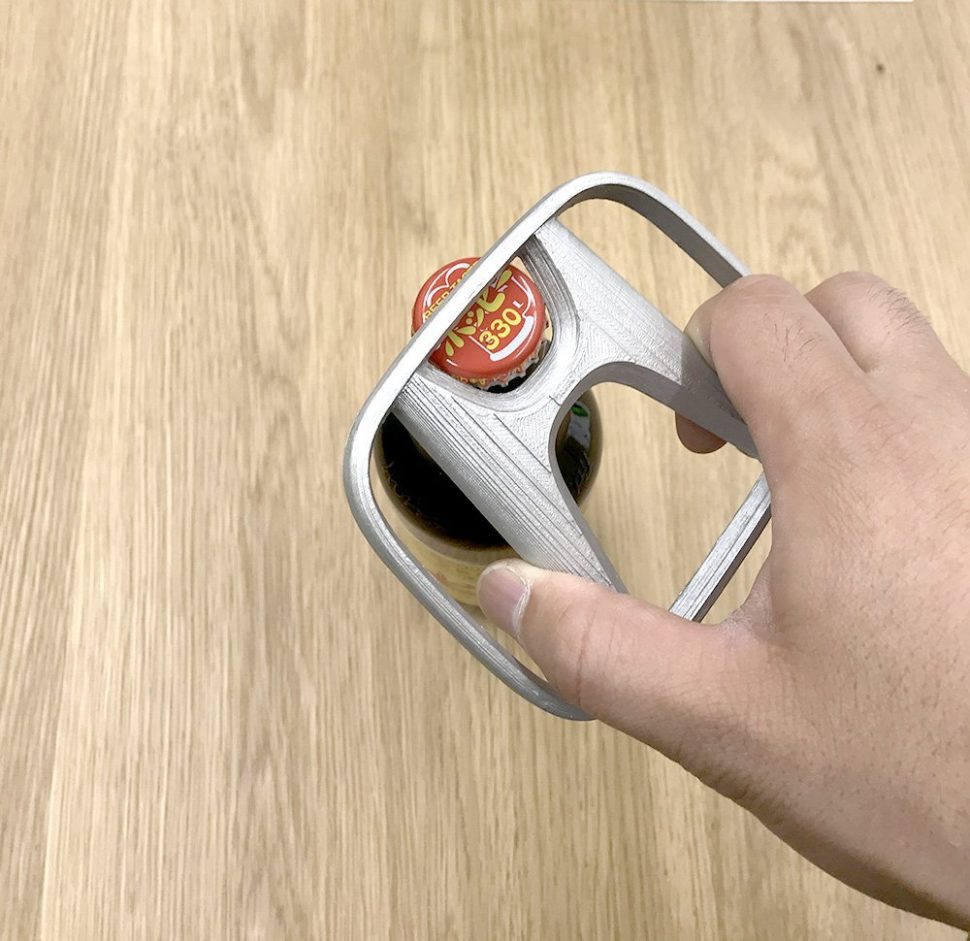
6. Honda
The curve of the edge in the Honda logo makes for the perfect shape for a bottle opener. It doesn’t look like the easiest bottle opener to manipulate, but it looks like it gets the job done.
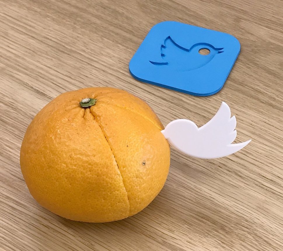
7. Twitter
Although it’s pictured as an orange peeler, the Twitter logo could probably be used for a lot of other things. Basically anytime you need something cut. It would probably be perfect for opening packages and cutting tape.
8. Yahoo
The stationary holder depicting Yahoo’s image looks rather inefficient. All it takes is mall bump and dozens of paper clips go flying. interesting in concept, but not very practical in the real world.
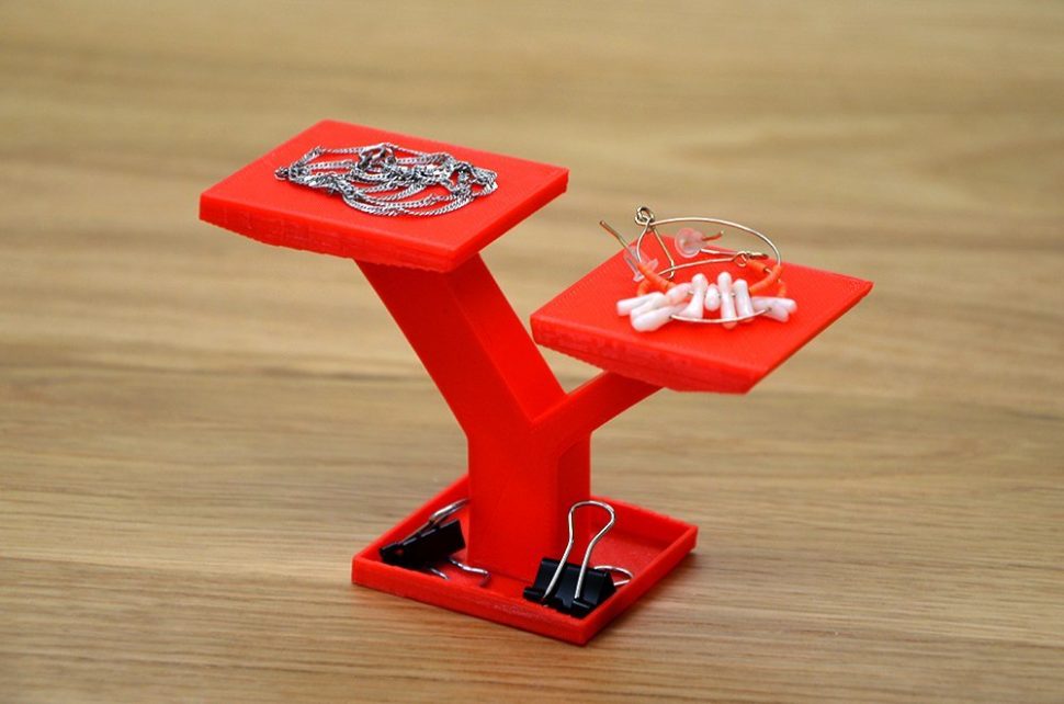
9. Coca-Cola
Unless you are a brand’s ambassador I can’t imagine that you’d wear this for a fashion statement. Nonetheless, it is pretty cool how the logo is embodied with such a simple design. It would be even cooler if the ring had more than one use.
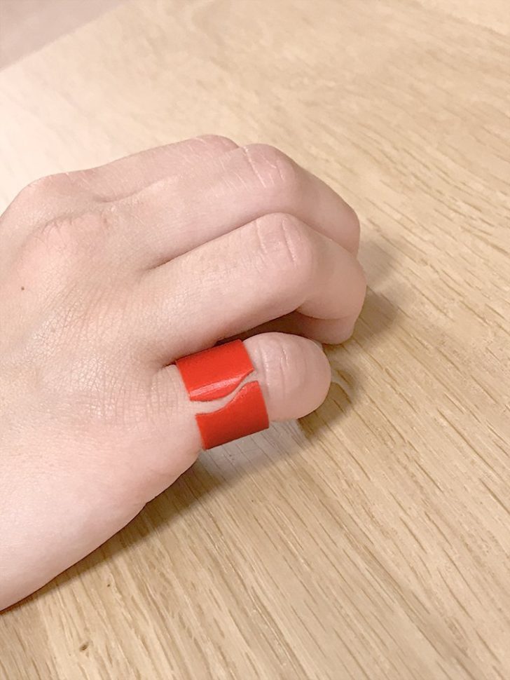
10. Jr.
I find it cool how you can’t tell that the tablet support embodies a logo unless you look at it from a certain angle. The design looks modern and doesn’t take up as much room as other tablet holders do.

11. Pocari Sweat
For those of you who are not familiar with this brand, Porcari Sweat is a water and ice company. The relation between the design object and the logo is carefully chosen, this being the first object that actually is connected to the product the logo represents.
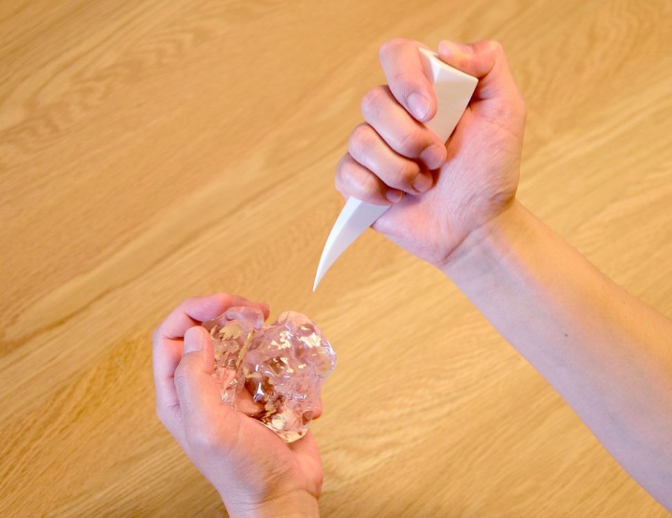
12. Taisho Pharmaceutical
I honestly think that this design was far too complex for such a simple object. It’s a cool logo, though, it’s just a little over the top for a paper holder.
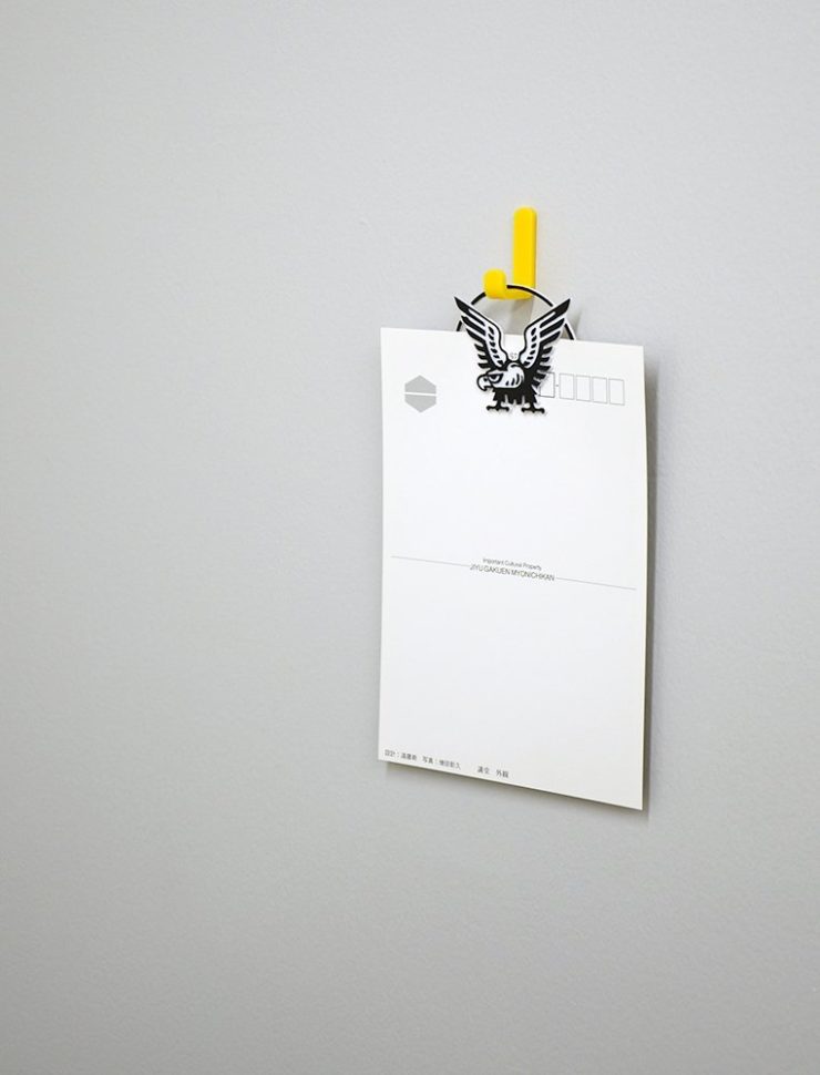
13. Kobayashi.
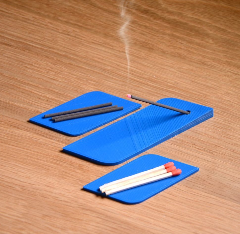
This is another Japanese brand that most of the non-Japanese people have never heard about. The attempt of making its logo a usable item is quite stretched. Usually, the incense stick holder have a much elegant touch than the three pieces of blue plastic, which, if you missplace them, don’t even look like the logo anymore.
14. Marudai
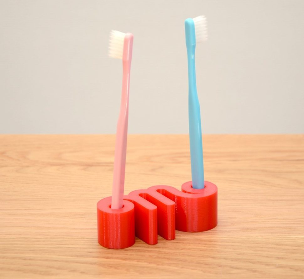
Marudai is a Japanese food company featuring the given logo. We can appreciate the effort, but the usable object is not that usable, after all. A family of six would need three of those toothbrush holders, which would take way too much room.
15. Louis Vuitton
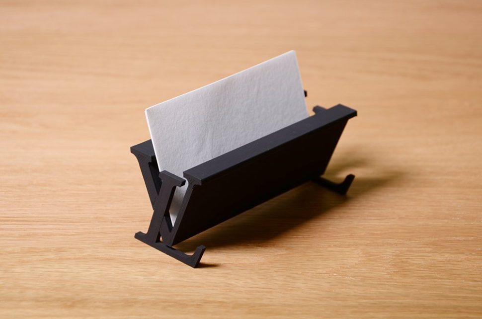
The napkin or/and little notes holder has the potential of a great gift for a person who loves the brand and works in a fancy office.
16. Seino
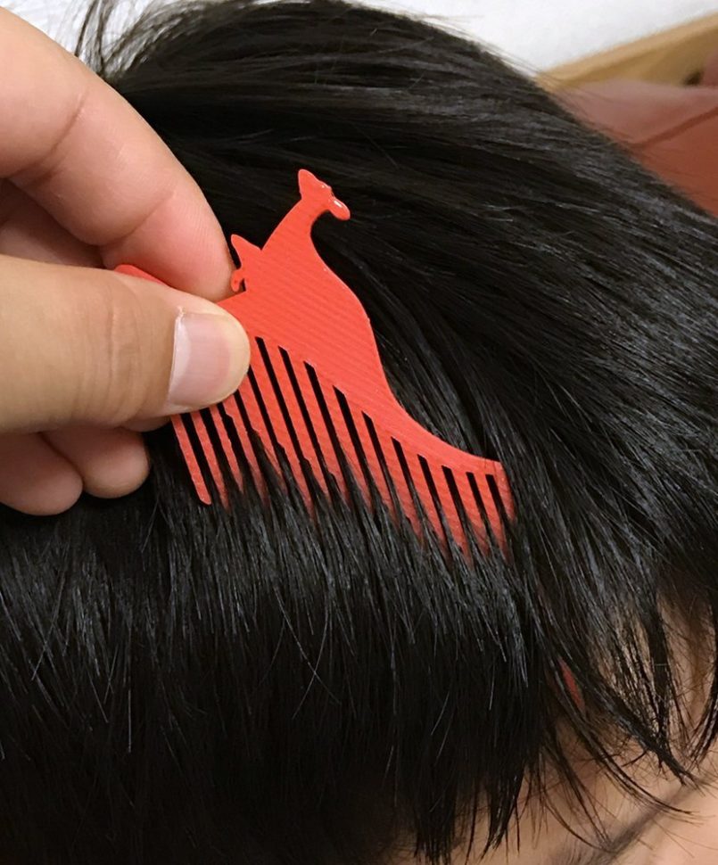
In order to unserstand why this cangoroo has so many legs, we have to know what the company is all about. Seino is a Japanese transportation company that makes itself remarkable due to its fast delivery. Thus the logo which was turned into a comb. I have to admit it, I think this is a very clever idea.
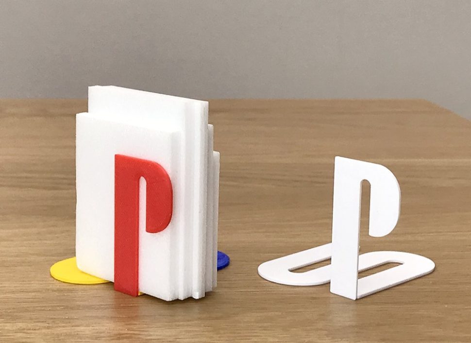
17. Playstation
I’d like you all to comment in the section below if you know what this is and how does it work. I’m confused.
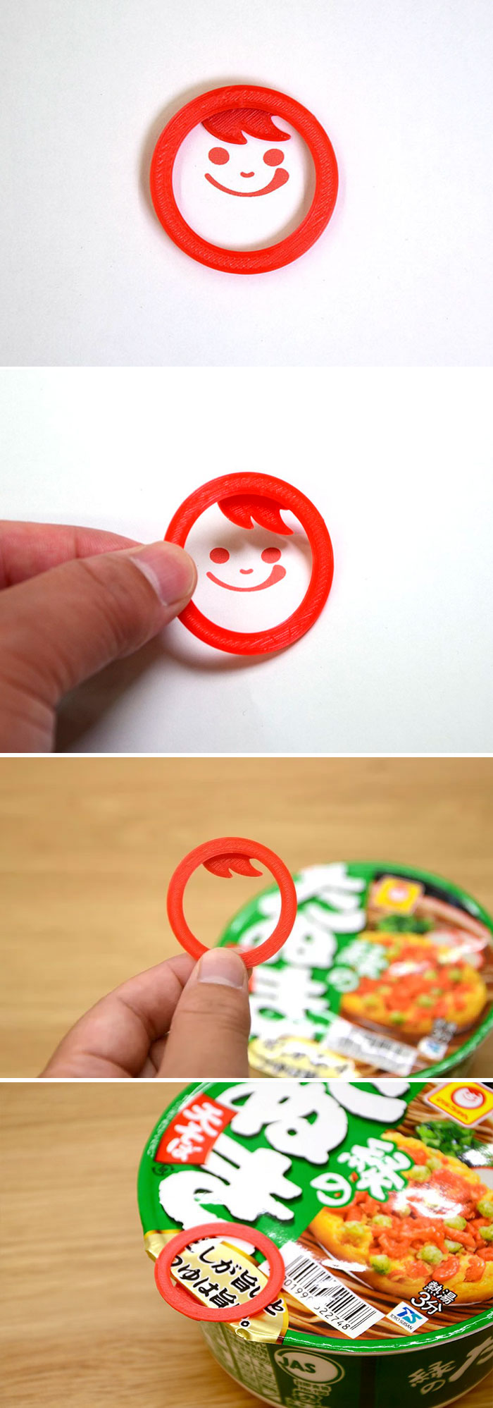
18. Maruchan
This is one of those objects that people would buy just because they are cool and innovative, and to brag about at friends.
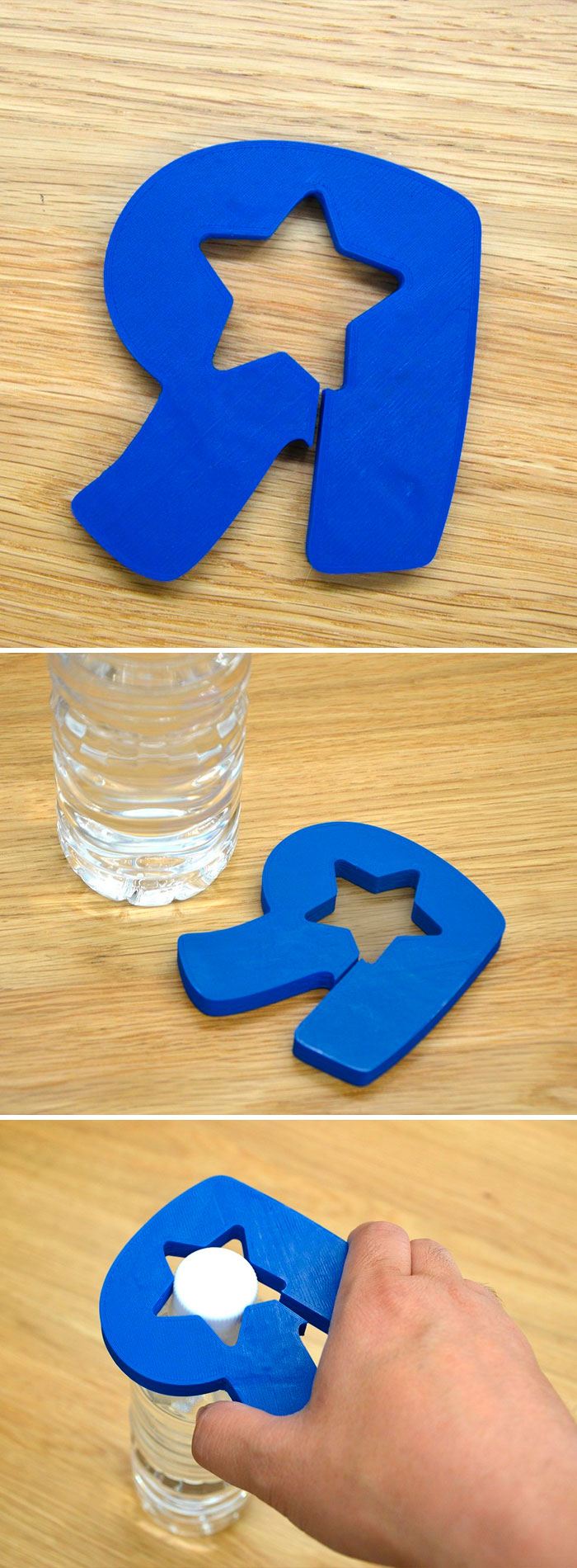
19. Toys“R”us
Sometimes, bottles simply don’t open and you pass it to several people until somebody manages to break the seal. This user object will help you open the hardest to open bottles. I see how this could be a great gift for grandparents who are not as strong as they used to.
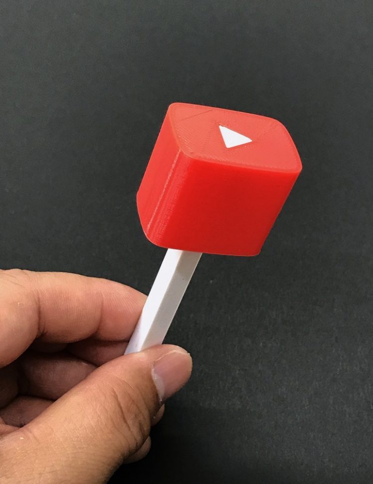
20. Youtube
We conclude this article with the most useless “useful” object of all. A block of plastic on a plastic stick has a compromised purpose unless somebody elucidates its mistery.
Read More at Japanese Designer Transforms Popular Logos Into Usable Items
from Web Design Ledger https://webdesignledger.com/japanese-designer-transforms-popular-logos-usable-items/
No comments:
Post a Comment