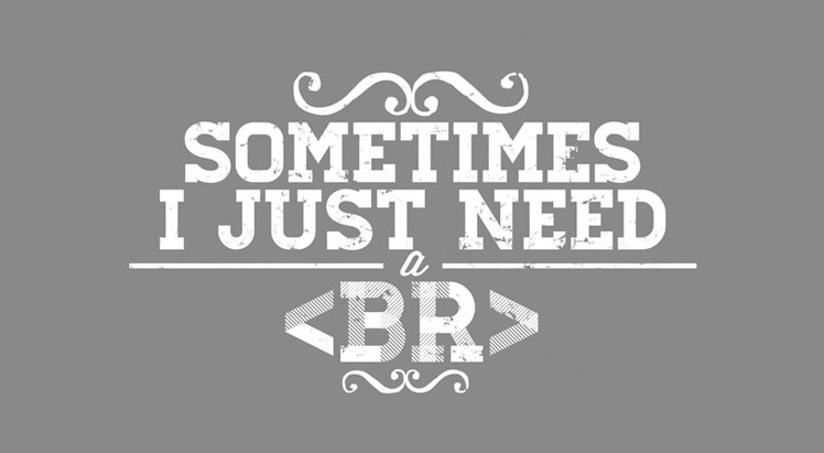
What did 0 say to 8? Nice belt, girl!
One of the best ways you can connect to any audience is with tasteful humor. Everyone enjoys a joke. If you incorporate the right style of humor into your web design, you’ll have people hooked. So what’s the secret formula? How can you possibly be funny enough to keep them wanting more, yet subtle enough that your design doesn’t come off as silly? Here are a couple of quick and simple tips that you should consider for your next design:
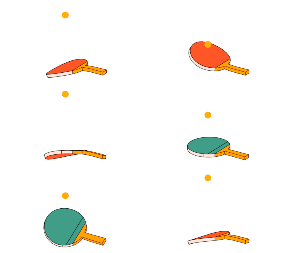
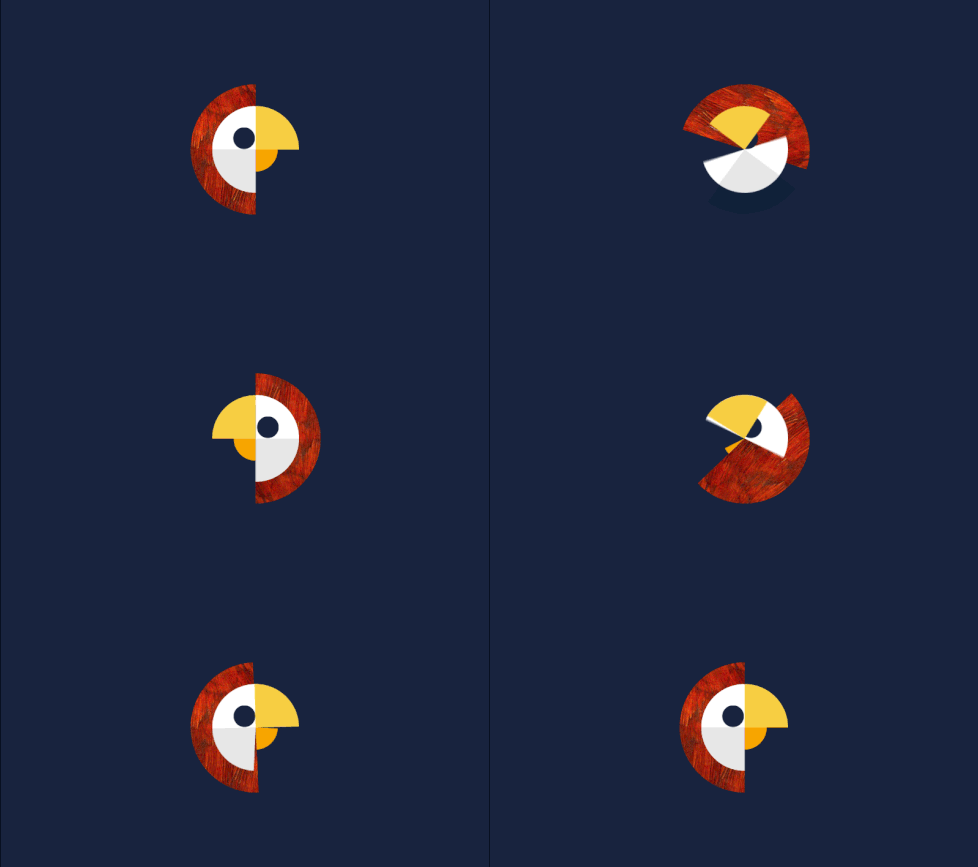
Making loading interesting
Whether you’re a web surfer or a video gamer, loading sucks. In fact, the loading sequences for any sort of application are filled with nothing but anxious distaste. So, how can you fix that? Let’s be honest, it’s not like loading will ever go away. Applications take time to process, therefore, there will always be a some sort of window where the user will need to wait.
The best way to tackle this is by making the loading screen a fun place to be. Granted, it’s not going to be the next blockbuster film, but you can always add a funny image, gif, or video. Get people in a good mood before they even see your content.
Be relatable
You’re not a robot, so you shouldn’t talk like one. I mean, it would be cool if you could, but for the sake of keeping it personal in web design, it’s probably best that you keep that talent to yourself for now. One of the most boring things anyone can do in web design is to make the text sound like it was computer generated. Be personable with your words. Make the viewers see that you aren’t some lifeless, cold, metal computer and that you are actually capable of making a joke or two.
Q. What is the biggest lie in the entire universe?
A. “I have read and agree to the Terms & Conditions.
Keep it original
You know as well as everyone else that the internet can be your best friend or the worst of your enemies. People are quick to call out a copycat. There’s no point in imitating something funny someone else has already done. If what you’re copying is really funny, odds are that someone has already seen it. It’s only a matter of time before you get found out.
Stay true to yourself. Yes, you want to be funny, but you also want to be original. Think outside of the box and take a little extra time to be creative. As the great novelist Herman Melville once said:
“It’s better to fail at originality than to succeed in imitation.”
Images and gifs mean everything
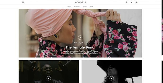
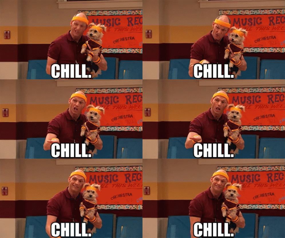
Aside from your loading screens, you should try to add funny and tasteful images if it relates to your topic. We live in a world of memes now. Use them to your advantage and it’ll set you free.
![]()
Use metaphors
Metaphors are a great way to connect your audience to your work. If you can make them funny, well then you’ll have them eating out of the palm of your hand. Okay, maybe not literally eating out of the palm of your hand, but you know what I mean.
Metaphors allow you to quickly explain a concept and give your audience a visual representation. You could say something like, “Life is like a box of chocolates – You never know what you’re gonna get”, and people will quickly put 2 and 2 together and understand what the heck you’re talking about. On top of that, you can see what I mean when I say that you can connect even more to your audience when you make these metaphors funny. If people can connect the real world to your web design with humor, then you’re doing it right.
It will take a big tractor to plow the fertile fields of his mind.
Be Literal
Dry humor is one of the most popular and demanded branches of comedy. Actors like Steve Carell and Will Ferell have made millions with their dry humor. Of course, not everyone is born to be a stand-up comedian, so the best way to portray this sort of humor is with your images. Be straightforward and blunt, people dig it.
So, just as an example, if you have some sort of promotion or sale, you can have a custom image that says, “Hot Deals!” and then have a cartoon character of some sort gripping their red, steaming, and pulsing hand as the item that’s on sale plummets to the ground. You have endless possibilities with this sort of humor.
It’s hard to explain puns to kleptomaniacs because they always take things literally.
Don’t over-do it
Too much of anything is a bad thing. As much as you want to be funny and relatable, you don’t want people clawing at the doors to get out. Don’t overwhelm them with too many jokes, or they’ll never take you seriously. There’s a fine line between having them laughing with you and them laughing at you. Take your time, be creative, and be reasonable.
As I said above, good humor in web design is both well timed and mastered with practice. Very few people come busting out of the gates with a perfect balance of humor and seriousness. The key is to take baby steps and listen to feedback. We’ve now reached the minimum word count for this article, so it’s over now. Only kidding.
If you enjoy helpful articles like this one, and want to stay up-to-date with the world of web design, then be sure to check-in with Webdesignledger daily!
Read More at Connect with Your Audience: Incorporate Humor In Web Design
from Web Design Ledger https://webdesignledger.com/incorporate-humor-in-web-design/
No comments:
Post a Comment