Most webmasters think that their website is only about them. Wrong! Your website is mostly about your target audience, the people who would flock to it and click on the CTA button.
So it makes sense to design one that would appeal to them first. And not just appeal but also be a quick and easy experience for them. From working on the aesthetics to working on the functionality, here are some freebies that would help you turn any boring old website into a snazzy new one that both communicates the objectives and promises great user experience.
Build Websites & Make Them More Usable
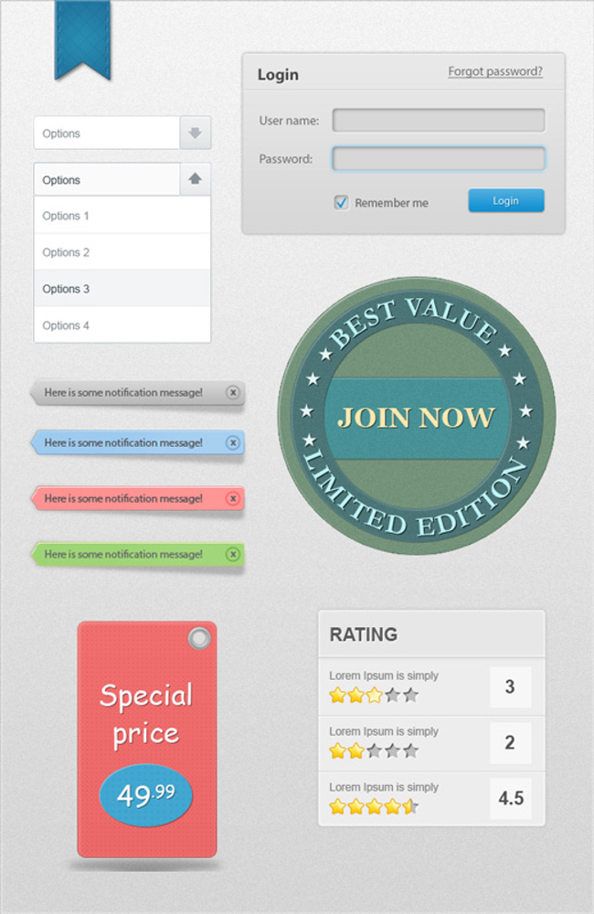
There are basic elements to every website but they need not be boring. Of course, you will have a login page but need that be boring and ancient? This freebie is an eclectic mix of 7 PSD design resources comprising login pages, display badges, ribbons, and so much more.
You can use this in a myriad of ways. The rating system automatically adds to the credibility of any product or site in general. The tags can be used to show special products and prices while badges are a great way to keep the users engaged by linking it to engagement or membership levels.
Besides scoring in the design department, a website should also be usable and easy to navigate, this set would help you with both.
A Modern Free Font to Build Websites
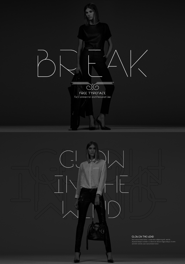
It’s not just about what you write on your website but also how you write. The font plays an important role to help build websites more visually appealing and definitely helps with branding too. Certain font types carry a lot of weight and a sort of perception associated with it, like for instance Break has a high-end luxurious vibe to it and is, therefore, perfect for a bespoke brand.
Although primarily used by fashion-centric websites, Break would also find a place for itself in a website dealing with luxury artefacts or even for a website of a creative agency. Available in five weights – bold, semibold, regular, light, and extra light, the font contains both upper and lower case, numerics and symbols.
Editable Call To Action Buttons
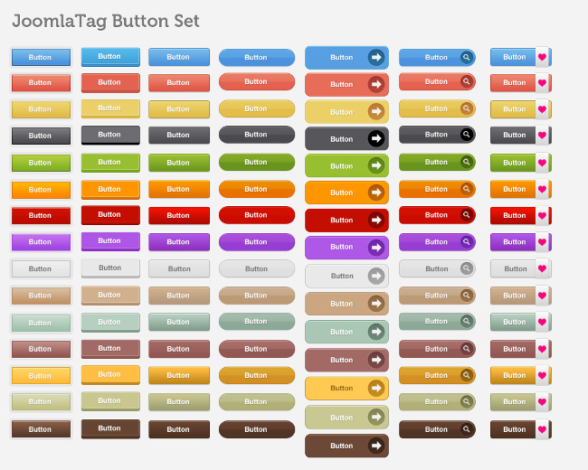
Getting the reader to click on the call to action is the penultimate goal of any website, the ultimate being conversions. When you have a visitor on your site, you work hard and design a website that would entice them into staying a little longer, you craft content in a way that it communicates and sells to them. But not a lot of attention is given to the call to action button, you may come up with a solid text or visual content around it but the button in itself is usually ignored.
From a design perspective, your CTA button could be an add-on to the overall design of your website making it an additional element that adds to the quirk. Or even if you don’t want to go down that fancy route, just pick one that’s at least not centuries old! This freebie has a list of 105 editable CTA buttons that you can use for a number of different types of websites. These are easy to modify and allows for changing the text, color, and size too.
Stock up on this for repeated usage in different projects.
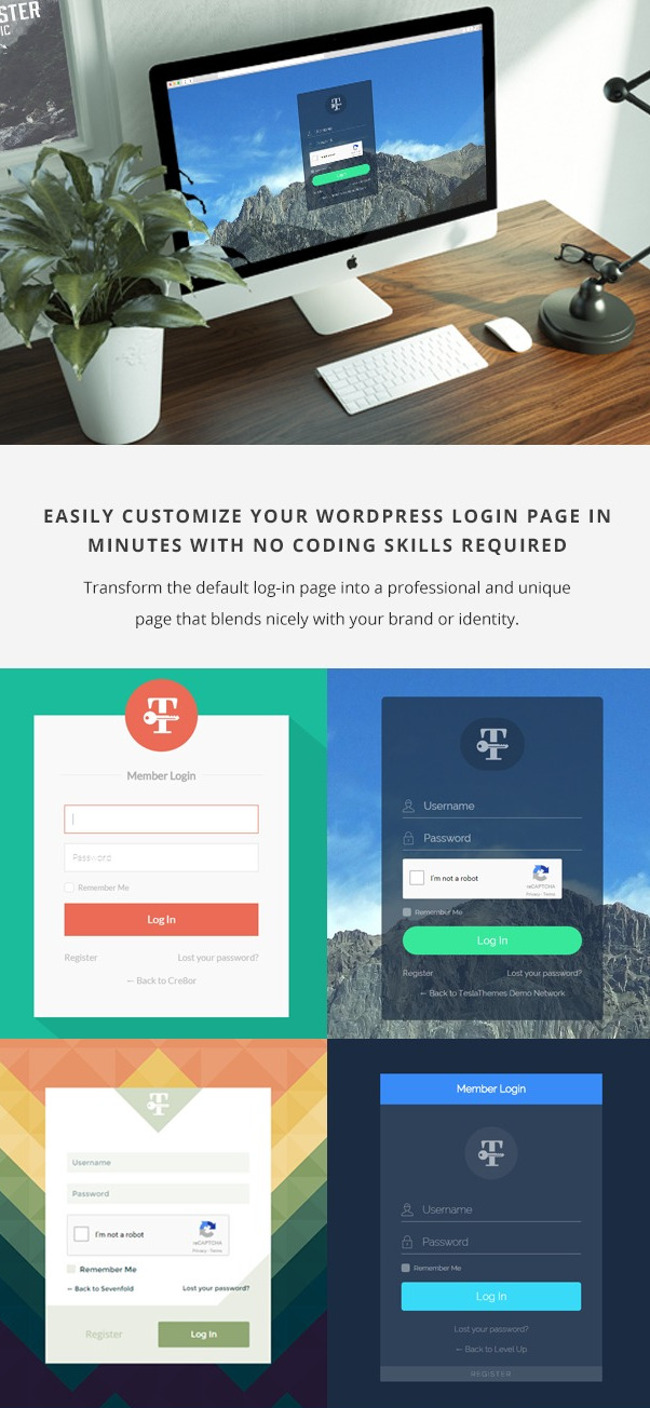
Create your custom login in minutes without any coding skills
A login page is the entry point of your website. That’s where you meet your customers and where you meet your customers is usually a sad boring place. With websites inching more towards the creative zone now, you have to make use of everything to stay ahead of the game. Use your creative juices to come up with a different take on the mundane login page. Spruce it up with special customizable backgrounds that make your readers chuckle or look at it in awe.
Select different styling options and text colors to add mojo to it. And overall, just make it look visually appealing than the sad sorry state most of the login pages are in. And if you are thinking “Well, just how big of a hole would sprucing up my login page burn in my pocket” then you’d be pleasantly surprised. Not only do you get this deal at absolutely no cost but you also don’t need to outsource this to a designer. Even website owners with no coding knowledge can create a login page in minutes! It’s that easy and quick.
Beautiful Macro Photography Techniques E-Books
Images are such an integral part of any website. Whether it’s a portfolio-centric website or one that is primarily educational, there’s no thinking of a website without images. But images are also expensive, a generic stock photo would set you back at least $50 if not more.
If you are looking to cut corners, then it’s best to click images yourself. Anyone with a DSLR and basic photography knowledge would be able to cut down the cost incurred on procuring images for a website by going down the DIY lane. Of course, as the requirements to build websites gets more pronounced you would have to click images more in tune with those like a fashion based website calls for fashion-centric images, an e-commerce would require a good understanding of clicking product photos. But in general, you need to know the basics. One such aspect of photography that you should know and that would come handy is macro photography. The ability to zoom in on and show something from a macro perspective will help your images to stand out better and your website would get a visual boost.
Not sure where to start looking for macro photography tutorials? Consider this freebie that teaches you everything from the basics to the advanced.
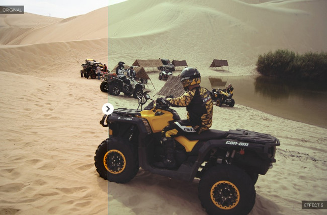
Photoshop Actions for Sports Effect
Photographers are always pressed for time. They are out scouting for locations, getting the gear in top shape, shooting, shooting, and then shooting some more. And then comes the post-processing part. Editing from scratch would take hours and especially if you have to do something repetitive and basic, you should consider Photoshop Actions, these are a series of recorded steps that help to enhance a photo as per your requirement.
Need to simultaneously work with RGB, Sharpness, Contrast, and Brightness? One Action will change everything in a click. More so, these enhance your images as per the steps laid down by the experts. If you choose a Photoshop Action that was originally crafted by a pro, you can use it to edit your picture as per their direction, albeit indirectly. So your images get a boost from the pros themselves.
This freebie is perfect for those who click sports images as they are sports-centric but can also be worked in other ways.
Social Media Mistakes That Are Killing Your Brand
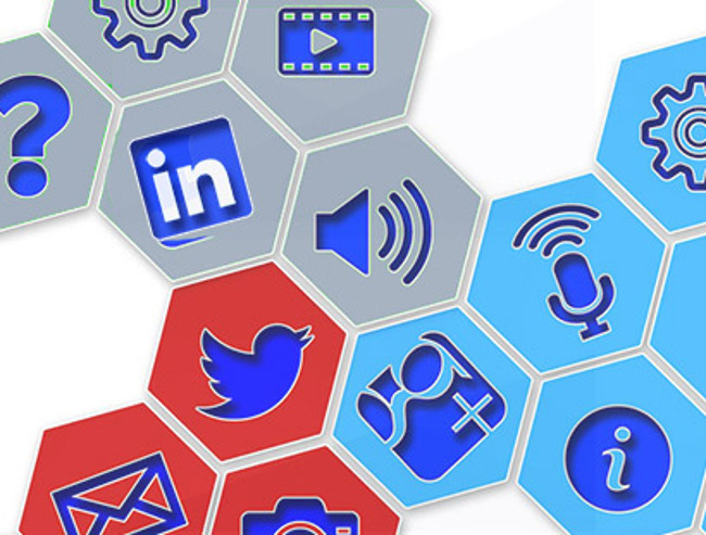
Social media isn’t just the shiny new toy now it’s like that marriage you should work at and work really hard at because your competitors are doing just that. Reach out to your prospects and convert them with killer content. And the best way to do so is by using a social share plugin that would automate the process.
The plugin helps to target prospects and the correct social media platform and share content, eventually increasing the number of visitors on your site. Harness the power of social media with a good social share plugin like this one.
UI Kit to Tantalize Your Shopping or Social Website
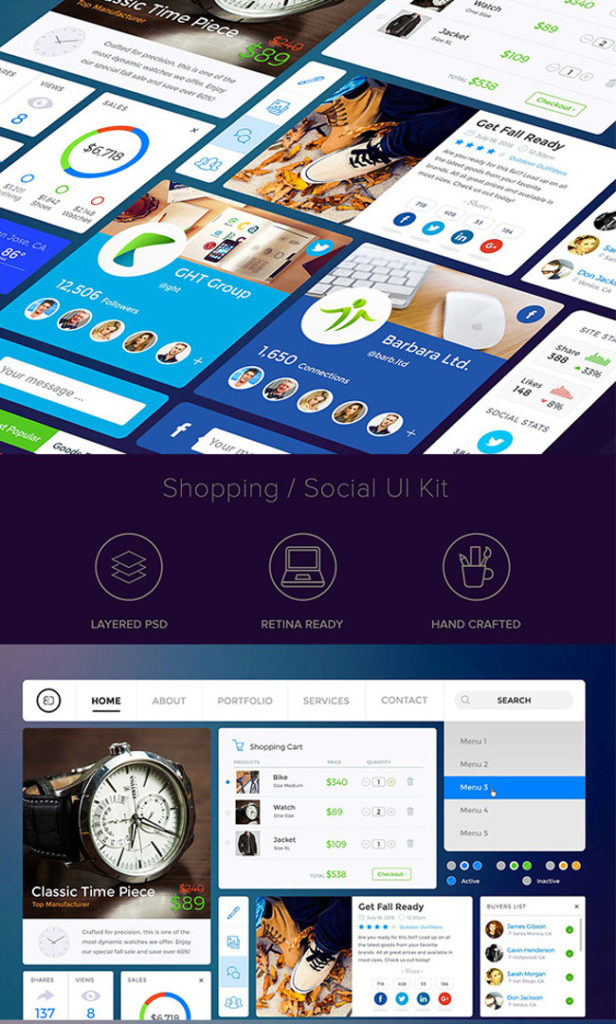
What’s with those super bad shopping websites? Do they really want us to even stay on the website for more than 5 seconds? Fashion or any e-commerce website has to be visually appealing, one that makes the visitor want to buy everything.
If you are working on a fashion-centric website and don’t want to blow it, consider this UI kit that’s handcrafted and comes with a plethora of features that will make the procedure quick and the interface amazing.
Create A Photography Website That Works For You
Designers and photographers need websites for themselves too, it’s like a stage for your work. Invest a lot of time and effort in this, learn the basics to build websites and how to be different from the herd or simply check out this e-book that covers everything you need to know about making your own website.
Give your competitors something to envy, make your website a kickass amazing platform that’s perfect to show your kickass amazing work.
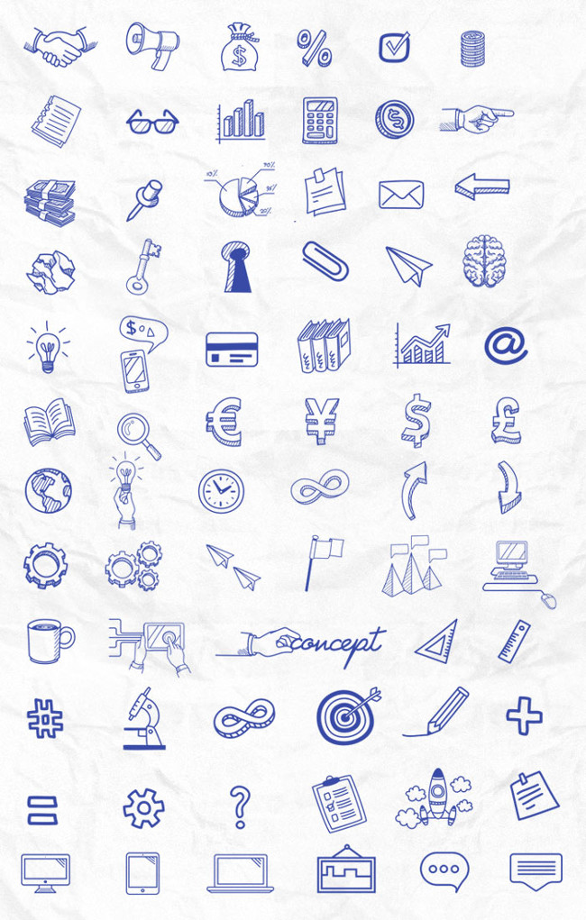
Beautiful free icons to build websites
A set of assorted icons that will come in use in almost all of your projects, this freebie is a saving grace for every designer. Stock up on this and you are bound to find repeated usage for each one. From making your page look visually appealing to communicating what needs to be conveyed, these icons are champions in themselves.
Which of the freebies did you like best to build websites that customers will love?
Read More at 10 Proven Ways to Build a Websites that Customers Will Love
from Web Design Ledger http://webdesignledger.com/10-proven-ways-build-websites-customers-will-love/



No comments:
Post a Comment