“There will always be a new technology, such as virtual reality, or in the case of paper and packaging, the internet of things. That will certainly change the medium, but the hardest part will always be to create meaningful products and services. For me, this always starts with a person”.
Chad Jennings, VP of Product Design at MOO
Chad Jennings, VP of Product Design at MOO, has throughout his nearly 20 years in the business arguably helped shape user-experience design into what it is today. From the beginning, the ever-evolving internet of things has ignited Chad’s creativity and approach to his work. Chad’s initial love of design came by way of computers – finding the design of interfaces much more of a draw than the underlying workings of the machine itself. He went on to study user-centered design at the Illinois Institute of Technology in Chicago and began his UX/UI career working at firms Method and Smart Design. From here, he went on to found Blurb.com, an experience that would help shape his approach to designing physical products that are sold in a digital marketplace. Today, Chad finds himself in London leading product design for MOO, a brand loved by creative businesses and professionals for its customer-centric approach.
Throughout his career, Chad has watched design tools and mediums evolve but believes the core inspiration behind design remains the same – people. Chad and the product design team at MOO work tirelessly to keep customer desires as the driving force behind their work, approaching things with a human touch that can be hard to achieve online. Read on to see how Chad and the MOO team come together to create their designs, and why he believes you should “eat a lot of cake”.

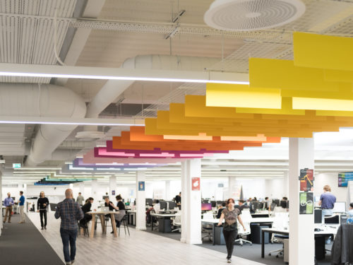
MOO’s Farrindgon, London office
Let’s start from the beginning. You’ve worked for and co-founded some exciting companies over the course of your career. In doing so, you’ve managed an array of different teams (product, design, marketing, content, etc.) How did you end up in your current role at MOO?
I moved to San Francisco in ’99, and after stints building my own design chops and helping to form interaction design practices in the agency world at Method and Smart Design I had the amazing opportunity to co-found Blurb in 2005. Richard Moross, MOO’s founder and CEO launched MOO around the same time and so we crossed paths as part of the first wave of Web 2.0 companies. MOO and Blurb had many parallels including a brand loved by designers and photographers. In fact, both companies saw massive early growth in part because of our partnerships with Flickr, one of the first major photo-centered social networks.
So I admired MOO, especially the amazing brand Richard and the team crafted. I’d recently moved to London and when Richard asked me to lead Product at MOO, it was an easy decision. I also oversee physical product design and UX, which I love, as it keeps me grounded in the beautiful world of tactile design and artifacts. That said, I was also drawn to MOO for the opportunity to innovate in the digital space, most recently with the launch of Monogram, our iOS app to help you show your work, pitch your business, and share what you do.
What ultimately led you to focus on UX/UI?
I grew up a bit of a computer geek, coding BASIC, creating low-res games and playing text adventures on my Apple IIc (yes, I’m old). I started out studying computer science, but found my interest in the interface and psychology of how people used the computer, more than the underlying code. I love pinball and similarly was much more into the game design than the mechanical bits underneath. I was lucky enough to find my way to the Institute of Design at the Illinois Institute of Technology in Chicago which was one of the first programs to teach user-centered design. I found my calling there which brought together technology, business and design into what we now refer to as UX. Steve Jobs once said “design is not just what it looks and feels like. It is how it works.” I think that is more important today than ever before.
MOO is the second company you’ve worked with that makes beautiful physical products that are sold exclusively online. How did your experience of co-founding Blurb influence how you approach UX/UI as a whole and your job at MOO?
Blurb actually had two designers on the founding team; myself and Brian Burkhart, now at Gensler. Brian’s background was in book packaging and graphic design. We were joined early by Alysha Naples, currently leading interaction design at Magic Leap. Our collaboration in defining a new brand and the physical and digital product experience at the same time was key to Blurb’s early success. Truly outstanding user experiences are seldom individually led, especially at Blurb and MOO, which are both characterized by fairly complex service design problems encompassing; e-commerce, design tools, a two-sided marketplace, packaging, and customized, on-demand premium physical products. That experience continues to influence me, and at MOO we’ve built a design-centered culture that draws really talented creative thinkers and makers. As a leader of both product management and UX, my job is to help clearly define customer problems and let the teams iterate on elegant solutions. I also believe user-centered methods drive easy-to-use, delightful products that have helped both Blurb and MOO stand out in rather competitive markets.
What are the challenges you face designing physical products that are sold online?
MOO serves both creative professionals and creative businesses who may value quality design and premium print, but not have the skills to translate that vision into a brand. For professionals, the biggest challenge is communicating our quality and innovation through photography, copy and brand. We offer two types of free sample packs; one for business cards, and another containing all of our printed products. We also have our ‘MOO Promise’ that is important for an online physical product provider, and states – “We’ve never thought ‘satisfaction guaranteed’ was the most inspiring phrase. We’d like you to be satisfied of course, but we’d prefer it if you were absolutely thrilled beyond words with your order.”
We believe strongly at MOO that good design works wonders and high-quality design should not only be available to professionals or those that can afford an agency. For non-designers, our online templates and creation tools need to be extremely easy to use and represent what they will receive in print. This is not always easy, especially as we explore innovations such as Printfinity (our patented technology that allows you to print a different photo or design on every MOO Business Card, Sticker or Postcard in a pack) and our recent launch of gold foil, spot gloss and raised spot gloss.
Take me through a day in the life of the UX/UI product team at MOO. How do you bring together the different teams (project managers/engineers/other designers) to ultimately bring to life MOO’s products?
The answer to this question is ever evolving as each team, problem and context changes over the course of a product lifecycle. That said, at MOO we have a few foundations all teams build upon. First, we always try to start with our customer. Who are they? What are their desires and pains? What jobs do they want our product to do for them? We use classic UX tools, such as personas, to help reinforce that we aren’t building products for ourselves.
Next, all our product teams are built around a concept of cross-discipline “crews”. Crews vary in size from 5 people up to 15 people, but the goal is that each crew has everything they need to deliver and ship their product. Every crew tends to include product management, product design/UX, engineering, QA and in most instances a shared user researcher. We feel strongly this decentralized and embedded model of design org, where designers sit with their crew(s), is extremely important. It creates a strong feeling of ownership, allows for quick iterations, and design is part of the team. This is in contrast to the “agency” model which may be more efficient, but doesn’t empower strategic design or a co-ownership of the products. Peter Merholz, one of the co-founders of Adaptive Path, has a book coming out soon titled the “Org Design for Design Orgs” where he proposes a hybrid “Centralized Partnership” model. The entire team recently had a workshop with Peter and were trying to shift how we work a bit. Like I said, always evolving.
In addition, the crews are (mostly) organized by the user journey. For example, we have crews devoted to the “Browse”, “Build”, and “Buy” experiences instead of the underlying tech. This keeps us all thinking about the overall user experience. Finally, each crew and the entire Org uses OKRs, which stand for “Objectives and Key Results”. Simplistically, an objective is the dream – a stretch goal or product theme – and the key result is how you plan on measuring success. Every crew crafts and commits to these each quarter. We then share these and align regularly. Given we now have 10+ crews all working on their section of the user journey, this alignment is extremely important.
How do you approach the task of designing products that will be the face of thousands of brands while maintaining the quality and feel MOO is known for?
From quite early on MOO recognized that building a strong brand was extremely important as a differentiator. Creating that trust takes years and a consistent commitment to quality design is what many companies lose as they grow. For my product team, we’re so lucky that we can focus on building the best products and digital experience, because we know we have amazing product marketing and comms design teams that are ready to scream and shout (in a uniquely MOO way) about the products. We move fast, but if it doesn’t meet our quality level it will never see the light of day.
We also spend a lot of time and effort creating truly unique features to help our customers, and MOO, stand out from the competition. MOO started with mini-cards, invented (and patented) Printfinity, launched our one-of-a-kind Luxe line, and most recently launched our Tailored collection (gold foil and spot gloss), as well as our Business Cards+ with NFC embedded technology, and Monogram app.
For someone not familiar with MOO, how do you explain what sets the design of your products apart? In other words, why choose MOO?
There are many different elements that make MOO what it is today. We pride ourselves in being able to make great design accessible to all, whether that’s a single business owner operating from home, or a large enterprise with thousands of employees – and are constantly looking at technologies to help our customers achieve their design potential regardless of skillset. Design is at the heart of what we do, and that in itself sets us apart from our competitors. For design professionals, we offer a full upload option to bring their own designs to life, as well as plenty of inspiration on our site. For other customers, we have hundreds of stunning design templates that are easily customized on a user-friendly interface and can be ordered swiftly, as well as Printfinity. We strive to make things incredibly human at MOO, through little messages on cards and stickers included in our orders, the language we use when talking to customers on social channels and via email, as well as award-winning and down to earth customer service.
Do you have a favorite MOO product/project you’ve worked on recently?
Well, frankly, last year was a blast. We’ve begun a natural progression into the digital space, but are still making products true to the MOO brand and our mission. Last year we launched our internet-connected Paper+ platform. It features cards that are embedded with an NFC chip which triggers a digital action; like opening a webpage or starting a playlist, when tapped on an NFC-enabled device. Paper+ allows the user to change the action associated with each card at any time, even after printing, and see analytics of how it is used in the world. In March of this year we launched our first digital-only product, Monogram, which has really taken off especially with designers, photographers and artisan businesses. It’s an on-the-go portfolio app made from digital ‘cards’, allowing users to import images from their camera roll or Dropbox, as well as adding text and social links, and arranging the cards whichever way they choose. It’s a simple way to build new case studies and portfolios to present on a phone or share on the web. It is extremely important for us, as a business, that we continue to invent and we are always looking at how technology can help our customers and evolve our products.

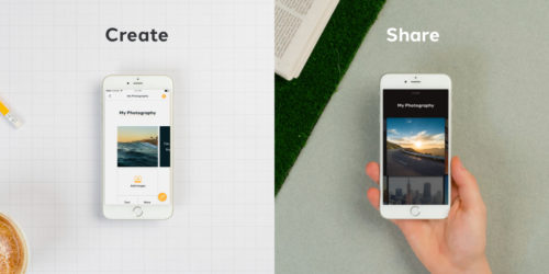
Monogram, the iPhone app by MOO
What are the current challenges facing product UX/UI design? How do you see these challenges changing the industry?
I’ve now been designing interfaces for almost 20 years, and while the industry is always evolving, the fundamentals of quality design don’t really change much. There will always be a new technology, such as virtual reality, or in the case of paper and packaging, the internet of things. That will certainly change the medium, but the hardest part will always be to create meaningful products and services. For me this always starts with a person – their needs, pains and desires. Keeping the customer (or potential customer) as the driving force in design is always easier said than done. I commonly ask in our design and product manager interviews when was the last time the person spoke with a customer. In many instances, unfortunately, the answer is never or at least not in the past year. As UX as a discipline has grown and attracted new people, I find it is less and less user-centric which I strongly believe drives innovation and more importantly, simple, elegant easy to use products.
Where do you find inspiration? Who in the industry do you follow?
We moved to London from Bay Area (shout out to Oakland!) over three years ago and we continue to find London and Europe to be an unbelievably inspiring place to live and explore. The museums, galleries and events are endless (Tate Modern, V&A, the Barbican are favorites) – and in London most are also free. You can just wander (and let your mind wander) which is when I find myself seeing patterns and connections in my work. It may be a bit hokey, but I also find much inspiration from my nine-year old daughter. Children see the world with a largely unfiltered and curious mind. She reminds me to be optimistic and believe in the inherent goodness of humans to make the world a better place.
As for specific people in the industry it depends a bit on what problem I’m working on at the moment. Currently at MOO we’re working through how to best collaborate across teams and quickly grow the product and design teams while keeping quality and delight at the center of what we make. I mentioned Peter’s book above, and we’re also referencing Christina Wodtke’s book “Radical Focus” as we try to make OKR’s work for us. Richard Moross, MOO’s founder, is also an incredible leader. It’s rare to have a CEO with such an eye for design and advocate for design and user experience a true market differentiator.
What would you tell someone just getting started or looking to get into the design field?
Design is really about problem-solving. The more problems you solve (or attempt to solve) the better designer you become. I tend to tell new graduates to take a first job in a design consultancy (i.e. Method, IDEO, Smart Design) because it forces you to work on many design problems across a variety of industries. It also helps you hone your client management and storytelling skills. After a few years you’ll likely find moving in-house or to a start-up an easy and fulfilling switch, where you’ll be asked to focus (sometimes for years) on a market or customer. All those problems you solved and learned from early on coalesce into a powerful set of tools for building one of a kind brands and products. Also, don’t take yourself too seriously. Have fun. Hire people who are extremely talented and give them freedom run. Take breaks. Eat a lot of cake.
Read More at MOO’s Chad Jennings: Meaningful Design Starts with People
from Web Design Ledger http://webdesignledger.com/moos-chad-jennings-meaningful-design-starts-people/
No comments:
Post a Comment