The design of a man-made object is only complete when people use it.
What happened?
Charles Babbage designed the first computer between 1833 and 1871. Then came 1984. The Apple Macintosh computer was invented: the birth of a mass-market PC with a graphical user interface and mouse. A completely new operating system was created to navigate information within this graphical interface.
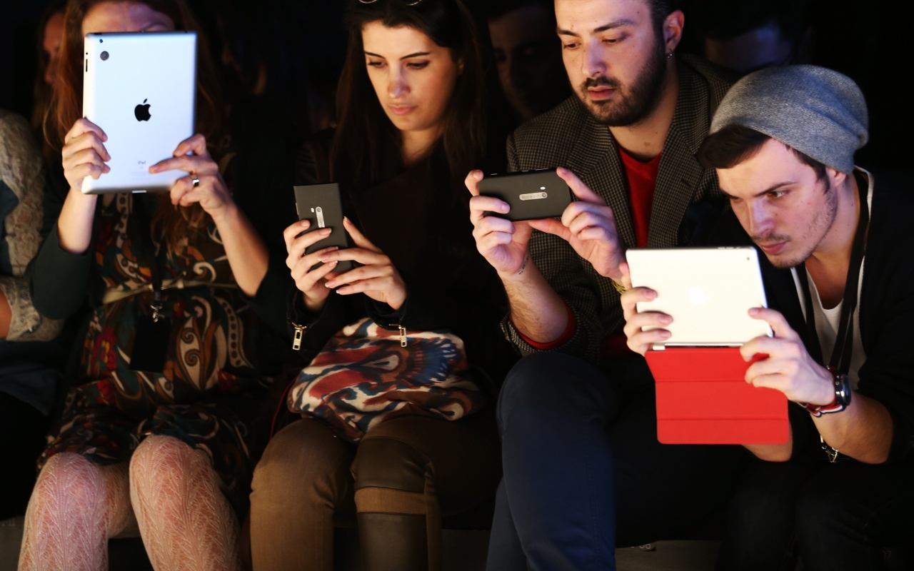
Since then, screens have continued to shrink. We’ve moved from desktop, to laptop, to smartphone, to iWatch, to GoogleGlass, to — well —anything: the internet of things. The amount of smartphone users reaches 1.75 Billion by 2014.
We’re addicted to our screens.
But while creating and consuming information in 2D, we forgot about space.We forgot that information exists across systems, not just within them. And because we are so addicted to what happens inside screens, we forgot how to be human.
The evolving device
We’re discovering that information exist across systems and not just within them. New interfaces are increasingly designed with human habits in mind. Visually, we’re looking to natural surfaces and elements, which further communicate and respond to our human nature.
Material Design by Google Developers is trying to give people access to meaningful content using human behavior and “develop a single underlying system that allows for a unified experience across platforms and device sizes.” It sounds like a step in the right direction and is fun, neat, and colorful.
When we can design across systems, devices will evolve or disappear. We will not stop consuming content, rather consume it in a way that suits human behaviour, not the other way around.
Delivering content that sounds human
Future interfaces deliver content in more meaningful, relevant ways.Content can stimulate all of our senses and be delivered at contextually relevant times.
Fluid Interfaces is part of MIT Media Lab and is designing interfaces, which allow content to flow across systems. FingerReader is a wearable device that assists in reading printed text by receiving audio feedback of the words and haptic feedback of the text layout. Blind people can now read with their finger, an example of the human body as an interface, assisted by technology.
Audio is expanding not only the internet, but also our relationship with the content itself. Audio is an exciting medium to deliver content because unlike visual information, it doesn’t take up space.
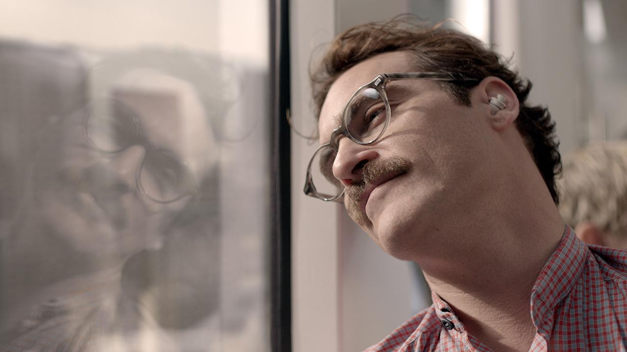
As depicted in Her, we can experience an emotional connection with audio content, because sounds human; and characters and personalities mean that the content is — in a sense human. The Early Edition by Capsule.fm gives content personality using artificial hosts, Miranda and Carl, who read news headlines, weather, entertainment and jokes in between your music. The most sharable and engaging content is actually not necessarily informative content such as news, rather the engaging and personalised audio confessions, artificial jokes and flattery.
Guy Hoffman proves the power of connecting audio with body language. His projects in human-robot interaction combine audio output with posture, which connect with humans on a natural level. In his TED Talk “Robots with Soul”, Hoffman explains how his inspiration from animation and acting resulted in the implementation of body language in robots, which were programmed to improvise music performances.

Still from “Her” by Spike Jonze
Systems are connected
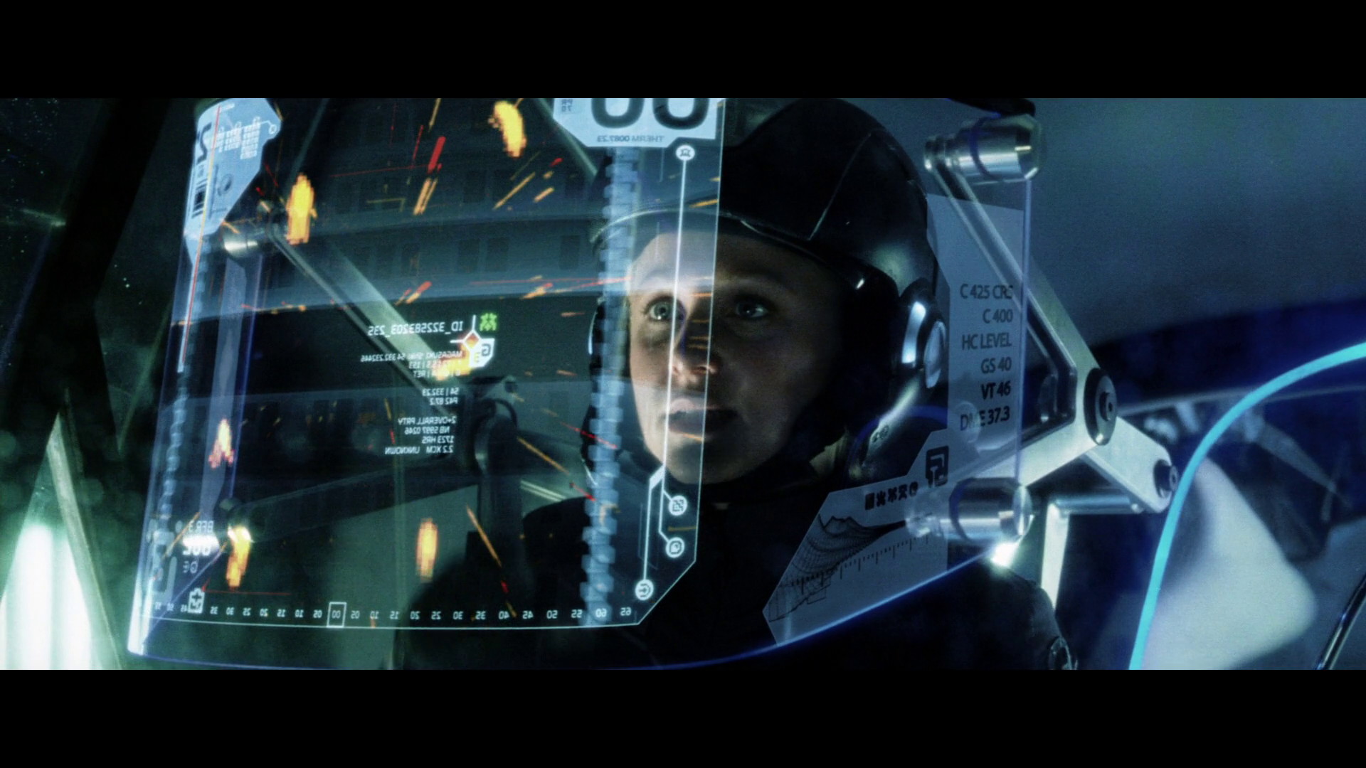
Minority Report offered a vision of the collaborative workspace. John Underkoffler of Oblong Industries worked together with Spielberg on Minority Report and has since delivered a similar technology for the real-world collaborative workspace: Mezzanine. Take a look at the demo Underkoffler presented to Robert Scoble, which shows a truly collaborative workflow.
Elon Musk shows futuristic interfaces and workflows at SpaceX, where the complete design experience has been reimagined, allowing engineers to design more directly in 3D. Implementing a number of technologies, including Leap Motion, Siemens and Oculus VR, as well as NVIDIA and Projection Design. Musk demos the Hand Gesture Holographic Interface to show how SpaceX is improving the engineering and design processes through interaction.

Still from “Minority Report”
The world is our interface
As we increasingly discover that we are no longer constrained to a screen or device, there are new possibilities for interaction with content and our environment. The car offers a unique case for interface design. Here, we should again seek inspiration from human senses, using them compliment the driving experience — or rather — free us to concentrate on driving. Using voice recognition technology and eye tracking technology, as well as new touch interfaces such as Matthaeus Krenn’s proposal for an in-car UI, we can build an intuitive environment, which works together with our own behavior.
Touch is increasingly exciting in interaction design and the future interface, where haptic technology provides a more sensitive and responsive experience with our environments. In his Keynote at Solid 2014, Ivan Poupyrev demonstrates his work with Disney, using haptics to build inspiring, interactive playgrounds with “Beyond Gadgets: Interactive Everything”.

Still from Ivan Poupyrev: “Beyond Gadgets: Interactive Everything” – Solid 2014 Keynote
Contextual content
Not only should the interface be part of our existing environment, the content should react or be generated by our environment. Welcome to contextual content.
Delivering content which is relevant to your context is what we’re building at Capsule.fm and means that information that you hear is relevant to your context: everything from your location, mood, behavior and intentions. Not only do you get the content that you want at a time that suits you, using natural language processing, the content in delivered in an interactive flow.
So say you’ve just heard a news story relevant to your location and in the morning, when you’re on the way to work. We will then bridge that to your music, streamed from iTunes, Soundcloud or WiMP, because you’re on the move. In cases where you are more likely to be relaxing or news is of a different mood, the amount of music and other content is adjusted to suit your context. This is how a morning might sound.
Alive and growing
Systems are living and grow with our input. Our feedback makes them grow and become more intelligent.
As they expand, we can seek inspiration from the natural work in the form of natural surfaces and materials. The iPhone6 Sapphire shows the potential of new materials with light, durable and portable possibilities.
Nature already has design figured out. Constructal law is a universal phenomenon derived from physics to account for design generation and evolution in nature. Adrian Bejan states “For a finite-size system to persist in time (to live), it must evolve in such a way that it provides easier access to the imposed currents that flow through it.” The distribution of imperfection over time generates geometry. If the flows stops, the system is dead.
User experience in this time of information flow are considered in the documentary “Connecting”, where Robert Murdock describes the process of guiding the user to desired outcomes and the interface as a stage in which props (or features) are used to gently direct the user.
Let’s think of content and information as a fluid, living system, which is moving with us during our everyday lives. Let’s deliver and provide access to that stream, in an intelligent, relevant way, which is in tune with human behavior. Let’s rethink interfaces as our world, rather than devices or trapped within an exiting element.
Read More at Design to Make Technology Human
from Web Design Ledger http://webdesignledger.com/design-make-technology-human/

No comments:
Post a Comment