Friday 31 August 2018

The History Of The Android Logo

Android Logo

Are you team Apple or team Android? Regardless of which OS you prefer, you’ve undoubtedly seen Google’s popular Android logo floating around once or twice. We’ve gone over the history of the Apple logo, now it’s time to take a look at the origins of the cute little green dude behind Android.

Android Logo

Irina Blok

The logo that Android launched with and still uses today was created by Irina Blok, who was a big part of the original launch campaign. At the beginning, the logo was intended specifically for developers. After the reveal, individual customers fell in love with the little green robot so much that Google decided to use it as the logo.


“The idea was to create the open source logo (very much like open source Android platform), that was released to the developer community without regular brand guidelines.” – Irina Blok

The inspiration behind the Android logo

There are many critics out there that claim that the design of the android robot was stolen from an old Atari video game called “Gauntlet: The Third Encounter.”

Android Logo

If you take a look at the image above, the is no doubt that they look very similar. Ironically enough, the character in the game is also called ANDROID.


It would be hard to pin the inspiration of the Android logo on any one source. Some even believe that the logo was inspired by the original R2-D2 robot from Star Wars.

Android Logo

Much to everyone’s surprise, Irina has come out and disclosed that there are actually many early design drafts for the Android logo, and this just so happened to be the one they chose.

Android Logo

Given the fact that the design theme of the logo is apparent in multiple different popular games and movies, I highly doubt that it was stolen.


Other than the design, the color was also thought about deeply. The green color, fittingly being called “Android Green” is meant to depict growth, freshness, and prosperity.

Android Logo

Android has quickly taken over

Although Android hasn’t been around as long as some of the other tech giants, it’s safe to say that they definitely have earned their place among the rest. Since its creation in 2003, Android has risen in the ranks and only really has one competitor, Apple. Although there are many Apple fans out there, there are equally as many, if not more Android fans that will never be caught using anything else.


What do you think about the popular logo? Is it a good look for the company, or should google find something new? Personally, I believe that the logo is a big selling point for the devices sold using the Android OS. If Google continues to use this marketing formula, whatever it is, then I’m certain that we will soon be seeing Apple products becoming obsolete.


Read More at The History Of The Android Logo


from Web Design Ledger https://webdesignledger.com/history-android-logo/

Thursday 30 August 2018

Ugly Location Photoshoot Challenge

A few weeks ago, a model friend of mine, Rachelle Kathleen, and I were planning to meet for a fun little photo shoot. Instead of searching out the usual beautiful locations around where we live, I had the idea to do just the opposite. I wanted to go somewhere “ugly” by all conventional photography standards and then see what we could do with it. Lowe’s seemed like the perfect option.

The point was to challenge ourselves. I wanted somewhere with horrible lighting and limited backdrops. Somewhere that made absolutely no sense for a photo shoot. Our local Lowe’s home improvement retail store hits all those points. Before we went in we decided on a few rules:

1. We had to work with whatever was already there. I brought in just my camera without any artificial lighting or props. She simply brought a small bag with a couple outfit options.

2. We couldn’t rearrange the displays or make any big changes. In one instance (as you’ll see later) we moved a cart from the side of the aisle to the center, but then put it right back. We’ve both spent years in the service industry, we weren’t about to leave the workers with a trashed store an hour before closing time on a Sunday night.

3. We’d stop shooting if anyone was in the background. We didn’t want to give anyone any reason to complain, so we went to a place that was completely empty of customers, and if someone did show up, we lowered the camera until they were done browsing and left the area.

Of course, if none of this was allowed we would’ve left, but as soon as we walked in an employee asked if they could help us and I asked, “We were just going to take a few photos, is that okay?”

He replied, “Of course! I was just wondering why she was so overdressed for a trip to the hardware store!”

Since they were about an hour from closing the store was almost completely empty. Anyone we didcome in contact with was super friendly, if not slightly curious. We had a few people stop and watch, but that’s to be expected anytime Rachelle models anywhere. The girl just can’t help but stop traffic.

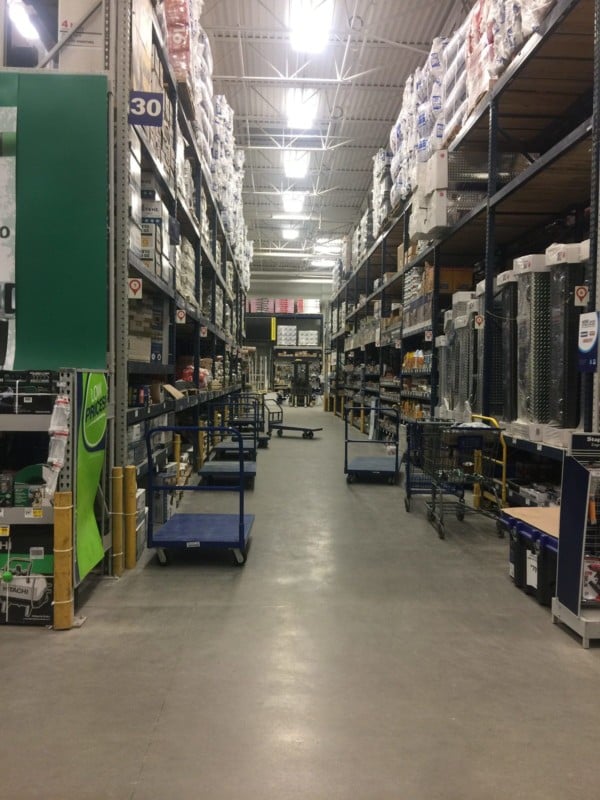
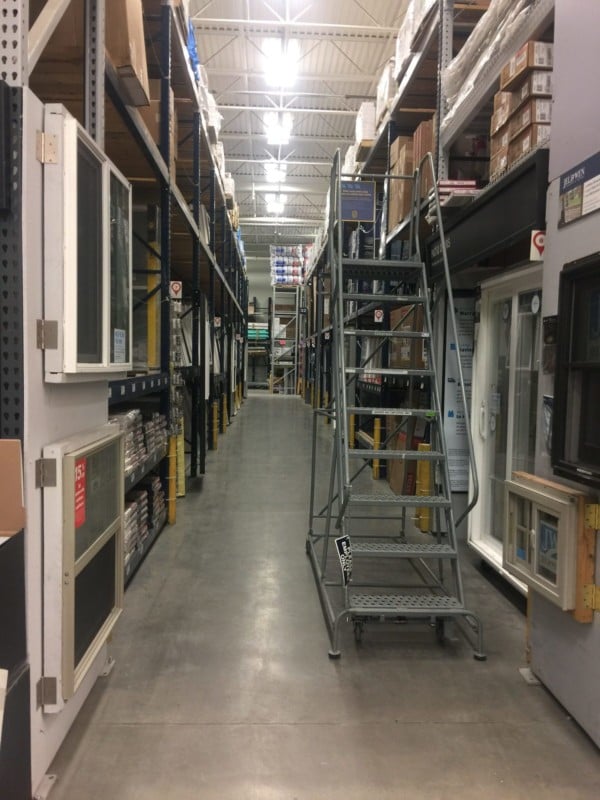
And this is what we got! I’ve included the cell-phone pic of the actual location along with each photoset, so you can see what we were working with.

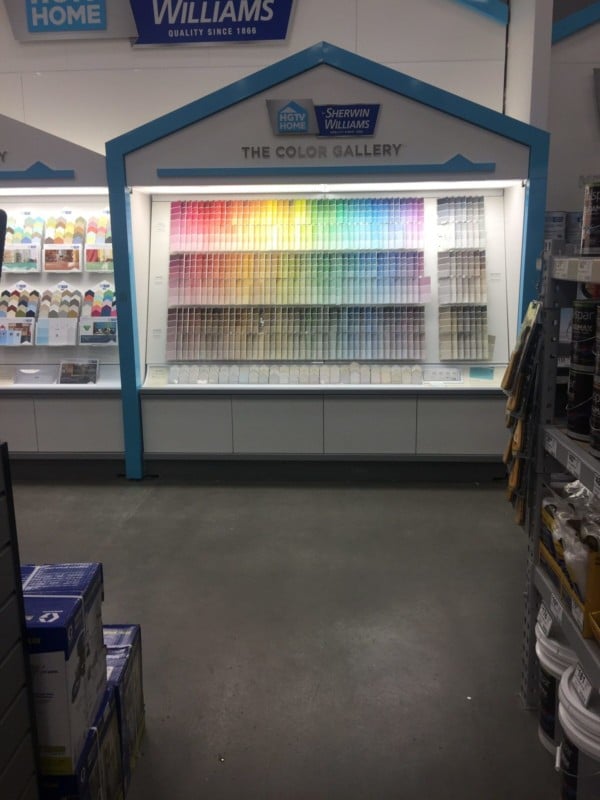
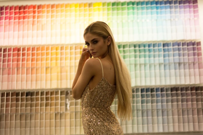
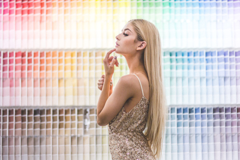
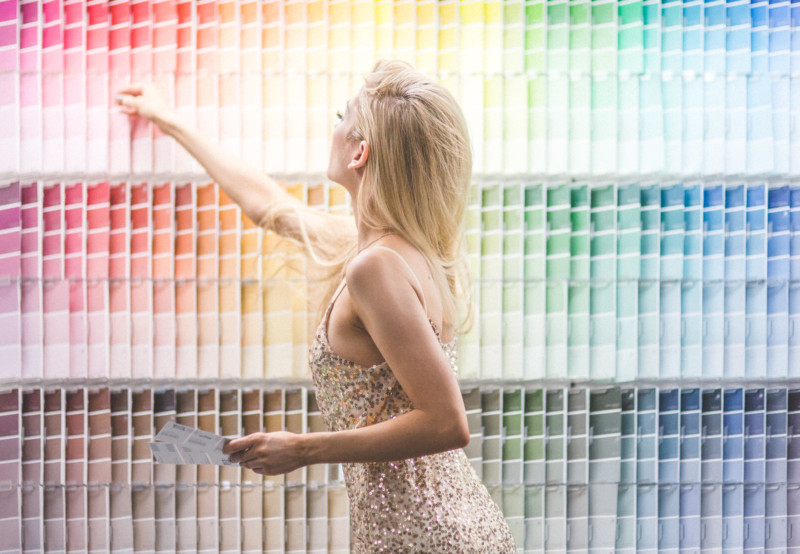
Lowe’s Location 1: The Paint Samples

I have to admit, I have always wanted to shoot in front of these paint samples, so as soon as we walked in the door I made a bee-line right to them. I’m excited I finally got to shoot in front of them – these shots turned out to be some of my favorites ever!

Location Shot:

Straight Out Of Camera (SOOC):

Edited:

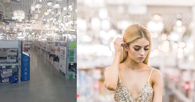
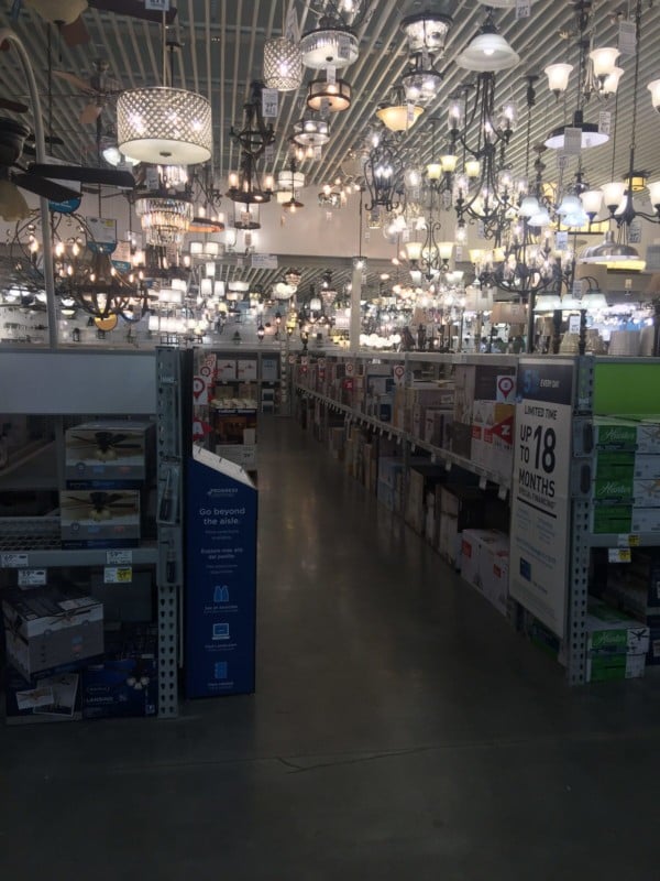
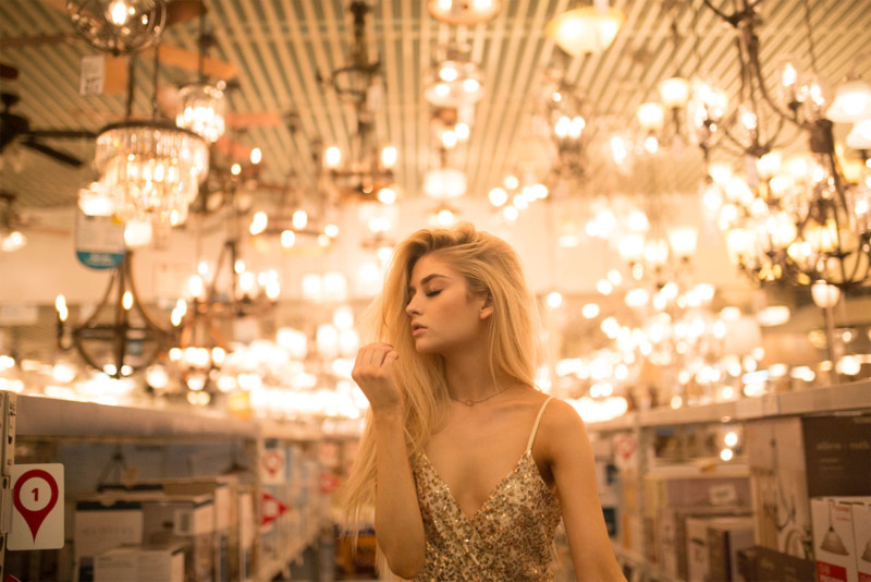
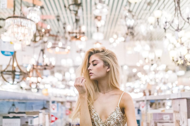
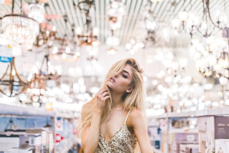
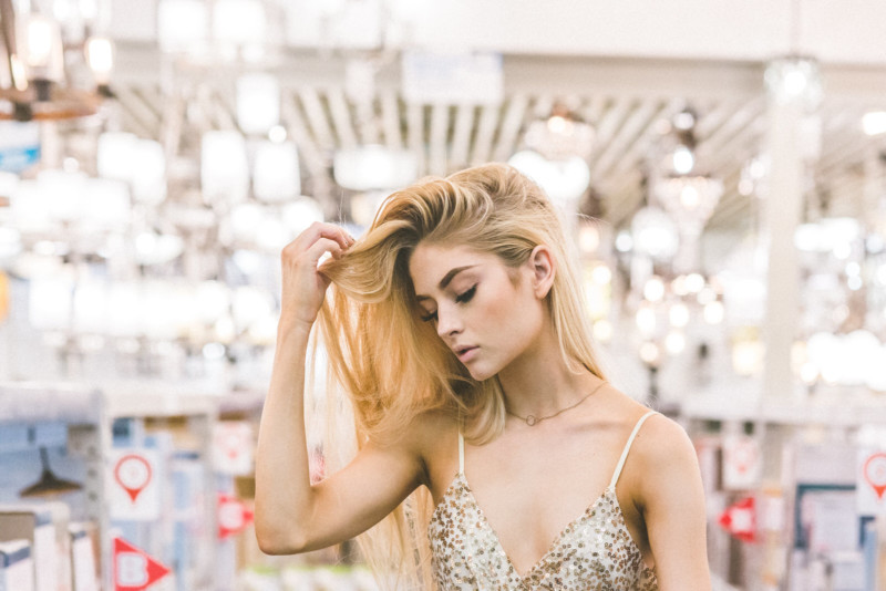
Lowe’s Location 2: The Lighting Section

I was also excited about the lighting section. I’ve always been a fan of shooting straight into the light (though I’ve heard it’s a bit of a no-no). The main problem was the lights were so much higher than we thought…or maybe we’re just a lot shorter than we realized (we’re both barely 5’4″).

I knew the light itself was going to be pretty horrendous, with all the different colors, brightness levels, and shadows, but I was excited to give it a shot. You can see in the second photo what it looked like straight out of camera.

Location Shot:

SOOC:

Edited:

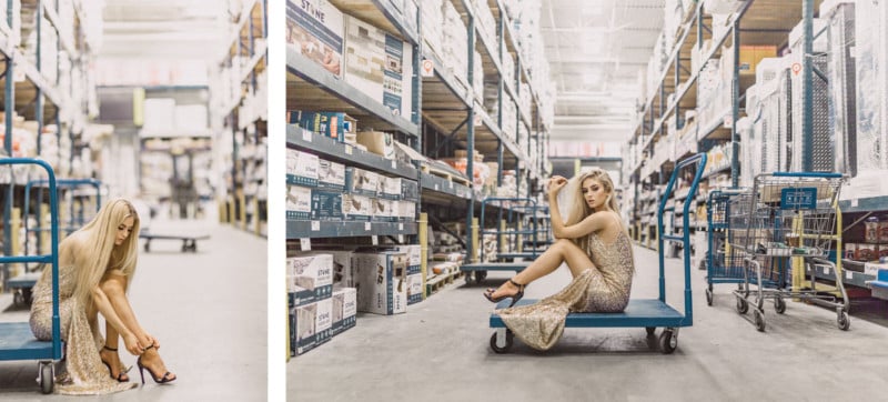
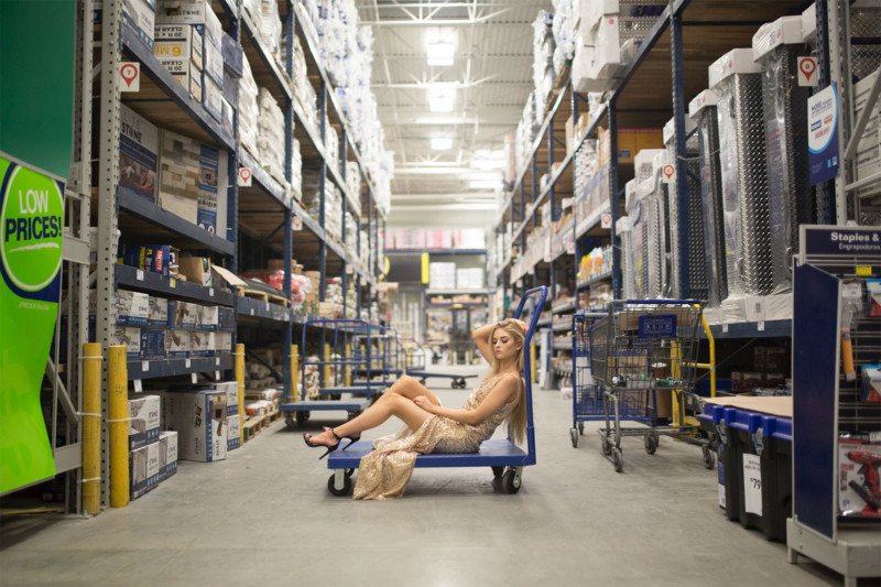
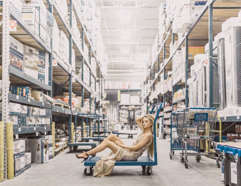
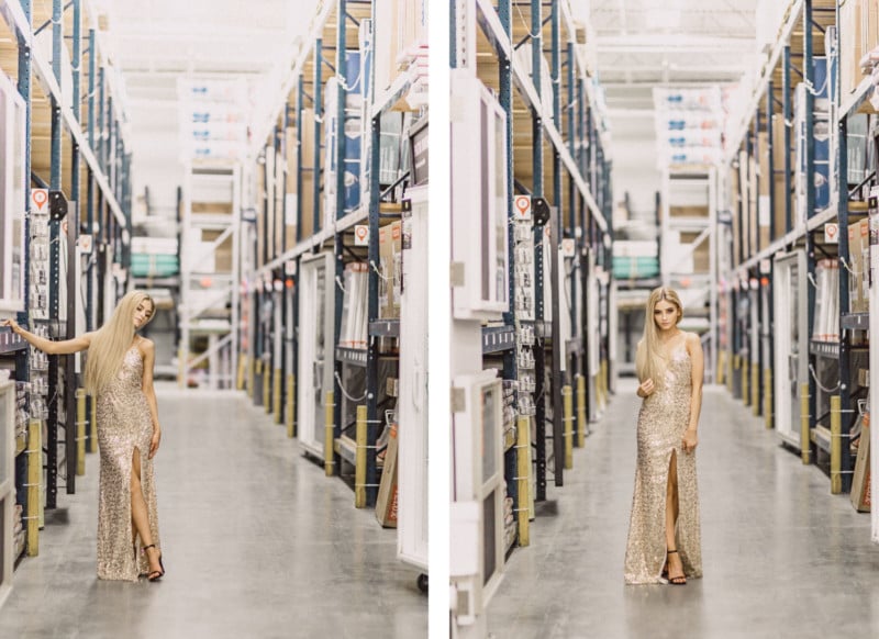
Lowe’s Location 3: The Aisles

Also, yes, we know you aren’t allowed to sit on the carts. An employee was there and gave us permission to keep shooting. Like I mentioned earlier, we were in a pretty big hurry, so she was sitting on that cart for a total of maybe 6 minutes, so calm the hell down, it’s not like we were dancing on them.

And yes, we know there has probably been something pretty disgusting spilled on them at some point, but we really couldn’t care less. Rachelle and I have shot nude in abandoned buildings full of spiders, bats and bird shit, a dry cart really isn’t much of an issue.

We shot in both the larger aisles and the skinnier ones. Here’s the larger aisle:

Location Shot: Aisle 1


SOOC:

Edited:

Location Shot: Aisle 2

Lowe’s Location 4: The Garden Section

I would’ve loved to spend more time in the garden section, but the store was closing and we were running out of time. We spotted a cluster of fake shrubs and I had her kneel down in front of them so I could fill the frame. It’s too bad we had to move on so quickly – this was actually the best lighting we got out of the entire store! If we had been there in the daytime, it probably would’ve been even better!

I knew I wanted to edit the finished photo with a kind of moody, wintery look. So even though the raw image really wasn’t too bad, it still needed some adjustments to get to what I wanted it to be.

Location Shot:

SOOC:

Edited:

Overall, this was a really fun challenge! Not that I’d invite an actual client to ever do a Lowe’s photo shoot (I mean, never say never), but I was pretty happy with the result! Horrible location for the win! Next time you see an awful spot, maybe give it a chance, you never know what you might end up with.


About the author: Jenna Martin is the founder of PhotoFern.com and a fine art and underwater photographer based out of Billings, Montana. After acquiring her Master’s in Psychiatric Rehabilitation, she made a drastic career change into the field of photography where she has been producing surreal images ever since. You can find more of her work and writing on her website and blog, or follow her via Instagram or Facebook. This article was also published here.

Read More at Ugly Location Photoshoot Challenge


from Web Design Ledger https://webdesignledger.com/ugly-location-photoshoot-challenge/

What Happens When 18 Countries One Photoshopped One Woman

featuredperception

A few years ago, Journalist Esther Honig published a viral series of images showing how different countries around the world would retouch a portrait of a woman according to their beauty standards.

This is the original portrait that was sent out to 18 freelance designers in 18 countries around the world:

ORIGINAL-IMAGE_tagged

Here are the simple instructions that were given by the market agency Fractl, which was commissioned for this project:

Photoshop her form. The idea is to Photoshop and retouch this woman to make her more attractive to the citizens of your country. We are looking to explore how perceptions of beauty change across the world. Multiple designers are involved. You can modify clothing, but her form must be visible. No nudity. All other changes, including those to her shape and form, are up to you.

“We focused on female designers, as we wanted a woman’s view of what her culture finds attractive and to understand more about the pressures they face,” the project says. Here are the Photoshopped images that were sent back:

Argentina_tagged

China_tagged

Colombia_tagged

Egypt_tagged

Italy_tagged

Mexico_2_tagged

Netherlands_tagged

Peru_tagged

Phillippines_tagged

Romania_tagged

South-Africa_tagged

Spain_tagged

Syrua_tagged

UK_tagged

Ukraine_tagged

USA_tagged

venezuela

“The goal of this project is to better understand potentially unrealistic standards of beauty and to see how such pressures vary around the world,” the project says.

The experiment found that…

Some of the designers kept the woman looking like herself, while others made her look like a completely new person.

Some countries gave her an exaggerated hourglass figure, while others gave her an apparent BMI of 17.5, or near anorexic.

China and Italy returned the thinnest Photoshopped figures (China’s had an estimated BMI of 17), while Spain returned the heaviest.

“Beauty cannot be judged objectively, for what one person finds beautiful or admirable may not appeal to another,” the experiment concludes. “And the range of depictions found in our study appears to confirm this notion.”

The team behind this project is planning to do future experiments to further explore perceptions of male and female beauty.

Read More at What Happens When 18 Countries One Photoshopped One Woman


from Web Design Ledger https://webdesignledger.com/happens-18-countries-one-photoshopped-one-woman/

Stunning Digital Museum of Fine Art In Paris

digital museum

A new museum joins the world wide known touristic attractions from Paris. The new digital museum of fine art opened its gates for the public and the people simply can’t get enough of it. It’s called the Atelier des Lumiere.

What makes this museum so unique is that it’s located in a former foundry in the 11th arrondissement. The opening of this museum marks the French capital’s first ever digital arts museum.

Facts and opinions about the Digital Museum of Fine Art

Culturespaces, a private operator of museums and monuments, has overseen the project from the time of it’s creation until now. When you walk in the door, you’ll find yourself surrounded by digitally projected art. Spread beautifully across 10-meter high walls in the massive 3,300 square-meter space.

digital museum

The whole idea behind the creation of this museum was to give people access to art that normally wouldn’t have such access. In addition, the way the art is displayed is meant to showcase the way technology has impacted the way people view art.

These immersive exhibitions can be an introductory way to discover pictorial art and such a digital center was lacking in Paris, explained Michael Couzigou, director of the Atelier des Lumiere.

digital museum

The team that makes the magic happen in the digital museum believe that art culture is drawing closer and closer to digital representations. This means it takes us farther away from the standard paint and canvas.

“People do not learn about culture as they did in the past,” said Bruno Monnier, the president of Culturespaces. “Practices are evolving and the cultural offering must be in step with them. The marriage of art and digital technology is, in my opinion, the future of the dissemination of art among future generations.”

digital museum

The building boasts three main exhibition rooms. Two of those three rooms are strictly dedicated to Austrian painter Gustav Klimt and an entire century of Viennese paintings, which include work by Egon Schiele and Hundertwasser.

“We decided to focus on Gustav Klimt, on the centenary of his death, for three reasons: the variety of his expressive forms, which range from classicism to early impressionism, and his quest to create a ‘total art’ during the secession (an art movement at the turn of the 19th century), his fame, and the poetic and romantic nature of his oeuvre, which we saw as an ideal starting point,” said Couzigou.

“We are also including a short programme devoted to the painter and architect Friedensreich Hundertwasser, who was influenced by Klimt’s work.”

digital museum

The third room is dedicated to up coming artists that wish to display their work. It features digital and AI installations.

Final thoughts

It’s no secret that digital art is on the rise. As technology advances, so will everything else, including art expression. I see it as just another way for creative minds to use their talents to unlock the secrets hidden in their mind. Without this technology, we may never get to experience what it’s like to see through the eyes of these individuals.

digital museum


Read More at Stunning Digital Museum of Fine Art In Paris


from Web Design Ledger https://webdesignledger.com/stunning-digital-museum-fine-art-paris/

Wednesday 29 August 2018

30 Best Free Calendar & Datepicker jQuery Plugins

calendarjqueryplugin

Some might assume that an Internet loaded with free code would breed indolence. Yet it seems developers are willing to contribute their help to projects more than ever before. JavaScript libraries are a microcosm of the larger open source community - specifically jQuery with its ever-growing popularity and easy learning curve.

One such area of broadened potential would be jQuery-based calendars for websites. Although date & calendar interfaces have sparse usage, they come in handy for very specific circumstances. And when building a site that requires this type of interface you'll be happy to know there are dozens of open source plugins available.

I've catalogued the 30 best free jQuery plugins that offer datetime functionality. Some are more developed than others and each plugin has its own set of benefits. The best part about using open source code is that it's easy to customize for your own purpose. So peruse through this collection and take a look at any plugins which pique your curiosity...

The post 30 Best Free Calendar & Datepicker jQuery Plugins appeared first on Vandelay Design.


from Vandelay Design https://www.vandelaydesign.com/30-best-free-jquery-plugins/

Northwell – The Handwritten Font You Didn’t Know You Needed FOTW#

Northwell

In this week’s installment of Font of the Week, we’re going to be taking a look at some of the work of the very talented sam Parrett. In particular, we’re going to highlight the font named Northwell.

Northwell

Northwell is a handwritten, rustic font that offers homemade sense to whatever design it’s attached to. The brush strokes and signature style make this the perfect font for any branding or home-ware designs.

What would Northwell go well with?


The font gives a personal touch to anything it finds itself on. It would be perfect for some inspirational signage hanging in a farm-style house, studio apartment, or cozy office space.

Northwell
It’s also a great choice for business cards, wedding invitations, or trendy packaging. It’s all about that handwritten, personal vibe nowadays, and the star font hits it dead on.

Northwell

What’s in the package?

In Northwell’s total package, you get 3 font files.


  1. Northwell – The handwritten script font with uppercase and lowercase characters, numerals, and a very large selection on punctuals.


  1. Northwell Alt – This is the second version of Northwell. It contains a completely new set of uppercase and lowercase characters. If you’re going after a truly handwritten feel, you can swap between the two versions to avoid repetition.


  1. Northwell swash – The swash file is a set of 20 hand drawn swashes to complement your text. To use it, install it as a separate font, select it from the font menu, and use any A-U character to create your swash.

The amazing work of Sam Parrett

Sam is no stranger to brilliant work. You’ll find that Sam creates quite a few massively detailed fonts that will make any project of yours stand out wonderfully.

Setsailstudios.com is an entire website dedicated to Sam’s work. It’s packed to the absolute brim with custom fonts that you’ll adore. Go and take a look, and I’m sure you’ll find exactly what you’re looking for. You might even find some nice freebees along the way.

Northwell

We hope that you liked this article and the Northwell font. If you liked what you saw, be sure to give it a download and personalize any project you’ve been working on.

Read More at Northwell – The Handwritten Font You Didn’t Know You Needed FOTW#


from Web Design Ledger https://webdesignledger.com/northwell-a-rustic-font/

A Collection of 20 Well-Designed Portfolio Sites

Every designer or artist wants to have the best possible online portfolio to showcase their work in a manner that will convert visitors into clients. That’s the desired result, but how does a portfolio have to be to deliver those results?

The answer is that it’s all relative. Even if we like it or not, the answer actually depends on the person that’s viewing the portfolio, because ultimately, that’s the person who decides if he hires you or not.

Even though that’s a little bit discouraging for some, there are still standards that we can follow as designers to create the best portfolio website. First of all, the portfolio has to be useful. It needs to put focus on your work and not on the aesthetics of your website.

If the only impression that the visitor has about your website is regarding its looks and appearances, then you may have lost a client. If, however, the visitor remembers your work primarily, then you have a possible client and that’s what you need to aim for.

I’ve followed discussions online and talked to people who have searched for a designer to contract for a few years now and I have also written previous articles about it and I’ve noticed that are a few characteristics that people look out for.

For example, a portfolio needs to have a clean style and eye for details. A simple site to make the work shine will most of the times get the clients that you want. You should keep the site as minimal and as product-focused as possible. This shouldn’t be because the products speak for themselves, but because most of the time people that are visiting portfolios might be busy and won’t have much time to deal with your heavy loading animations or effects.

Still, you don’t have to develop a hate against modern websites with dynamic graphics generated by SVG or jQuery animations. For some designers, these are quite useful and show the visitor what he is capable of. Of course, if you fall into this category you must show restraint when it comes to what you put in your portfolio. Add too many ‘pretty things’ to your portfolio and some older folks will think it’s a Geocities trend all over again.

In this article, you will see a collection of modern portfolio sites that you should take as examples. They showcase various styles, from which you can take away a little something.

20 Well-Designed Portfolio Sites

Ivo Mynttinen

portfolio sites

Haraldur Thorleifsson

portfolio sites

Davey Heuser

portfolio sites

Mig Reyes

portfolio sites

Jonathan Suh

designer portfolio

He’s a multidisciplinary developer & designer based out of the Northwest Indiana/Chicago area.

He primarily creates digital things for the web. By day he’s building stuff with the awesome folks at Juice Interactive.

Bethany Heck

designer portfolio

The portfolio of Bethany Heck, graduate in Graphic Design from Auburn University. Her work has been featured in New York Magazine, the New Yorker, Wired, Smashing Magazine, Uppercase Magazine and several other international publications.

Mike Kus

designer portfolio

Mike is a UK based designer specialising in Web/UI Design, Graphic Design, Branding, Illustration & Photography.

He has a worldwide client roster and his work is regularly featured in design related publications. Mike is also a regular speaker at design/tech conferences.

Greg Washington

designer portfolio

Brave the Woods

They are a design and illustration studio based out of Austin, Texas, whose work also happens to be their passion, hobby, and gift (conveniently).

Brave the Woods is not simply a name, it’s a call to action, to be adventurous and curious. It is what they believe and how they work.

By doing so they make connections, experiment, collaborate, get inspired, and ultimately discover creative solutions. Executing those solutions is something they do with great pride and craft.

Eric Huguenin

Sylvain Weiss

He’s an Art Director & Designer living in Paris, France. His career started in 2006, and along the years he worked for some recognized agencies and clients.

Fahrenheit

Over the last 7 years, Fahrenheit Marketing has become a trusted name in Design, Development and Marketing consulting, serving enterprise level clients as well as established local businesses seeking to increase their profile and the reach of their brand.

Joe Allison

designer portfolios

He’s a passionate Digital Designer and Creative Developer, with a love for digital storytelling. He’s obsessed by usability and constantly looks to create intriguing and concept enhancing interactions that remain intuitive for the user.

He’s obsessed with details and feels strongly about the importance and benefits of prototyping during the design stage of a project. He has a love for typography, which has him constantly looking for ways to improve the typographic nature of the digital space.

Green Chameleon

Green Chameleon is a creative solutions agency founded by a group of talented creatives and marketers. They combine clear thinking with cutting-edge design and technical development to help drive their clients’ businesses forward within their respective industries.

Whether you are a business owner, marketing manager for a multi-national firm, or anywhere in-between, they love to combine your expertise with their creative and technical skill set to begin a unique and forward-thinking partnership.

Jimmy Raheriarisoa

Interactive Red

Interactive Red is a digital agency based in Kent and with over 10 years experience. They have a full team of designers, developers and consultants that deliver your project with the care and passion it deserves and they do it in plain English.

Marcelo Duende

Kreativa Studio

Kreativa is a forward-thinking studio founded in 2008. Their team consists of talented good people that are in search of progress and ways to break boundaries.

Focusing on the design and development of websites, applications, logotypes and more, they always use modern technologies and try to solve their clients’ problems in new and unique ways.

Ryan Gittings

Patrick Monkel

He’s a freelance designer based in the Netherlands. For the past years, he’s had the pleasure of producing digital art, print and online for a wide range of companies and publications worldwide. He’s worked with clients such as Tribal DDB, NOS, VPRO, Digital Natives, Philips, Born05, ID&T, Meredith and Computer Arts.

The post A Collection of 20 Well-Designed Portfolio Sites appeared first on SpyreStudios.


from SpyreStudios http://spyrestudios.com/a-collection-of-20-well-designed-portfolio-sites/