Wouldn’t it be nice to make a beautiful, highly-functional and UX-optimized website? Especially so without constantly being constrained in your efforts due to a lack of time? A limited budget can also be annoying at times. The answer always seems to be that you have to work harder and accept results that might be satisfactory. Yet, they fall far short of what you had envisioned.
It’s never a nice feeling to know you could have done better if only you had the time and money to do so. There’s a way out of this dilemma, and you may find it a surprisingly simple one. It doesn’t involve a pact with the devil, selling your first born, or even worse, plagiarizing.
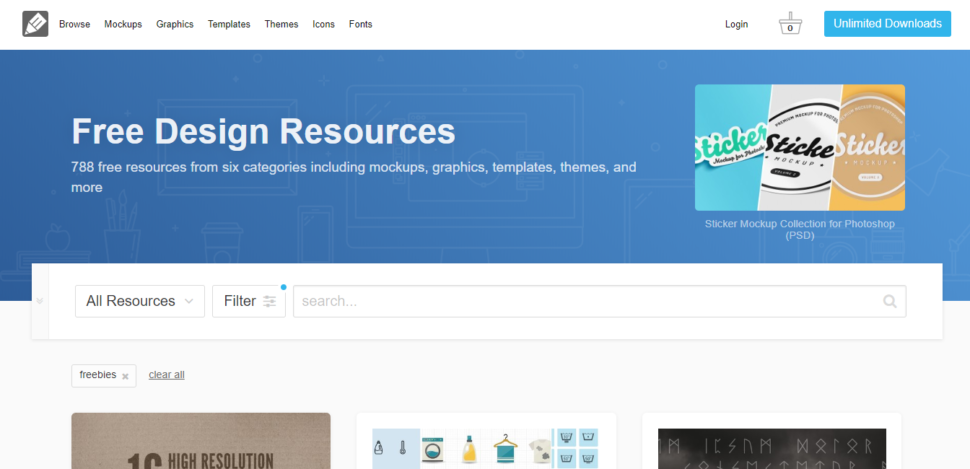
What it does involve is pre-built websites. These are the design aids that are in tune with existing industry design standards. They come pre-packaged with an excellent UX design.
Introducing Be Theme, the Premier Source of Pre-Built Websites
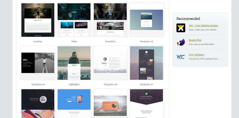
Be Theme is one of the best, if not the best, go-to resources for pre-built websites. It has a selection of over 370 and counting that address more than 30 different industries. Yes, you can have so many pre-built websites at your disposal. Then, there’s not much involved in finding a suitable theme for any business website.
As far as saving time and money is concerned, you can easily customize a website from tip to toe. In fact, you will have it up and running in half a day.
Using prebuilt websites when you have limited resources
Here are ways you can use pre-built websites in your quest to deliver a stunning business website. You can do so quickly and with limited resources.
Find eye-candy color schemes that stand out
It can be tricky, and sometimes a little exasperating to try and find a color scheme. Especially if you are looking for something in perfect tune with a business client’s wishes. Once you come across the right color palette, you still have to take care of it. It should not clash with or overwhelm the website’s content.
You won’t have to concern yourself with either of these issues when you use a pre-built website. Be Theme features a collection with 30+ different industry sectors covered. Each of them comes with its choice of color palettes.
Your savings will be in terms of time spent researching. Also, you will save a lot of time negotiating with your client. This is not to mention the time it can take to make proper use of a given color palette.
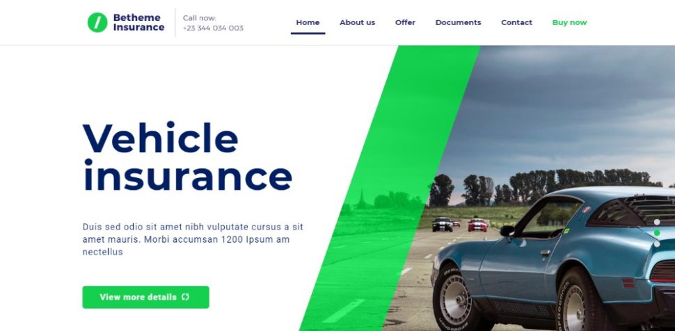
BeInsurance2
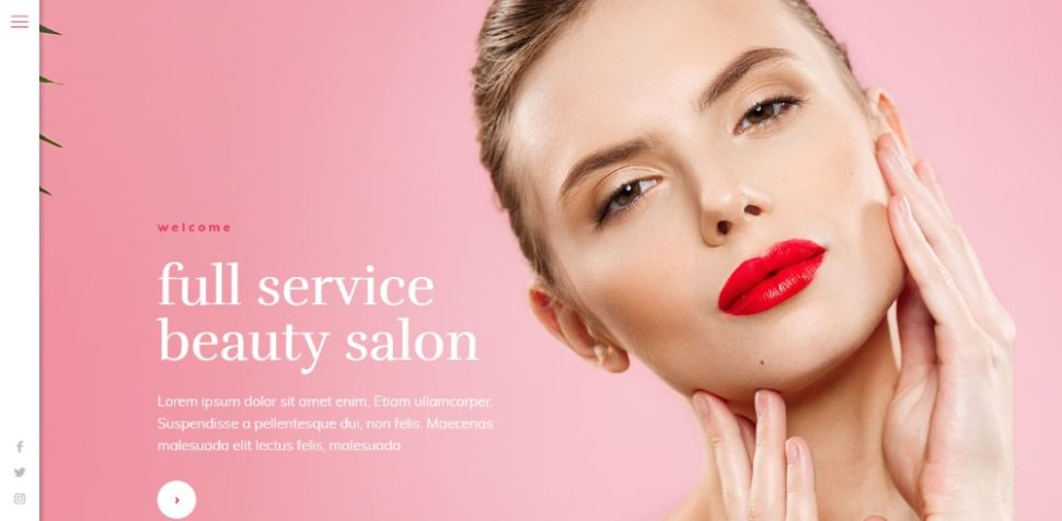
BeBeauty3
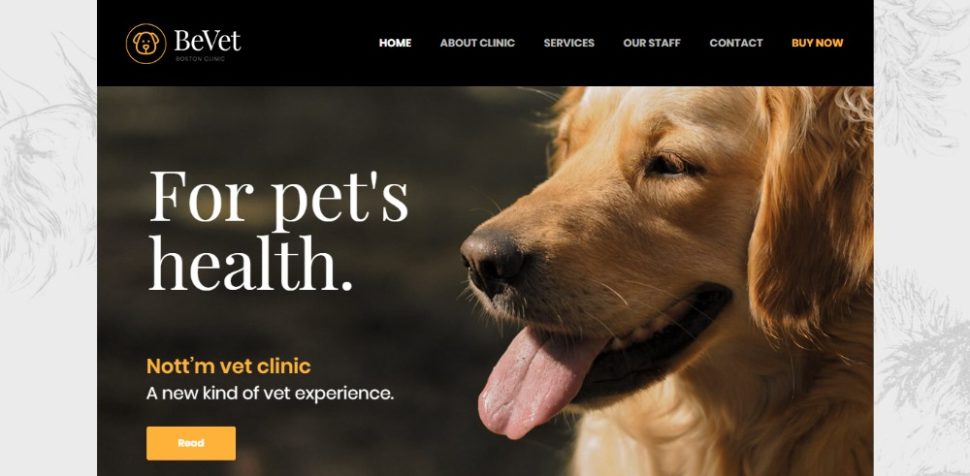
BeVet2
Follow trends without spending hours on research
Keeping up with the latest trends is a key to a successful career as a web designer. Most web designers know this. Most of them have a problem keeping current because of the sheer volume of work they are faced with day in and day out.
So, following the latest design trends ends up near the bottom of the barrel as far as priorities go.
Be Theme prides itself in keeping up with the latest trends. This is evidenced in their pre-built websites in addition to their other core features. You needn’t feel ashamed or neglectful if you’re not on top of the latest trends. That’s been taken care of.
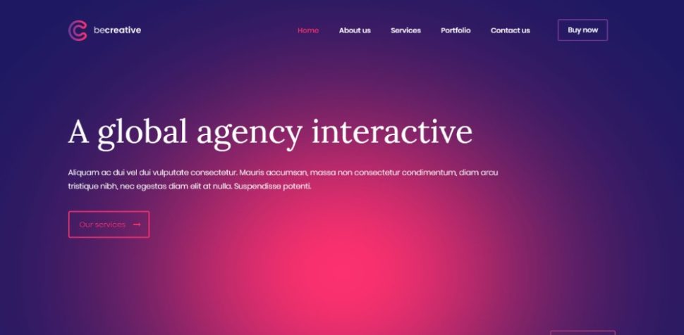
BeCreative3
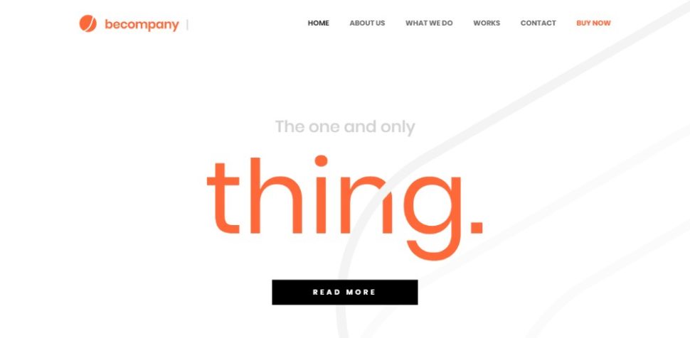
BeCompany3
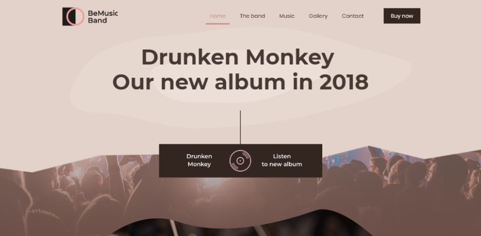
BeBand2
Build interactive websites that create a memorable experience
Building an interactive website has its own set of rules and tricks of the trade. Done correctly, your website should have no trouble attracting and engaging visitor. It will easily entice them to stick around for a while.
You can choose parallax sliders, scrolling effects, animations, or all the above. Either way, there are many ways they can be worked into your website designs. Creativity is key here, but creativity suffers when the time is short, and the budget is scarce. This is where pre-built websites with interactivity build in can save the day.
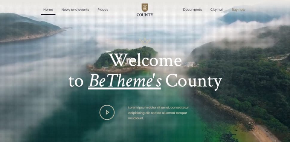
BeCounty
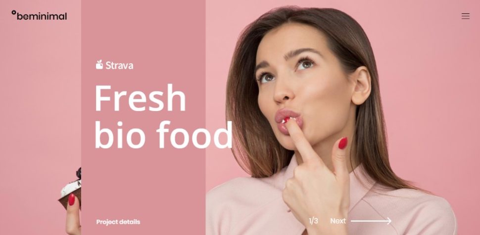
BeMinimal2
BeNavigation
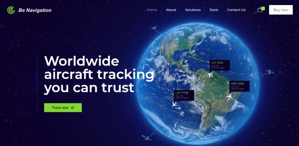
Designing a perfect look for a client’s specific business
There is a problem of defining a perfect look. It is that the meaning is usually different from one business type or niche to another. Once you’ve settled on the perfect look, you have to act fast since some trends change with the seasons. Last year’s perfect look won’t always satisfy this year’s clients’ requirements.
Do not wander around for the perfect look at the expense of getting real work accomplished. Instead, why not choose a pre-built website that’s already in tune with existing standards?
By doing so you’ll be well on your way to matching your client’s business to a T.
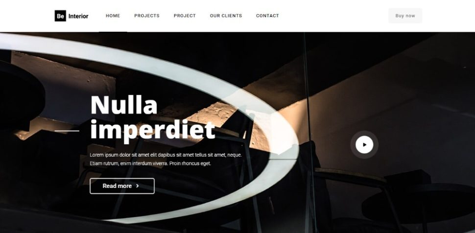
BeLawyer4
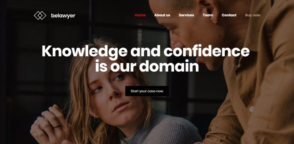
BeMovie2
BeInterior3
Get the perfect UX without building from scratch
Books have been written and courses have been given on UX design. It’s a skill that many web designers have yet to master. Consequently, it typically takes lots of time to build a flawless user journey. You could farm the design work out, or simply give it your best shot in the time you have available.
Do not compromise quality to avoid blowing your budget or missing a deadline. Instead, it is better to use a pre-built website that comes pre-packed with an outstanding UX.
BeERP
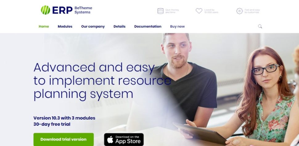
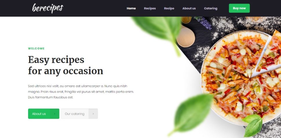
BeRecipes
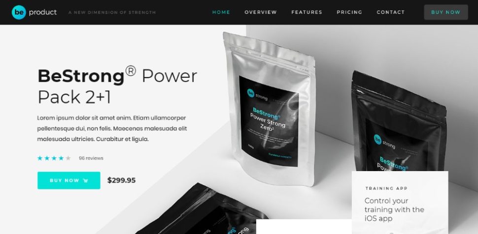
BeProduct
Conclusion
If you’ve been a web designer long enough, you know that working with limited resources is par for the course. Try as you might, it’s a lose-lose situation that’s hard to avoid.
You’re sailing along fine one moment, and you find yourself with too much work on your hands the next. Day to day interruptions take a toll on your efficiency as well.
You shouldn’t really have to work all-nighters or hope that maybe you’ll have some free time next weekend.
That won’t be the case when you have a wide variety of pre-built websites to choose from and work with. Be Theme has more than 370 of them. They address more than 30 different industries. They come pre-packed with color schemes, automation, and special effects. The top-notch UX features and functionality are also there!
Enjoy!
Read More at Trying to Create Stunning Designs with Limited Resources? Here are 7 Ways Pre-built Websites Can Help
from Web Design Ledger https://webdesignledger.com/trying-to-create-stunning-designs-with-limited-resources-here-are-7-ways-pre-built-websites-can-help/