Believe it or not, dark backgrounds in UI web design are beneficial in many different ways. Depending on the overall theme of the web page, it may or may not be a good fit for the job. Instead of debating whether or not you should use a dark background in UI, let’s talk about why they’re always a beneficial choice.
The aesthetic
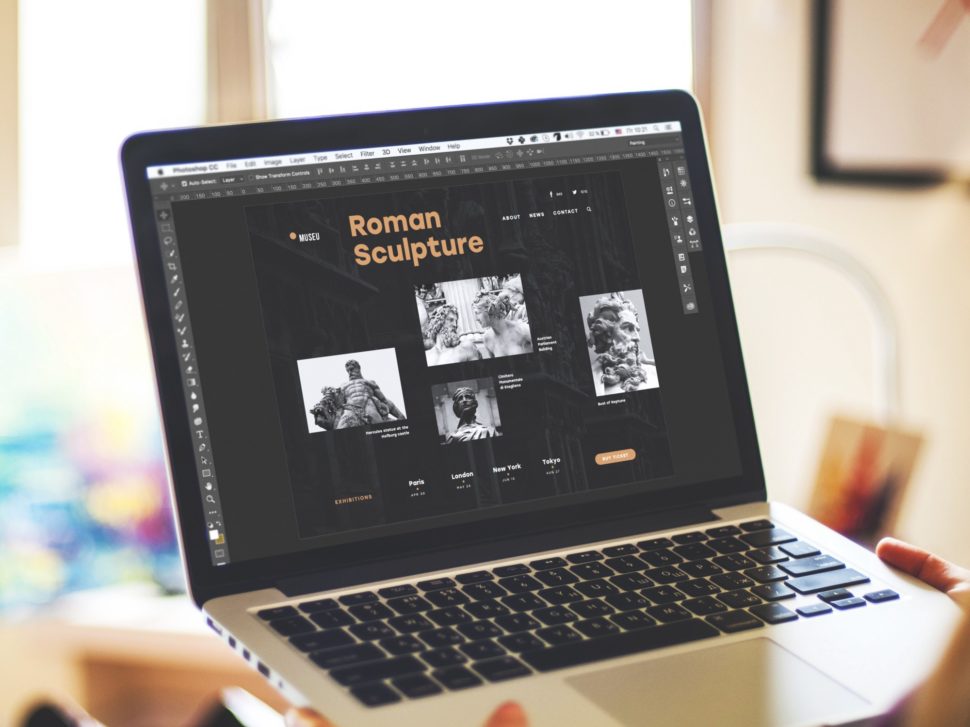
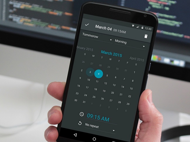
In recent years, dark colors have taken not just the web design world by storm, but design as a whole. People are reverting to darker colors now more than ever. There are many reasons for this, but it’s mainly for the wild contrast.
Let’s say you want an image to stand out. Typically speaking, most images are lighter in color. There’s no better way to make sure someone sees it than to drop it on a dark background. It’s definitely a simple technique, but it’s also one of the most effective.
You do have to be careful, though. If your text isn’t light enough, or if it’s too thin, it will be unreadable. But, if you’re using normal sized fonts, you should be okay.
Dark backgrounds save
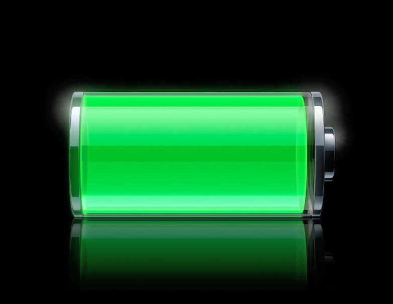
What do I mean by that? Well, dark backgrounds are proven to save electricity and be less harsh on your eyes. Think about all the “night-mode” options we have for our devices nowadays. All that they really do is change the backgrounds from a light color, to black. Dark backgrounds produce less light, and therefor save energy and our eyes.
In addition to being less harsh for your eyes, a lot of medical conditions can be triggered by bright flashes of color. It’s highly unlikely, but it’s something to definitely consider.

When dark backgrounds in UI are not good
Although dark backgrounds are the go-to for web designers, there are some cases when they aren’t necessarily ideal. Here are a few examples and reasons the dark side may not be a good choice:
- If the screen the background is being displayed on isn’t backlit, the text will be impossible to read.
- If there’s too much ambient light, the light colored fonts will be washed out, and all you’ll see is the dark background.
- Like I stated before, if the fonts are too thin, they will be overtaken by the darkness, and you won’t be able to see them.
- In some cases, small screen scratches are more visible with darker backgrounds.
As you can see, the advantages of a dark background in UI greatly outweigh the disadvantages. You can technically consider this use of dark backgrounds a trend, but I definitely don’t see it ever going away.
What do you think? Are dark backgrounds in UI here to stay, or will something else take their place? If you like information like this, and want to keep up with the latest web design trends, be sure to stay tuned to Webdesignledger!
Read More at The Benefits of Dark Backgrounds in UI
from Web Design Ledger https://webdesignledger.com/benefits-dark-backgrounds-ui/
No comments:
Post a Comment