Building a presentation website for a small business is a popular activity for many web designers; and the same might also be true for you. Small business websites need to be clean, crisp, and loaded with personality; giving you the opportunity to demonstrate your design skills in the best possible light.
While every small business has its unique characteristics, their websites must provide a good UX, take advantage of customization and branding options, be responsive, and include special pages that support their individual business models.
This popular WordPress theme provides the ideal solution for these needs, with its more than 220 professionally-designed and customizable pre-built websites. Over 45,000 professional web designers rely on this WP theme for their small business and other website projects.
- Be Theme is easy to work with – no coding is required
- There is never a problem finding a pre-built website that is perfect for your needs.
- Pre-built websites can be installed with one click;
- The latest design trends are represented.
- Be is designed with quality in mind.
20 Pre-Built Websites That Are Changing the Way You Design for Small Businesses
Be Theme sets you up nicely to respond to the way in which small business clients often operate.
- You will generally be working with a small team, so decisions can be made fast.
- You can help the process along by using a pre-built website in place of a mockup. Your client will view your design faster, in greater detail, and with superior functionality.
- With the help of Be Theme’s visual builder, you can make changes fast and on demand. You will Keep the design process simpler for all parties involved.
- You can zero in on the fine details without having to spend an amount of time in doing so.
Examine these 20 examples of pre-built websites for small businesses. The first three show how they provide a strong base for a solid design.
Before
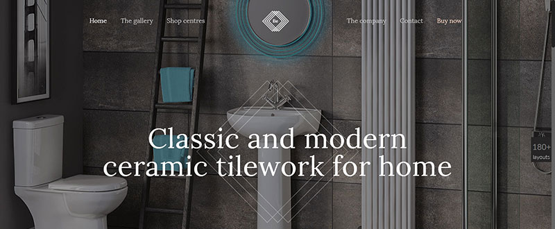
Be Tiles
- This pre-built website shows the product together with the central message – up front
- The graphic elements are laid out as if directed by an architect
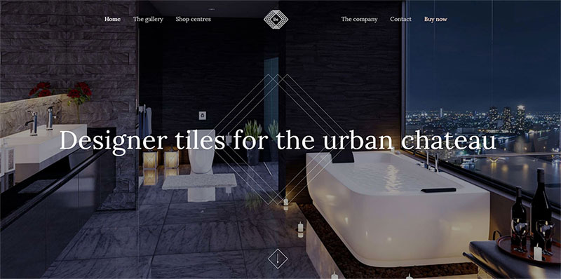
After we changed it
Notice how the imagery and text have been customized to fit the client’s requirements. The UX elements remain basically intact. The hero image engages the visitor, the central message is clear, and navigation is intuitive.
Before
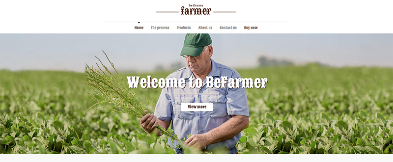
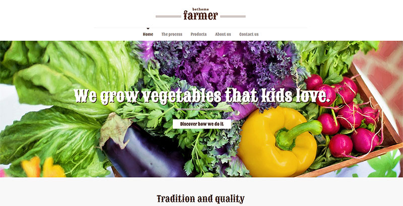
Be Farmer
This pre-built website is destined for use by a farm, a farming operation, or a seller of produce.
- It has a nice human touch, the typography is in keeping with the brand, and there is a focus on a call to action.
- The images are large and clear, and the menu covers the necessary bases.
How would you transform it?
After
You would first change the image to be more in line with your business – a seller of farm produce in this case. The “freshly harvested’ theme remains intact. The font has not changed (it could be of course), and a logo has been added. All of this can easily be accomplished in mere minutes.
Before
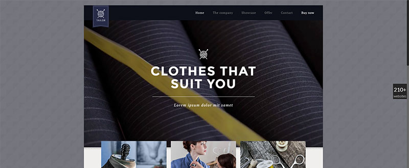
Be Tailor
This pre-built website is for a tailor shop
The graphical elements are consistent with the theme’s concept. From the images, to the messages and typography.
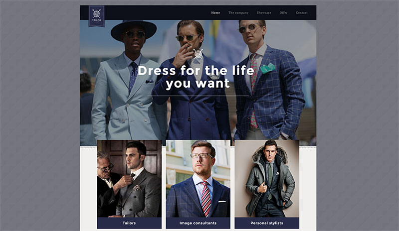
After we made the changes
Starting with Be Tailor, the structure is retained and the basic concept has been adhered to, but the vibe becomes manly, modern, and chic. Note how the subtle change in font creates a slightly less formal experience.
Check out this video and view how fast and smooth it is to remodel a pre-built website into a real working website.
17 more pre-built websites
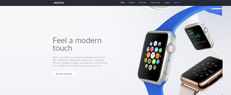
Be Watch
- Ideal for a smart watch shop’s website.
- The hero shot immediately engages the user, and the design is clean, with an abundance of white space.
- The menu is not difficult to find, but it is not intrusive.
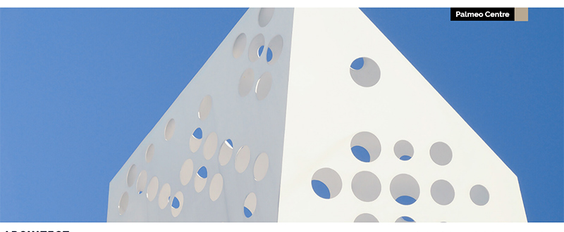
Be Architect 2
- A pre-built website in which the elements combine to produce a unique, interesting experience.
- This example shows one way in which a hero image, even an abstract one, can immediately engage a visitor.
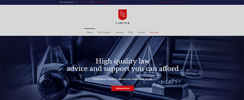
Be Lawyer2
- Corporate elegance on display, but with a vintage look.
- The business’s UVP is clear and to the point.
- An example of how symmetry of design can convey a sense of trust.
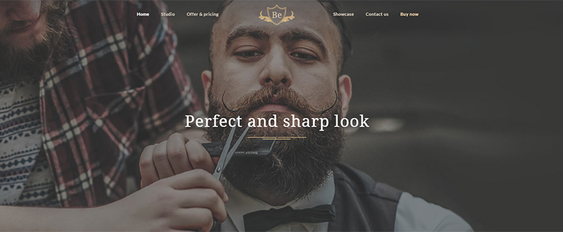
Be Barber 2
- Vintage, professional, warmth – combined for this small business enterprise.
- The design is kept simple throughout this pre-built website, with a generous use of white space.
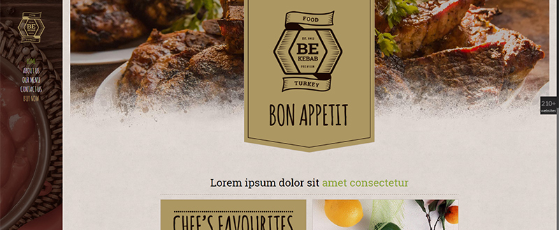
Be Kebab
- Note how the logo, color, and typography nicely complement the imagery.
- A good choice for a small, local business.
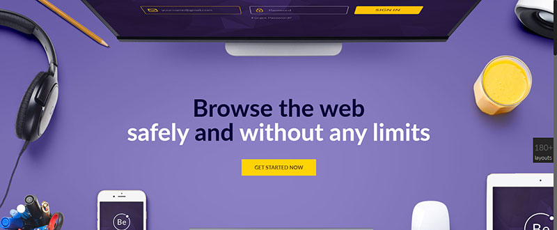
Be VPN
- A formal, well-structured business website – with a human touch.
- White space surrounds the message, with black to white font colors adding emphasis.
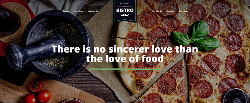
Be Bistro
- Another great example for use by a local business.
- Beautiful, big images, and a good UX to keep users engaged.
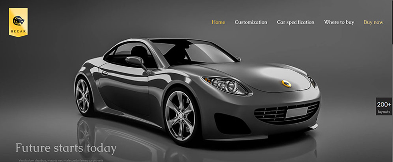
Be Car
- Illustrating the sales power a hero image can have, together with the use of white space and a clever choice of colors.
- A good example of a website design that conveys elegance and luxury.
Be Medic 2
- For a clinic or medical center.
- The focus is on producing a website that is professional and builds trust.
- Special pages introduce team members.
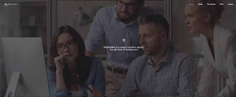
Be Minimal
- Minimalist designs find particular favor with creative enterprises.
- A modern, video header, sends a strong, yet relaxing message.
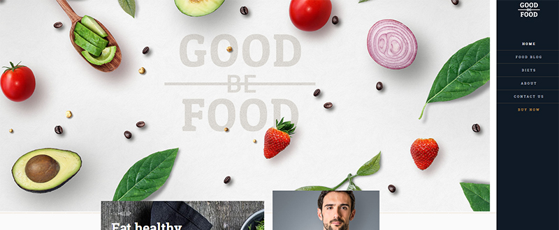
Be GoodFood
- Dedicated to a food service, nutritionist, or dietician.
- Good color and sharp imagery is all-important for a website following this theme.
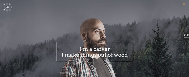
Be Carver
- Note how cleverly the message is made to stand out from the frame.
- This website combines a minimalist approach with plenty of white space.
- A good choice for an artisan looking for a one page website.
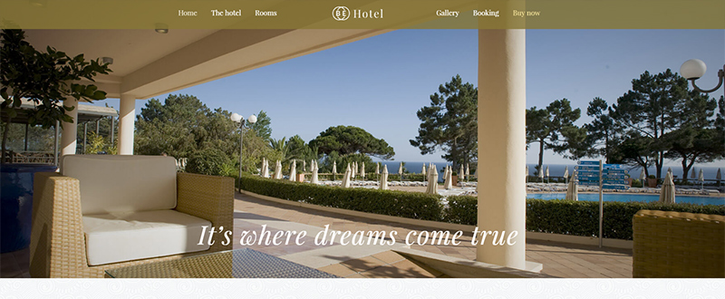
Be Hotel 2
- For a hotel – where images can be relied upon to tell the story.
- All the relevant sections (pages) are included – location, booking, rooms, etc.
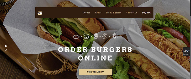
Be Burger
- Destined for an online burger delivery service; can be easily customized for any catering or delivery service.
- Modern, hip design.
- The focus is on the products and is designed to convert the user.
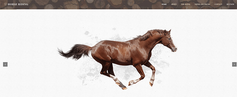
Be Horse
- For a horse farm, an equine or riding center, or even an equine veterinary service.
- The hero image is strong, simple, and elegant.
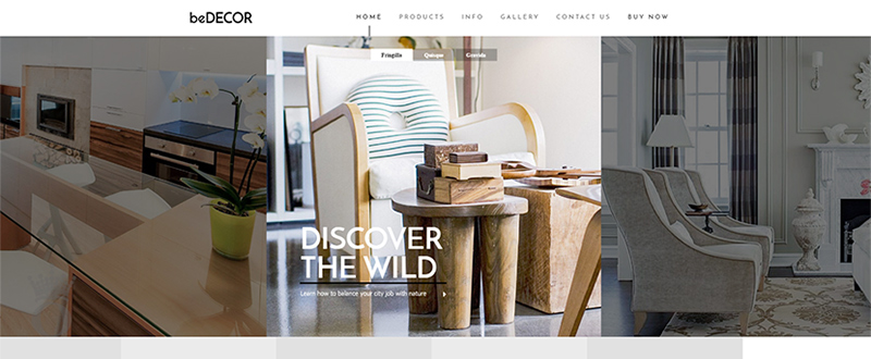
Be Decor
- This prebuilt website could be used for an individual interior designer or for an interior decorating agency.
- A showcase gallery and products section is included.
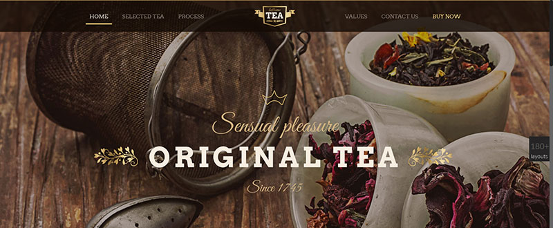
Be Tea
- This old-fashioned look is ideal for use by a tea shop.
- The design has a definite minimalist vibe, and makes excellent use of a range of colors.
Be Theme has what you need to create a beautiful website for virtually any type of small business or entrepreneur
This sampling of pre-built websites provides solid proof that when you purchase Be Theme, you can be assured of receiving tremendous value for money. Your ROI can be calculated in terms of greater productivity, increased money, consistently satisfied small-business clients, or all of the above.
With 220+ of these pre-built websites at your fingertips, each with a one-click install plus a ton of page and web-building features and with no coding skills needed, you will definitely get more than the value you are looking for. Be Theme’s history says it all. 45,000 professionals have used Be to create countless attractive, high-quality, and user engaging and converting websites. No wonder Be is a top 5 best seller on ThemeForest.
View all 220 pre-built websites here.
Read More at 20 Clean & Crisp Pre-Built Websites for Small Businesses
from Web Design Ledger https://webdesignledger.com/20-clean-crisp-pre-built-websites-small-businesses/


No comments:
Post a Comment