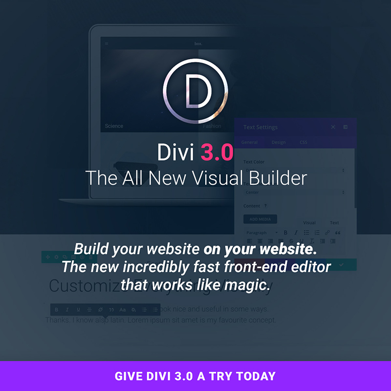
Web designer meets theme. Web designer invites theme to a test run. Theme is charming. Web designer falls in love. They move in together on a website. Then another. And another.
The relationship grows. Web designer offers loyalty. The theme offers an A/B testing feature. The web designer puts a ring on it, for a Lifetime Access. But there’s more than one happy ending in this unusual love story.
Today’s Divi 3.0 launch rewards current users and prospective users alike. The latest version of Divi introduces a groundbreaking improvement. Web designers all over the world see it as a revolution that changes the way we know the WP medium.
The Top Ten Reactions to the Divi 3.0 Launch
These user reactions range from serious and unusual, to downright funny. They all are enthusiastic, being part of love stories that web designers live with their favorite WP theme.
10. The cool front end builder that Divi launched delivered some unusual virtual encounters.
“Oh my heavens!!! that was sexual. ”- Michael Reynolds
“Lol I felt it too *puffs virtual e cig. lol “- Jermaine Young
9. Divi 3.0 even made people say goodbye to older friends:
“Good bye Visual Composer! Hello Divi” – Mark
8. Brought back nostalgia
“As a younger designer in the 1980s, I was blown away by WYSIWYG with PageMaker v1! This will give me the same thrill for on-line designing. Always had a need for speed.
Great work.” – Cristophe
7. Some even say that Divi is for WordPress what Pollock was for art:
WOW! This reminds me of what Jackson Pollock did for the artist. He changed the way artists worked and thought about their medium. ”- Joshua
6. Some people started thinking on changing careers:
“This totally makes my job obsolete. But very cool and impressive! ”- Nikolaj
5. Simply put, people felt understood.
“Finally. Somebody gets it. Been waiting like 10 years for this! ” – Teton
4. And reminded them of the childhood celebration:
“This is like being a kid and waiting for Christmas morning when you know you’re going to receive that long-awaited bicycle you’ve always wanted! Actually, even better!” – Susan
3. A launch capable of improving family relationships.
“Before I ever knew about WordPress, I used – dare I say it – “WIX” which, for obvious reasons, is very appealing to anyone who doesn’t know anything different. Their strength (in my view) has always been their visual editor.
When I started with DIVI last year, my secret wish was for the sort of visual editor they have, and which you are soon to release. And for this reason, I am recommending DIVI all the more in FB groups I belong to, and have even convinced my mother-in-law to commit to DIVI and not go with WIX.
Dude, you realize that my future is now in your hands, right?
Super excited!” – Ryan
2. It’s the launch that encouraged people to get in shape.
“I’m doing 1-armed pushups I’m so excited.” – Derek
- It simply blows newcomers away.
“OMG, I’m in disbelief!! I only joined the ET Dev club a week ago and I can’t believe the amassing difference between ET and another theme Dev’s. It feels like a privilege to even be here! WOW.
Not in my wildest dreams did I ever think I would be a customer of a product that is more than good, Yes I’m talking about Divi mostly, ET is way above my initial expectations, and I love it! I’ll be part of the family for life, that’s for sure.”- Liz
You Too Should Get Excited! – and Here’s Why
Divi 3.0 is new and it is modern; and for so many reasons. Let’s start with the new visual builder, Divi 3.0’s showpiece. Divi has long been a favorite of WordPress users because of its building block approach and the new and exciting features launched.
“Unlike the current version of the Divi Builder, in which elements on the page are represented by blocks, elements in the visual editor are represented by themselves. You can click into any section, row or module and edit the element’s settings just like you would in the current builder. When in visual mode, however, the broader editing experience, particularly the interplay between a module’s settings and the actual output of those settings, is infinitely more intuitive.
When you make a change, it happens instantly (and I mean instantly)! All of the editing occurs in your browser which means there is no need to use Ajax calls to load elements or update the design, and since we are using React, updating the DOM is incredibly efficient. Building a new page is really really fast” explains Nick Roach, founder and CEO at Elegant Themes.
Divi’s 40+ content modules are still there to provide you will all the flexibility you need. Adding new content is even easier than dragging and dropping – just hover, and click – and it’s done. Easy, powerful, intuitive – all apply. Click here to discover more.
Easily Customize Everything
If you like seeing the design adjustments in real time, you’ll love Divi 3.0.
Any design element you are working with can be customized, with the results appearing in real time.
A sampling of what you can customize:
- Fonts – There are dozens of custom fonts to choose from.
- Text – Want to adjust text color, size, line height, or letter spacing?
- Columns structures and row heights and widths are easily adjusted as well.
- To add background colors, images, video backgrounds, and parallax effects is about as simple as it gets.
- The same is true for dragging, dropping, and pasting content elements, or changing them by hovering and clicking.
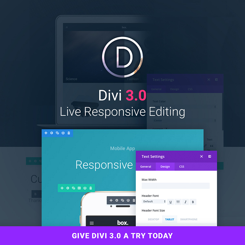
- Responsiveness – It’s a snap to apply different design settings for responsive breakpoints.
Enjoy the new Inline Editing Experience
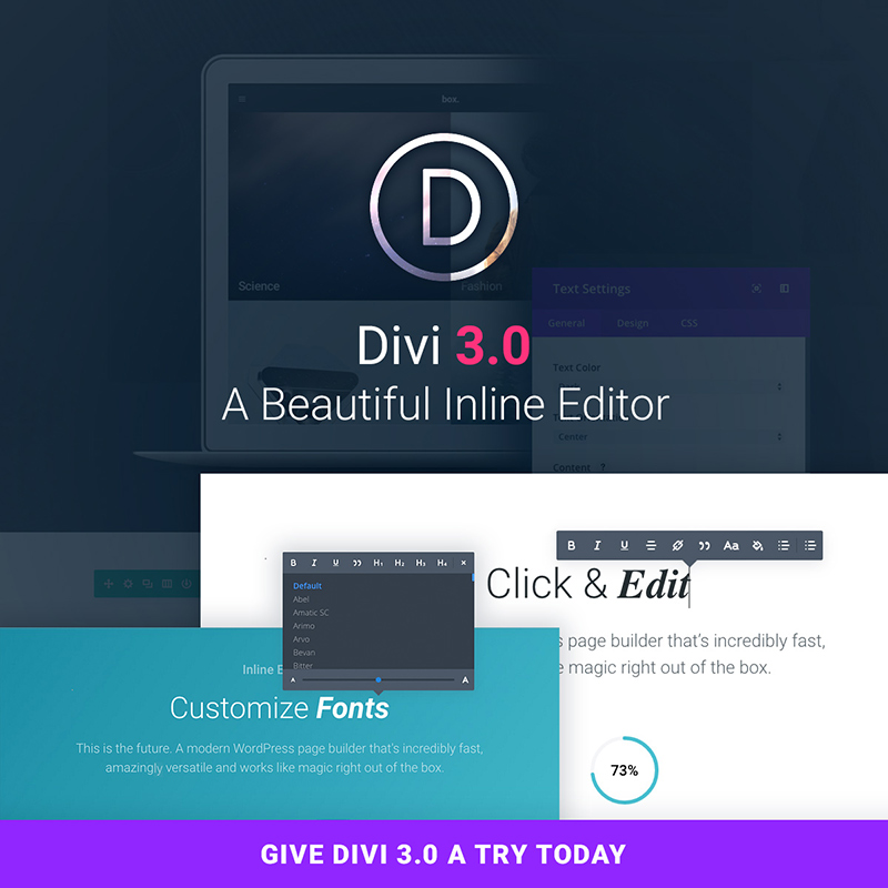
It’s simply a matter of click and edit. With Divi 3.0’s visual builder, you simply click on the text, as viewed on your website, and start editing. You can add or delete text, highlight text, or adjust the font style, size, or spacing.
Experience Divi’s new Speed
This front end builder’s speed will give you the fastest WP web design experience you’ve ever encountered. There are few page refreshes required and no traditional page loading requirements at all. JavaScript powers the builder.
You are doing the building on your own browser, so there’s no need to rely on browser-to-server communication. The only time required is that needed by the application to compute each change. This is for all practical purposes, instantaneous. Internet speed is not an issue.
The Invisible, Customizable Interface
In this case, the invisible UI refers to its design. It is so perfect that it goes unnoticed. It doesn’t get in your way, it predicts your intentions, and it offers solutions. It doesn’t bombard you with options you have no immediate need for. Simple put – you’ll absolutely love the new web design experience.
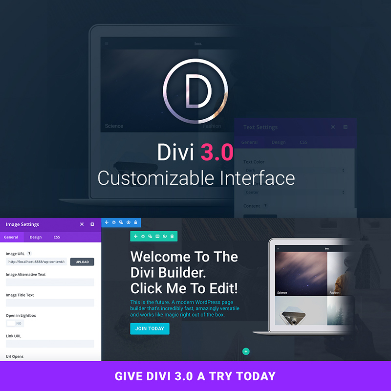
This is the first WP page builder with a customizable interface. You can have the controls displayed in the manner of your choosing, so they never get in your way.
Powered by React
The visual builder in Divi 3.0 is a completely new application, built from the ground, using React and Flux. This new technology has allowed the Divi creators team to do some really amazing things. Their promise? To evolve along the community and change Divi for the better, for many years to come.
Falling in Love – Again
Web designers that are already using Divi know that falling in love over and over again, with the same theme is possible. Divi constantly reinvents itself. With this launch, you will practically build your website on your website.
You will gain time and experience a revolutionary way of web designing. Check out Divi 3.0 here.
Read More at Top 10 Thrilled Reactions On the Divi 3.0 Release
from Web Design Ledger https://webdesignledger.com/top-10-thrilled-reactions-divi-3-0-release/

No comments:
Post a Comment