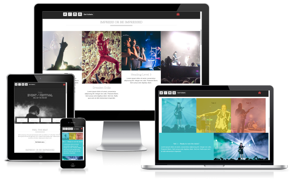
There are a good number of front-end editors out there when it comes to responsive design. Some are based on Bootstrap, others on different frameworks, and so on. However, most of them suffer from the same problem — they lack absolute control and originality. As such, most responsive design webpages tend to look similar in nature.
If you have ever experienced the same problem, consider it solved. Meet Responsive Foundation Framer, a unique solution by CoffeeCup that gives you absolute control over your design and at the same time, helps you create intuitive and responsive design without coding.
Responsive Foundation Framer: Responsive Design Made Easy
What is Responsive Foundation Framer?
Responsive Foundation Framer is a visual front-end editor with a solid grid system and custom predefined styles. It is based on the Foundation 6 framework., therefore, Responsive Foundation Framer is minimal, modular and lets you combine elements and styles with ease.
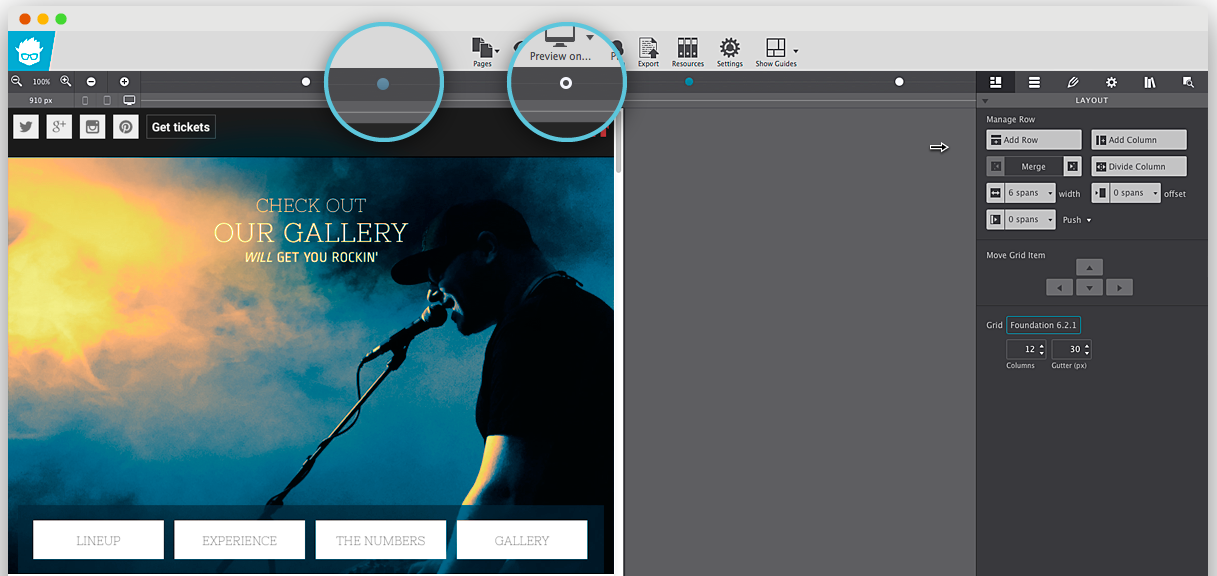
To begin with, Responsive Foundation Framer lets you harness the full power of CSS without having to deal with even a single line of code! You can specify the dimensions and run through the customization options and it will generate the required CSS code all by itself. Similarly, you can use the color picker to manage the color palette and the inline editor as well as the clickable controls to handle typography. Responsive Foundation Framer plays well with Google Fonts.
But what about content? Well, you can place your content wherever you want it, be it absolute positioning, float or using the Flexbox controls. You can layer multiple backgrounds and structure different layouts all in the matter of a few clicks! Plus, you can use the Picture element to serve different image sizes to your users on the basis of the device that they are using.
Considering the fact that Responsive Foundation Framer is based on Foundation 6 framework, it comes with the advantages of the Motion UI. You can, therefore, easily create animations and transitions with the help of data attributes.
That’s a rather strong list of features, isn’t it? But how does it fare on practice? Let’s put Responsive Foundation Framer to test and see what it can boast of.
Responsive Design: Responsive Foundation Framer Sneak Peak
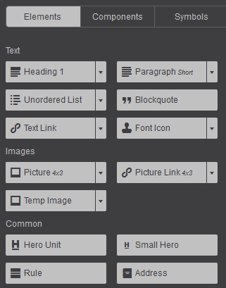
Most of the action in Responsive Foundation Framer happens by means of components. It comes with its own set of prebuilt and readymade components that you can make use of. Accordions, navigation menus, tab panels, modals, etc. are all there and you just need to click to insert. More importantly, you can create your own interactive components with the help of HTML elements and CSS mixins.
Also, Responsive Foundation Framer includes symbols for global content updates. What does that mean? It means you can save elements (say, a header or a footer) and then update them all from one spot.
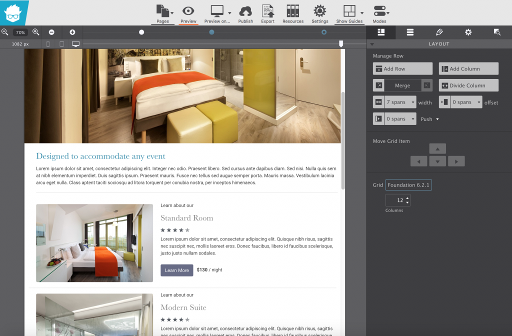
The interface is fairly straightforward. You can edit the rows and layouts as well as different elements on the basis of the right panel.
Bear in mind that we are talking about responsive design here. Now since Responsive Foundation Framer is a visual tool, it allows you to click and drag to change, edit, add or delete breakpoints. We know that Foundation framework comes with two breakpoints, but you can add or delete breakpoints by dragging the slider in the tool.
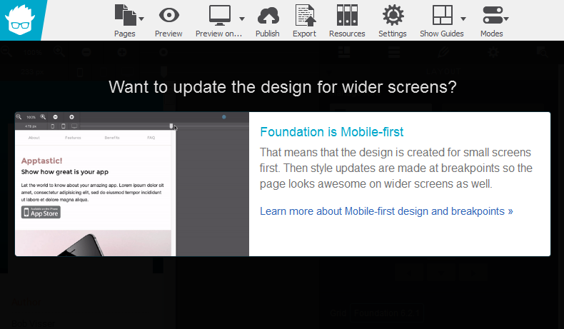
For instance, when the breakpoint value is reduced, Responsive Foundation Framer reacts accordingly:
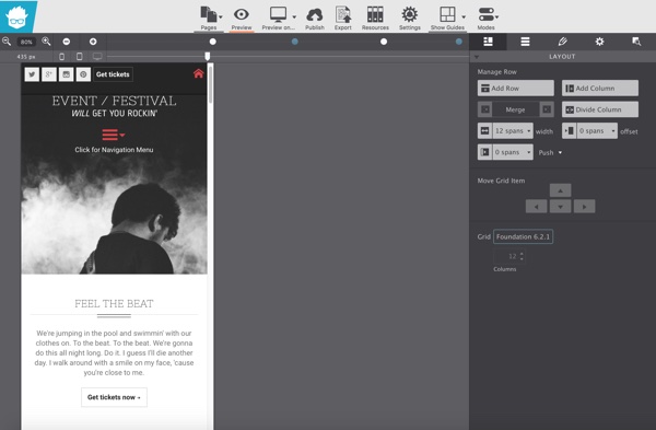
Since my screen was smaller, it allowed me to zoom in and out while fixing breakpoints, so that I can create designs that play well on larger screens too. This design and device agnostic approach is the back-bone of responsive design. It is refreshing to note that Responsive Foundation Framer is aware of this fact.
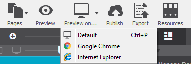
Once done, you can preview your work on the web browsers installed on your device.
You can sync (“Publish”) to the cloud if you have a paid subscription, or you can “Export” and deploy to your website or server elsewhere.
Responsive Foundation Framer comes with various customizable themes.

You can, of course, tweak every theme to suit your needs and requirements.
Unit Switcher: Control Unit Measurements on the Fly!
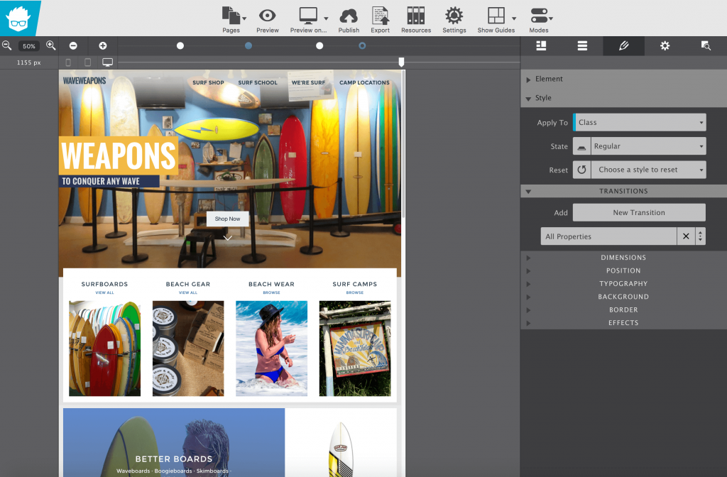
Responsive Foundation Framer lets you control unit measurements on the fly. We know that not all units are created alike. For example, layout elements work great with percentages as they can adapt based on the available width. While working with margins and padding you may want to use EM so you can space out your elements relative to the size of your text. However, what if you wish to use fixed dimensions for the purpose?
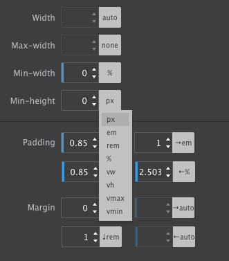
This is where the Unit Switcher proves useful. Visual designers will totally dig the VW option for fluid typography that resizes smoothly based on the device width and not just at a breakpoint. What to use when? It really depends on the design problem you’re addressing!
Pricing
Responsive Foundation Framer costs $79 for one license. It includes all of the features as well as premium quality support and access to documentation and tutorials.
There is a free trial option available as well. Responsive Foundation Framer runs on OSX and Windows devices.
Verdict
Responsive design is no longer a luxury. Everyone accesses the web via mobile devices at some point or the other during the day. Similarly, many people do use gigantic screens on their computers. All said and done, if your website is not responsive, it is of very little use.
As such, as a web designer, your designs should adhere to the principles of responsive design. Now, for the most part, most “responsive design” tools tend to repeat the same process over and over again. Either you are expected to code everything from the start, or you are given a severely crippled frontend editing functionality that offers a limited number of breakpoints and options for you to work with. In either case, your responsive design project does turn out responsive enough — but it lacks uniqueness and innovation that is expected from a web design concept.
Responsive Foundation Framer is an ideal tool for the job. By offering you granular control over each and every aspect related to your design, Responsive Foundation Framer makes it easy to create truly responsive design concepts. Similarly, several frontend visual editors tend to overlook the importance of web fonts; this one does not! Responsive Foundation Framer supports Google Fonts.
You also have the option to work with the back-end and export your stylesheets to the code editor of your choice. This makes it useful for folks who like to work with code rather than point and click all the time.
All said and done, Responsive Foundation Framer is a very useful solution when it comes to visual front-end editors for responsive design. By all means, you should consider giving it a spin right away!
Visit Responsive Foundation Framer
Read More at Responsive Foundation Framer: Responsive Design Made Easy
from Web Design Ledger https://webdesignledger.com/responsive-design-foundation-framer/
No comments:
Post a Comment