If it’s Wednesday, it’s Font’s of the Week’s day! In this series of articles we make known quality, expressive fonts that would compliment any project. This week, Opposit is the star!
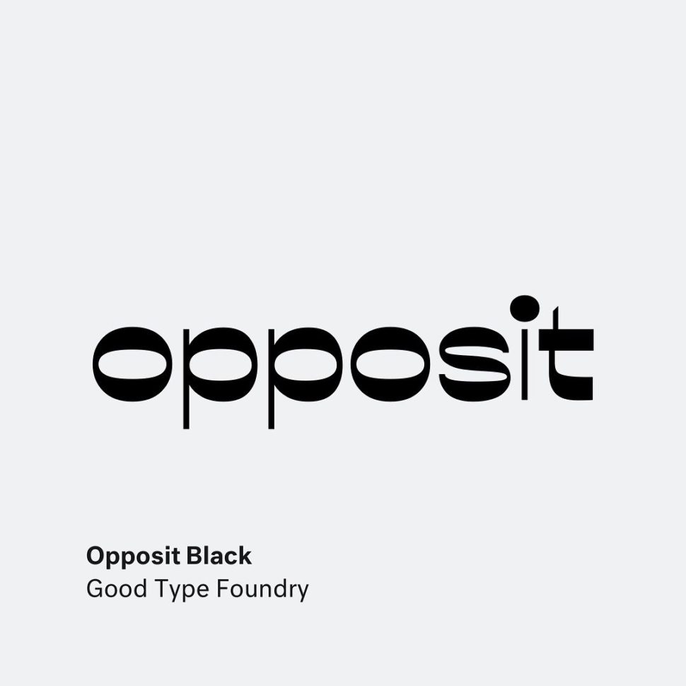
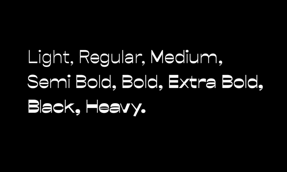
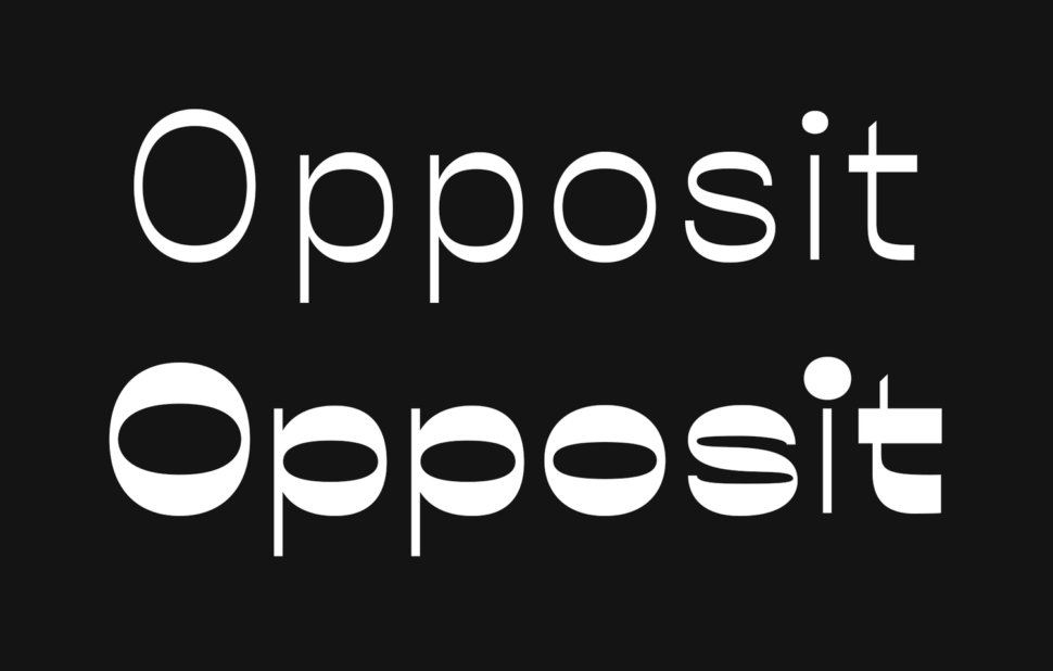
Opposit is a modern font that has been drawing the attention of many designers lately. Created by Kenneth Knutsen for the Good Type Foundry, in 2016, the font features a high contrast sans serif typeface that would put into the shade any regular font. The weight of Opposit ranges as follows: Light, Regular, Medium, Semi Bold, Bold, Extra Bold, Black, and Heavy. See the illustration below:
At Webdesignledger, we believe that every font has a story and a purpose. Every font has the power to express anything from love to hatred. You will never see highly contrasting fonts on a wedding invitation, nor delicate hand writing fonts on a protester’s board. Therefore, due to the high boldness of today’s font, Opposit is a great choice when it comes to strong, vocal messages, that need to be seen by lots of people. It’s the type of font that you would more likely see as titles for news, on the billboards, and even to express strong political views. Also, Opposit has the ability to catch the attention of many customers as part of the packaging. We invite all the designers who are visiting us to try Opposit out and let us know the result in the comment section below.
Our blog tries to shed a light on the most relevant topics for designers, that is why we try to keep a close relation with them. Three of our articles every week are dedicated to the work of designers and design agencies: Agency of the Week, Font of the Week, and Designer of the Week. We appreciate the hard-working, high-quality designers, and we want to give everyone the chance to be features on our blog. Thus, we are waiting for your emails at webdesignledger.blog@gmail.com where you can let us know what you do and in which of the three series would like to be featured. v
Read More at Opposit – a Font For Billboards (FOTW#4)
from Web Design Ledger https://webdesignledger.com/opposit-fotw4/
No comments:
Post a Comment