Who doesn’t love a button? In this case, we are not talking about the buttons of a suit, nor the ones that hold your pants together. Today, we are going to be talking about the buttons that have been a staple in interactive UI design for years. You might be thinking that a button is just a button, but it can be made into so much more. Button design gets a little bit more complex than you might think. Today, we are going to be discussing what makes a good button.
A Button should look like a button
Online, buttons act as visual cues to help enhance the user experience. In order for the user to get the full experience, they should not have to guess where the button is located. If you really want your visitors to click that button, it should look like a button that can be pressed. This is how you do it:
Give it a shape
You want your button to stand out. For this to happen, you have to give your button a recognizable shape. It should stand out from everything else on the page and instantly be recognized as something the users can interact with. Believe it or not, the most common button shape online is not a circle, like you’ve all probably imagined. Your safest bet is to use a rectangle. Not a normal rectangle, though, but one with rounded edges. These typically work the best because they stand out enough to be recognized, but not enough to disrupt the flow of your website’s design.

If you feel creative, you can just as well use something less traditional, such as a rhombus, a triangle, or even a custom shape. The key to making these easy to recognize is to be consistent throughout your website. They will give it a personal touch, which always makes the users more interested.
Use Shadows and Highlights
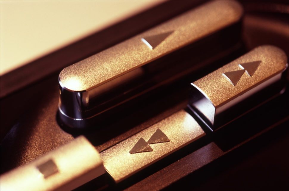
Shadows have a valuable role in design, as they make things look like they pop out. Every good UI design requires elements that stand out against the background, suggesting that they are tappable or clickable. Just like in real life where the keyboards of a laptop, for example, has raised buttons that can be presses down. More than the shape of your button, the shadows and highlights play a very important role in identifying an interactive button.
Label your buttons according to their purpose
We evolved quite a bit from the times when the only buttons we’d use were the play, rewind, forward and stop. They used to be represented by symbols that everybody was familiar with. Today, it would be almost impossible to put a symbol on every button and expect people to memorize them. There are so many! The good news is that we don’t need to do that, as we have the option to simply write on that button what it is meant for.
It may happen that the message is not clear enough. In this case, it is not wrong to have conformation label as a follow up, that explains the action of a certain button. These need to give the user the option to decline or accept the action of the button.
Place the Button Where It Can Be Found
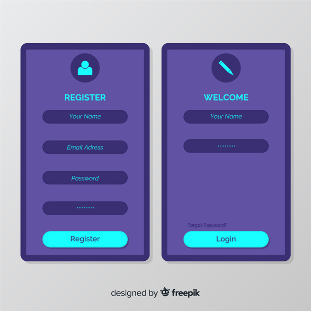
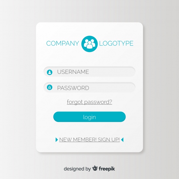
The user should never hunt for the button. Place them in such a way that everybody can find them. The easiest way to do that is by placing them where people expect them to be. Also, there’s nothing wrong with testing their placement before you determine where to put them. A good example for this is when you log in to any given website. You always put your name and password in, and the log in button is right below that. Nobody would expect the login button to be anywhere else.
Make Interaction with the Button Easy
Consider the size of the button relative to everything else on the page. Make sure that the button is large enough to interact with, but not so large that it takes from the beauty of the page. Studies have shown that the optimum size is 10mmX10mm. Another aspect to keep in mind is the distance between two clickable buttons. Give the buttons some room to breathe. You don’t want anyone accidentally clicking on the wrong button.
Allow Users to Visually Interact with the Button
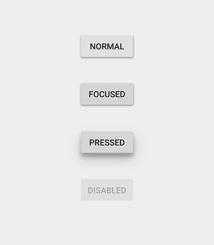
The button can look good, but if it doesn’t act like a button, the whole project is pointless. When the users click, make the button give visual feedback. This helps in two ways. The first way is that well, it feels more like a button, and that makes everyone happy. The second way is that it gives the user quick confirmation that they actually clicked the button.
Highlight the Important Buttons
Buttons have different roles, from minimal to major. The more important buttons should be easily distinguished between the any other button that’s not as important. The solution could be using different colors, outlining, or making the more important button bigger.
The summary
In order to improve your button design, you need to understand that:
- A button should look like a button;
- Buttons should be placed where they can be found
- The interaction with the button needs to be easy
- Interaction with a button should give visual feedback
- Important buttons should be highlighted
For such a simple concept there sure is a lot to know about buttons. Although the details are small, there’s nothing more satisfying than pressing a good button. We hope that these tips will help you design buttons that will offer your users a good experience. Share this blog post with other people you think would benefit from it and make sure you stay updated with out latest snippets of knowledge and inspiration by vising us daily.
Read More at How to Improve Your Button Design
from Web Design Ledger https://webdesignledger.com/how-to-improve-your-button-design/
No comments:
Post a Comment