The US presidential election is right around the corner. While some candidates are leveraging their eccentric personality and their bold attitudes to gain followers, and yes, I’m talking to you Mr. Trump, some of them invest massively in their online presence.
Which brings me to Hillary Clinton.
Intro
Hillary Clinton’s campaign staff knows exactly how to approach an audience, and they go all in to do so. In every single aspect of her digital campaign, you sometimes see tiny details that contribute on creating actually engaging content. From “God’s” voice (Morgan Freeman) in her bio video, to the awesome and bold logo with the subliminal-ish arrow symbolizing forward thinking, action and progress.
![]()
Speaking of small details, you can find the logo even in the source code of her website.
![]()
Her digital marketing campaign is hands down, one of the best I’ve seen in a while. Her logo, the quality of her videos, and the methods she used to tackle certain subjects is simply mindblowing. To be honest, I don’t know much about politics, but I can safely assume that she is digitally addressing most of the controversial topics built around her. From the enduring email problem to the Benghazi case and everything in between, Hillary’s staff defended herself with creative and professional copy and compelling visuals.
But enough with the political crap. Let’s cut it to the chase and talk about the things that actually interest us, the designers. Her website’s design.
Design
Right off the bet, the first thing we see on Hillary’s homepage, is a pop-up asking you to agree upon the fact that Donald Trump is one dangerous man. Although the pop-up’s design is rather simple and with a clear and distinguishable Call to Action, some people are not very happy about the straightforwardness of it.
“When I land on the website, I’m immediately met with a popup that wants my email if I disagree with Donald Trump. It doesn’t mention why it wants my email or what it’s going to do with it – it just wants it.” – Max Robinson, Aims Media Web Design, http://www.aimsmedia.co.uk
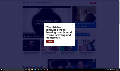
The reason why Hillary wants your email so badly is obvious. I full heartedly believe in the power of email. I happen to manage Bannersnack’s email marketing campaign and we leveraged email to convert old users, keep in touch with the customers and even run contests and surveys. Now, although they aren’t a Saas product, they are using email marketing exactly the same. They are constantly reminding you to support Hillary and help defeat the dreaded Donald.
Attacking Donald is the smartest marketing campaign and they know that. They are using email, video, and any available channel to bash and emphasize who Donald Trump is and why he would be a bad choice.
Hillary’s website changed a lot in the past months, and man they are really trying everything. It takes just one trip down the memory lane of the internet (Wayback Machine) and see all the changes on her website. The mesmerizing thing is that if you want to see the web design trends from a specific year, just take a peek at how her website used to look like that year.
From 2015 until a few months ago, the Hero image has been a crucial element of her website. Depending on the social-political events, the image kept changing trying to convey the message Hillary believes in and what she stands for, or who stands for her.
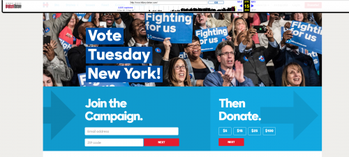
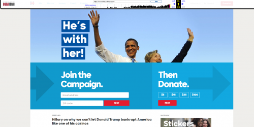
A few weeks ago, they ditched the hero image, and went for something more popular, more powerful.
Video
Just like the way they’ve been changing the hero image, the video plays an important role in illustrating certain changes, beliefs and causes she fights for. The thing that surprised me the most is how much they are leveraging the video format in order to convey the right message. While writing this article, in the past three days the main video changed three times and they’ve just redesigned the whole homepage. They’ve ditched any other elements that could distract you from the important items of the website, namely, the video, the donation box and the image of her with the “If you’re with her, chip in to support Hillary now” message.
From a leads perspective, the site does a good job of enabling the capture, the email addresses of visitors. There are at least two form fill pop ups that come up before you can advance to the site. Only when clicking on the small logo on the top left are you able to bypass the first form fill (which populates the entire screen when you first land on the site.) Clearly, the site’s primary purpose is to gather leads. So, that’s well done.
However, there are a few inconveniences that shouldn’t be left unnoticed.
From a user’s perspective, it is a bit off-putting that I can’t just browse the site without being asked for my email address. For the swing voter who is just browsing and doesn’t want to be placed on an email list, this could get them to bounce before they even get to the content.
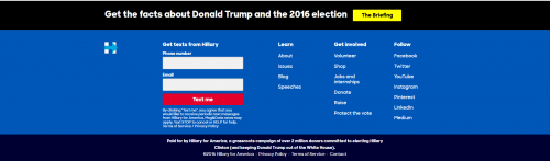
Another thing that changed drastically is the footer. Every single social media channel was listed on the website’s footer and then a minimalist box emphasizing the “PAID FOR BY HILLARY FOR AMERICA” slogan.

And then this happened…
I’m not saying it’s bad, it is just a bit too much. The call to action is a bit confusing, and the bulky social media text could’ve been easily replaced with some minimalistic icons. On the pros side, placing secondary navigation to less important areas of a website is also a great way to utilize the footer, as it can help declutter the main navigation, which in turn aids usability.
Conclusion
The site’s design is a good mix of visuals and content. It’s clean, photo and video heavy, and easy to navigate. It’s the right site for the audience they’re trying to reach which are voters who want to know what Hillary stands for and what are they going to get if she’s elected president. They’ve done a good job of letting the photos and content drive the site, and not slick design.
Read More at A Few Things Web Designers Can Learn From Hillary Clinton
from Web Design Ledger https://webdesignledger.com/things-web-designers-can-learn-hillary-clinton/
No comments:
Post a Comment