
Think about how many times you went on a website or a mobile app and left because of the poor design? I personally can count multiple times recently when I was searching for something specific, and the website was impossible to navigate. Unfortunately, this is a trend that I’ve noticed catching on here lately. Let’s put a stop to it and go over some of the worst UI designs that people still seem to think are okay.
Cluttered interface
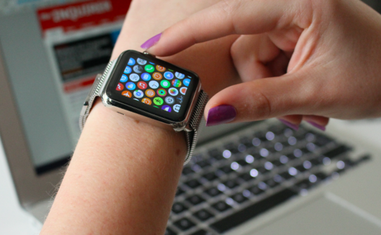
One of the biggest turn-offs for me is a messy or cluttered interface. Listen, I get it, you offer a lot of cool features and blog posts. However, I don’t need all that junk on my screen at one time. It can and very often does confuse people to a point where they’d rather look elsewhere.
Basically, a cluttered interface can quickly go from a source of information, to this:
The solution is simple, create a more interactive interface that allows for multiple, easy-to-read transitions to other areas of the website.
Lack of contrast
See how all of this just blends together? When navigating a website, you want clear and understandable navigation. I don’t want to have to squint and lean in just to see if what I’m clicking on is a link or just part of the scenery.
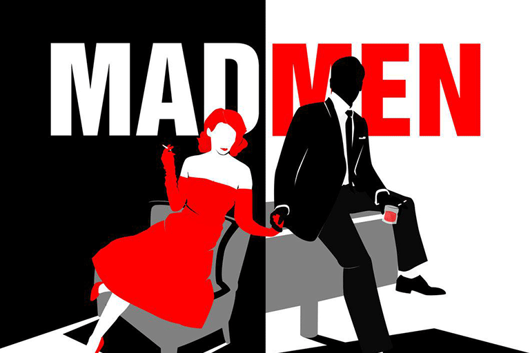
This is a great example of contrast. The letters are bold and defined, and nothing blends into the background. Of course, this is a promotion for a TV series, but you get the point. It also doesn’t have to be as wildly contrasting as the above image. Take this interface for example:
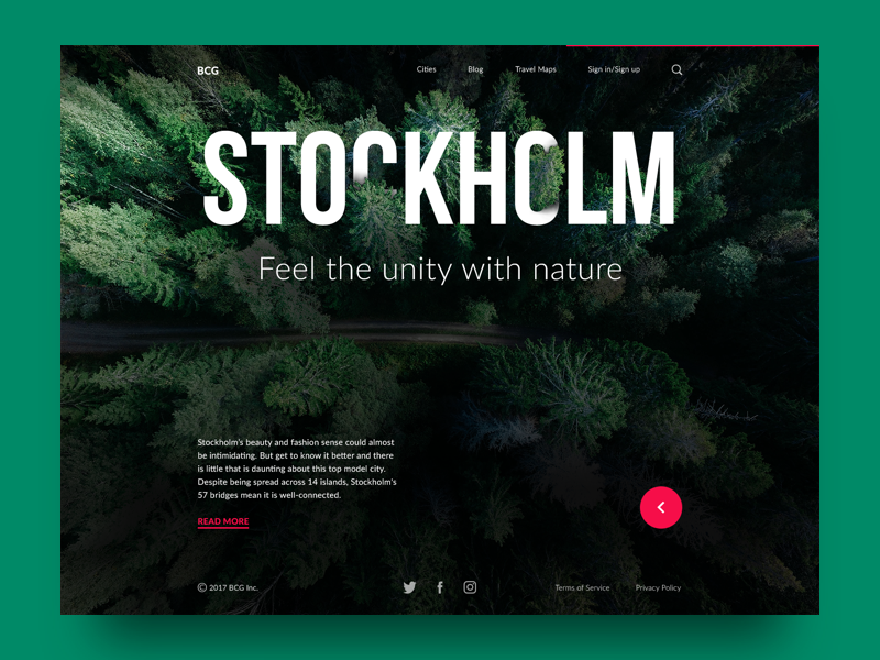
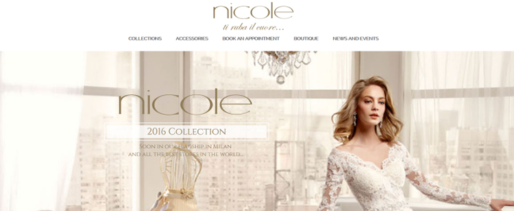
All the letters are clear, the colors aren’t overwhelming or wild, and it’s still very creative. This is a great example of a website UI that everyone wants to see more of.
Bad Consistency
One of the worst UI designs out there is bad consistency. Don’t get me wrong, changing things up a little bit just to be artsy and creative can really help your website grow. The problem is that people either take this way to far, or don’t take it far enough.
To break this down a little better, let’s talk about when consistency is needed and when it isn’t. For a design website, it’s not so important to be consistent, because that’s what design is, inconsistent. When you visit any given design website, the last thing you want to see is all the images lined up and the same size. You want each experience to be different and you want articles to be broken up in interesting ways.
On the other hand, you have websites that are so plain and boring because they’re so consistent.
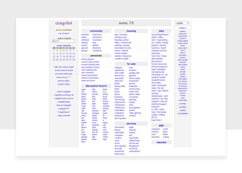
Craigslist is a great example of too much consistency. As one of the most used websites in the United States, it would make sense for them to spice it up a little.
This isn’t me bashing anything other than their design consistency. The website functions perfectly and is easy to navigate, it is just lacking in the pretty department.
How to Avoid These Most Common Mistakes of bad UI Designs?
Generally speaking, there are five mistakes people do that end up in a bad UI design:
1. Working limited by the deadlines
We all know that as a designer, it is quite difficult to gain notoriety at the beginning of the career. Novice designers are advised to take as many jobs as offered. Granted, this can happen to designers at any level. Not only do they overload themselves with work, but they are pressured by deadlines. In such circumstances, creativity has no room. One step to avoiding bad UI designs is making time to explore and select the best for clients.
2. Forgetting who or what you design for
When designing, people tend to forget that ultimately, the ones who will interact with their designed work are the users, not their clients. Therefore, instead of being focused on the deadline and paycheck, ask yourself “Is my work user-friendly? Do I offer a pleasant experience?”
3. Not knowing the target audience
We are talking about user interface, not designer interface for a good reason. UI design means putting the user before ourselves. It is important to create while focusing on the target audience. Our goal has to be offering them the experience and interface that would ensure them easy navigation.
4. Mentally designing too much too early
One of the qualities of a designer is flexibility. In the early stage of design, we might be so excited about a project that we project it in our minds and we try to stick to it no matter what. But we need to allow ourselves to explore more, and admit when something needs to be changed, even if they are our ideas.
5. Exaggerating with dynamics
Too much of anything can ruin a project. With today’s technology, we have easy access to tools that can do literary anything we want. It’s easy to get carried away with decoration and animation, but the key to a design is, in fact, to keep it simple and accessible.
Conclusion
Hopefully, these trends of bad UI design will go away sooner rather than later. The worst UI designs often come from startups or companies that haven’t been in business long. Ideally, after a few years of experience, they will get better at UI design.
New websites, take this as a learning opportunity. Don’t fall prey to what’s easy in UI design. Be different and unique. Keep the readers in mind, and everything else will follow suit.
Read More at The Best Examples of the Worst UI Designs and How To Avoid Them
from Web Design Ledger https://webdesignledger.com/best-examples-worst-ui-designs/
No comments:
Post a Comment