As one of the leaders in the software world, Microsoft has definitely worked hard at putting Windows on the map. I’m sure that there are lots of people interested in the history of Microsoft’s tech, but here in this article we are going to discuss something a little more related to design. Over the years, the face of Microsoft Windows has changed drastically. In fact, with the launch of each new operating system, the logo design has changed completely.
We’re starting this article off with a fun fact: the Windows logo key has no less than eight nicknames. These are: Windows key, Winkey, start key, logo key, flag key, super key, command key or flag. Here’s a fast rundown of the Windows logo designs in chronological order:
1985 – The Beginning (Windows 1.0, 2.0)
The first versions of their state of the art software that Microsoft relied were simply called Windows 1.0 and 2.0. If you take a look, this logo highly resembles the Windows 8, 8.1, and 10 logo. This is the start of the basic structure we will see in every Windows logo. Fun Fact, even though Windows 3.0 was released in 1990 support for 1.0 and 2.0 didn’t end until December 31, 2001.
![]()
1990 – 2001 (Windows 3.0)
At this point, Microsoft was evolving as a company. They took everything they had learned from the previous two versions and made Windows 3.0. You will notice that along with their evolution as a business, their logo also evolved in professionalism. This is the version of windows that made it popular. Support for this version also ended on December 31, 2001.

1992 – 2001 (Windows 3.1x, NT 3.1, and NT 3.5x)
During this period of time, Windows came up with a lot of new programs, but they only used two different logos. Both of these logos are very similar in appearance, but there are a few details that make them slightly different. Aside from the obvious differences like the window being tilted and the placement of the name, the colors were also changed to be brighter.
![]()
![]()
1995 – 2001 (Windows 95)
On August 24th, 1995, Windows 95 was released to the public. Microsoft really went big with this launch and it was the first time that a Windows program would get a massive face-lift via the graphical use interface and start menu. There are three different versions of the logo Microsoft used with Windows 95. The first one with just the word mark, the second one with the word mark and the logo, and the final one with the word mark, shadow, and logo. Each one uses the exact same font and the same logo, the only difference is the combination of word mark, the logo, and shadow.
![]()
![]()
1998 – 2006 (Windows 98, 98 SE)
On June 25th, 1998, Windows 98 was released. Shortly after, in May of 1999, the second edition was released, which fixed major bug problems from the previous version. You’ll notice that the geniuses at Microsoft Corporate didn’t get very creative with their new logo. It’s simply the Windows 95 logo with a new number at the end. It’s also worth mentioning that the 98 SE didn’t have an official logo.
![]()
1999 – 2010 (Windows 2000)
Windows 2000 was released only for business customers in December of 1999, and eventually became available for everyone in January of 2000. If this logo doesn’t scream late 90’s, early 2000, I don’t know what it does.

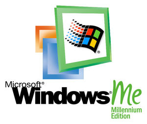
2000 – 2006 (Windows ME)
Windows ME is commonly referred to as the worst version of Windows Microsoft ever created. As it crashed very often and contained tons of bugs. It’s not very often you see this logo floating around because literately everyone that used it hated it.
2001 – 2014 (Windows XP)
In 2001, Microsoft completely renovated their program along with the logo that came with it. The idea was to give the new look a very clean feel. Strangely enough, there are at least eleven versions of the Windows XP logo.
![]()
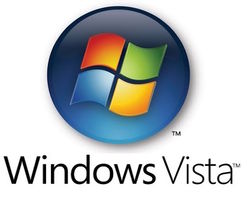
2006 – 2017 (Windows Vista)
In 2006, Microsoft modified their famous Windows logo to glow from the center. Although Vista wasn’t received well by the customers, their logo they created for this program is one of their most iconic.
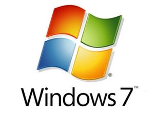
2009 – Present (Windows 7)
Windows 7 basically copied and pasted the Vista logo. Much like the Windows 95/98 logo design. All Microsoft really did was change the number at the end.
2012 – Present (Windows 8 and 8.1)
2012 would mark the year Windows took their approach towards modernism. This new logo is sleek, simple, and one color. It definetely achieves a minimalist style, at the same time, it salutes Windows’ roots. Take a look at the difference betweern the fonts in the 8 and 8.1 versions. The Windows 8 font is much bolder, while the 8.1 is very thin. This possibly because of the new length the new logo achieved with the additional .1.
![]()
![]()
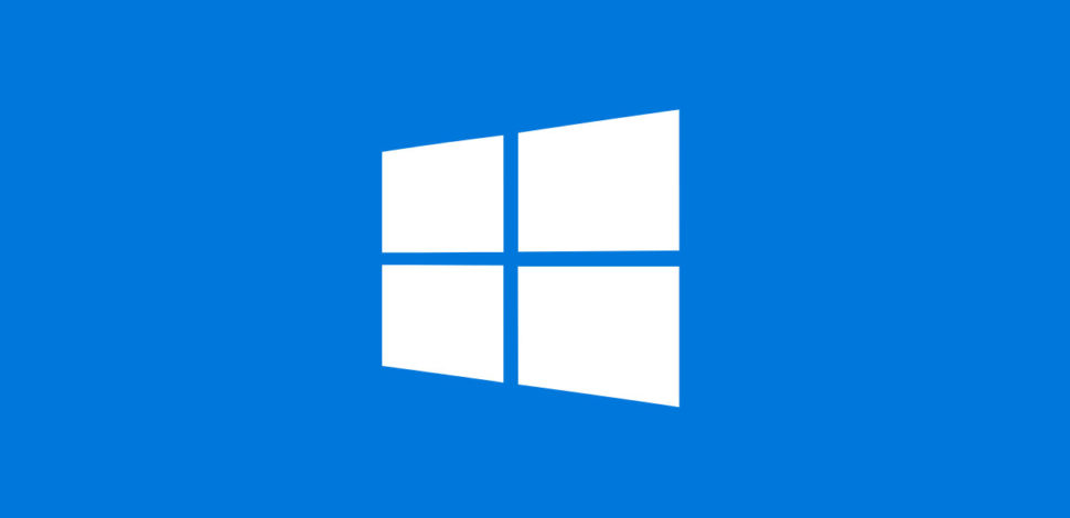
2015 – Present (Windows 10)
Almost everyone in the world is using Windows 10 now and has been since it launched. Compared to the Windows 8 logo, the new Windows 10 logo has been unbolded and changed to a much darker shade of blue. It’s been a few years since the new operating system from Windows so don’t get too comfortable with this look. Although nothing has been announced, we can expect something new in the near future, which means a new logo design… or does it?
![]()
What do you think of the direction Microsoft has taken Windows? Does the logo design suit the product, or does it need to be revamped completely? Regardless, we know that we will get a killer operating system. Thoughts? Opinions? Let us know in the comment section below. If you want to stay up to date with the design world and want to read more stories like this, be sure to check Webdesignledger daily.
Read More at The Fun History of the Windows Logo
from Web Design Ledger https://webdesignledger.com/fun-history-windows-logo/
No comments:
Post a Comment