
Choosing the best font for your logo is not a minor step in creating your brand’s identity. In fact, when your business receives some recognition, simply seeing the font you chose but in another context, will make people think of your brand instantly. That’s how valuable fonts are. When you choose the best logo font for your company, you have to put a lot of thought into it. It’s not a difficult process, but it’s certainly a crucial one. Today, we are here to give you some comprehensive tips and examples on how to choose the best logo font.
Let’s start with a little exercise of imagination. The images below depict some fonts of the most renowned brands out there. Your job is to try to guess to which brand does each font belong. Here we go:
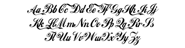

In order of appearance: Coca-Cola, Lego, Hershey’s, Vimeo, and Disney. I’m sure you were all able to solve the mystery, as there is no mystery at all. The fonts have been chosen correctly, which ensured the companies with easy recognition. This is what you need for your business, as well. Let’s go over some tips that will stick to your clients’ minds and will make them come for more.
1. Find a font that best describes your brand’s personality
The playful Disney font would look rather silly if Mercedes-Benz decided to use it for their logo, but it fits Disney’s personality so well! And that’s all due to the font’s swirls and swashes. Before you go into the particularities of a font, start first by choosing one of these general categories:
- Serif: for a classy and traditional look
- Sans serif: for a modern, and simple touch
- Script: for a feminine and elaborate look
- Novelty: for a funky and unique look
2. Never go for trendy fonts
When you choose a font, it’s like choosing a coat for your brand that needs to stay on forever. And as we all know, fashion always changes. What might look cool and trendy today, will look outdated tomorrow, or the day after tomorrow. We know, trendy is very tempting, but as we mentioned earlier, when you pick your coat you need to put a lot of thought into it. We would suggest that you go for an older font that features some of the particularities of the trendy font you like.
3. Look into a custom design
If you feel like any of the already existing fonts don’t describe your brand, custom designing it might be the solution. Not only can you have the perfect font for your brand, but you won’t have to worry about sharing the same typeface with any other brands. There are ups and, unfortunately, downs to this option. On one hand, you can get creative and design the font of your dreams, on the other hand, it can be more expensive than picking a font that has already been created. But if you have the financial resources to go for a custom design, this will probably be your best option, if not, go with plan B.

4. Plan B
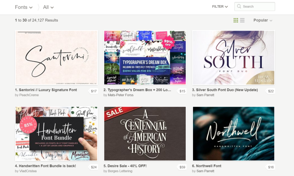
We get it, commissioning a custom typeface may not be in your budget, especially if you’re just starting out. If that’s the case, then you should put all your effort into finding a new font that is still unique. Websites such as Creative Market and MyFonts are great outlets for shopping for fonts. Taking this route has its advantages, though. When you purchase a font from websites like the ones mentioned, the original creator will typically allow you to add a few custom touches. It’s nothing major, but it could be a tweak like bolder letters or maybe an additional character or two.
5. Keep your brand’s growth in mind
One of the biggest mistakes you can make when choosing your logo font is limiting yourself. What do I mean by that? Change is inevitable, especially if you are a growing business. Your logo should be unique, but flexible. You never know when color schemes need to be changed, or even the brand itself. You should look for a font that looks good in multiple colors and different sizes.

6. Keep it simple and personal
As important as it is to have a unique look, you also do not want to go over the top with it. What you want instead is to make it easy to read and understand. If your audience cannot easily identify your name, then they can’t establish an emotional connection. Some of the mistakes people do are: choosing a messy handwriting typeface, a super elaborate cursive, tight lettering, harsh and thick strokes, and the worst, mixed lettering (using random typefaces). The key to an amazing logo font is to make it look effortless.

7. Don’t overuse your logo font
Have you heard a song over and over again, even unwillingly, until you got sick of it? In the same way, you can overuse the typeface of your logo. You want the experience people get when they view your logo to be unique to the logo. Make sure you choose a different font for headlines and body texts in order to keep the importance of your logo fresh. You need your logo to stand out, so don’t blend it in with other parts of your branding.

Conclusion
Keep your logo font simple. Make it personal. Take time to find the perfect logo font, don’t make an impulse decision. Here’s an extra tip: whatever you do, be the best at it. Quality always surpasses quantity.
Read More at Tips to Choosing the Best Logo Font
from Web Design Ledger https://webdesignledger.com/tips-choosing-best-logo-font/
No comments:
Post a Comment