The feature of keeping information up-to-date over a longer period of time makes brochures an important and useful tool in marketing campaigns. There are plenty of websites that provide you with brochure templates. We’ll mention some in this blog post. But at times, you might feel like designing one from scratch. For this very reason, we provided you with some simple brochure design guidelines.
We all know that brochures tell only one story at a time. This is the rule. In a brochure, you only focus on one thing, a single subject. Therefore, the information contained in a brochure is unitary, circumscribed to a particular theme. The design of the brochure, the presentation of the theme, the quality of the information, and the expectations of the target audience are directly responsible for the success or failure of a brochure-based advertising program. Once we understand the importance of a good brochure design, we can actually take the first steps into designing one.
Know your audience
Whether you design a brochure for yourself or for a client, you need to make sure that you know as much about your target audience as possible. Usually, this is the less visible or cared for aspect of a booklet: the audience to which it is addressed. An in-depth study of your audience increases the effectiveness of the message promoted through brochures. You need to take into account the age, the ethnicity, demographics, and the gender of your audience. Once you have figured all that out, you can effectively take the first steps into the physical design of the brochure.
Distribute the information correctly
Brochures limit us regarding the amount of content they can display. Advertising brochures should be based on a layout that draws the attention in a convenient way. You can do this by separating the text blocks through descriptive headlines. But in order to avoid any misunderstandings with your client, make sure you talk to him/her before you decided how much space is necessary for the content, and how much for the images. You don’t want whoever is reading the brochure to be overloaded with information in the first couple of sentences. Distribute all the information equally so the viewer stays interested.
Make them attractive, use colors
An advertising brochure has to go beyond its black-and-white version, which is typical of textbooks, small-scale cards, etc.. A reaction is guaranteed on those reading the booklet if you use colors, chosen in such a way that they resonate with the theme. Use polychromy for a bigger psychological impact. Beyond the point, colors make anything look better. We are a designer, after all, so use your imagination.
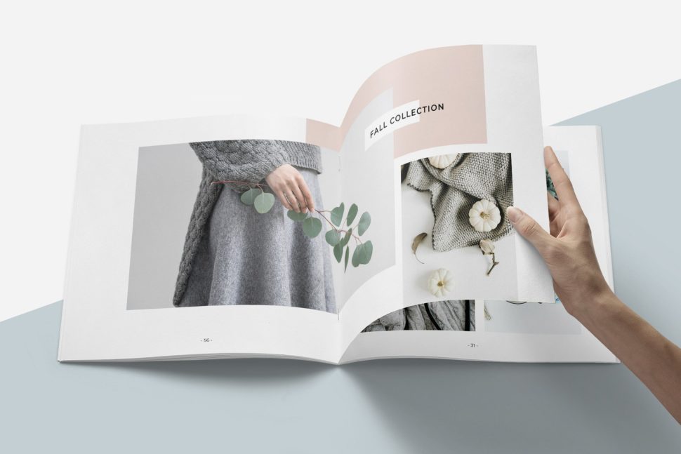
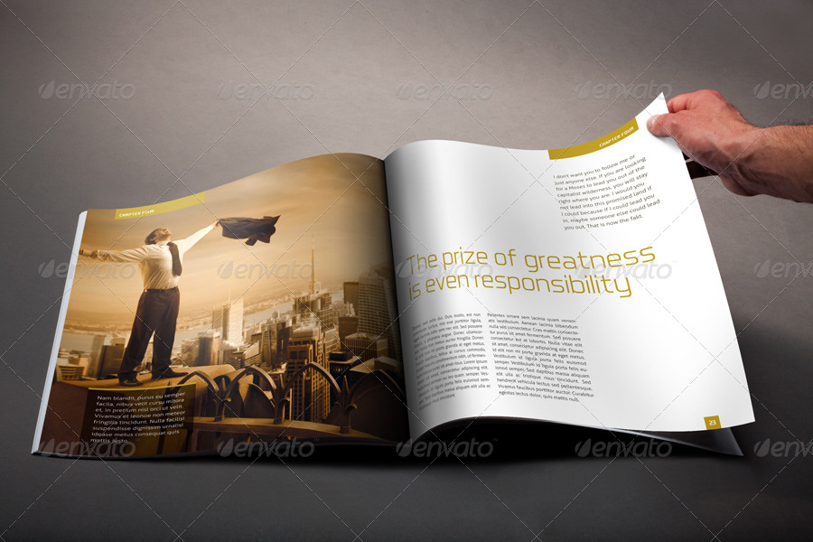
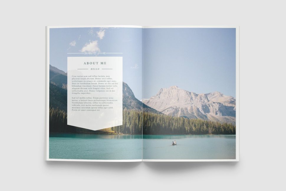
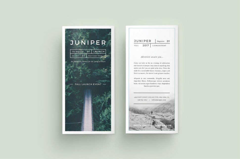
Images speak louder than text
Images draw attention involuntarily and are infinitely easier than any text. The use of thematic and aesthetic images is necessary to capture the interest of the reader. Incorporate large images that fill the page tastefully in the brochure layout. Get your hands on any corporate brochure and you will see that the photos seem to go beyond the edges of the pages. Adding images gives more depth to the content on the page. It takes the reader beyond the letters laid out in front of them and gives them a different form of visual stimulation.
Get your content right
The content, the information in the brochure must be legible, clear and grammatically correct. The easiest way of doing that is by keeping it simple. You don’t need heavy words, nor neverending sentences. Also, use only one font. Since you’re only using one font, try alternating the sizes according to the importance of the text. Give your viewers something new to read, without overcomplicating things.
Keep in mind that size matters
If you have a large budget, then go for a larger brochure size. Keep in mind, however, you want to keep things aesthetically pleasing, so don’t go too crazy with the size. A larger format allows a better use of the white space. Use white space with the intention of guiding the page from one block of information to another. White space balances the active areas in the brochure design with visual rest areas. The customer’s attention is a rare and valuable resource, so manage it with great design and a comfortable layout.
Ease your work
As mentioned at the beginning, there are websites that provide designers with quick downloads for brochure templates. As genuine as a custom brochure can be, we also understand that time is a valuable resource. If you ever find yourself in a pinch and need a quick brochure template, here are a few places you can find them:
https://graphicriver.net/item/a5-brochure-creative/7960373
https://creativemarket.com/studiosumac/2819638-Magnolia-Lookbook-Template
https://creativemarket.com/Forty6and2/622623-WANDERERS-Photography-Brochure
https://graphicriver.net/item/brand-manual/14370396
https://graphicriver.net/item/a5-trend-brochure/310012
Conclusion
Whether you are a beginner designer or an experienced one, we hope that you found these tips helpful. Here is a short summary of them that you can print out and always take into account when designing a brochure:
- learn who all you can about your audience;
- let your pages breath, don’t overload them with content;
- use colors;
- add relevant images that speak the same message as your text;
- make sure your text is correct in every aspect;
- find the right size for your brochure;
- ease your work by using already created brochure templates;
- have fun!
If you liked our blog post, please share it with your friends so they can benefit from these amazing tips. We would also love to know what are your favorite techniques when creating a brochure. Share your tips with us in the comment section below.
Read More at This Is How You Design a Brochure in 2018
from Web Design Ledger https://webdesignledger.com/this-is-how-you-design-a-brochure-in-2018/
No comments:
Post a Comment